Join us at FabCon Vienna from September 15-18, 2025
The ultimate Fabric, Power BI, SQL, and AI community-led learning event. Save €200 with code FABCOMM.
Get registered- Power BI forums
- Get Help with Power BI
- Desktop
- Service
- Report Server
- Power Query
- Mobile Apps
- Developer
- DAX Commands and Tips
- Custom Visuals Development Discussion
- Health and Life Sciences
- Power BI Spanish forums
- Translated Spanish Desktop
- Training and Consulting
- Instructor Led Training
- Dashboard in a Day for Women, by Women
- Galleries
- Data Stories Gallery
- Themes Gallery
- Contests Gallery
- Quick Measures Gallery
- Notebook Gallery
- Translytical Task Flow Gallery
- TMDL Gallery
- R Script Showcase
- Webinars and Video Gallery
- Ideas
- Custom Visuals Ideas (read-only)
- Issues
- Issues
- Events
- Upcoming Events
Compete to become Power BI Data Viz World Champion! First round ends August 18th. Get started.
- Power BI forums
- Forums
- Get Help with Power BI
- Desktop
- Slicer dates not correctly filtering measures such...
- Subscribe to RSS Feed
- Mark Topic as New
- Mark Topic as Read
- Float this Topic for Current User
- Bookmark
- Subscribe
- Printer Friendly Page
- Mark as New
- Bookmark
- Subscribe
- Mute
- Subscribe to RSS Feed
- Permalink
- Report Inappropriate Content
Slicer dates not correctly filtering measures such as 30 day rolling average
Hi all,
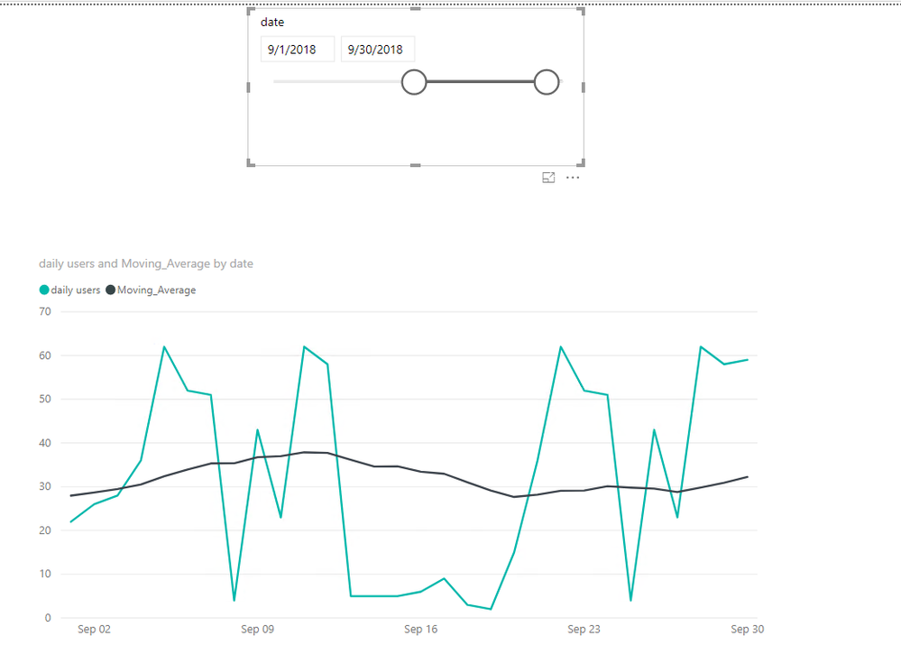
I have a line graph showing two lines:
1. daily active users
2. 30 day rolling average of daily active users.
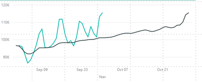
After modifiying my slicer date range (9/1/2018 - 9/30/2018), my data for daily active user are correctly filtered but the 30 day moving average is always showing 30 days more worth of data and one day less.
Solved! Go to Solution.
- Mark as New
- Bookmark
- Subscribe
- Mute
- Subscribe to RSS Feed
- Permalink
- Report Inappropriate Content
Hi @RogerSteinberg,
What is your formula of your rolling average? I made one sample here for your reference. Everything worked well here.
Moving_Average =
CALCULATE (
    AVERAGEX ( 'Table1', Table1[daily users] ),
    DATESINPERIOD ( Table1[date], LASTDATE ( Table1[date] ), -30, DAY )
)
For more details, please check the pbix as attached. If any other question, kindly share your pbix to me.
Regards,
Frank
If this post helps, then please consider Accept it as the solution to help the others find it more quickly.


