Get Fabric certified for FREE!
Don't miss your chance to take the Fabric Data Engineer (DP-600) exam for FREE! Find out how by attending the DP-600 session on April 23rd (pacific time), live or on-demand.
Learn more- Power BI forums
- Get Help with Power BI
- Desktop
- Service
- Report Server
- Power Query
- Mobile Apps
- Developer
- DAX Commands and Tips
- Custom Visuals Development Discussion
- Health and Life Sciences
- Power BI Spanish forums
- Translated Spanish Desktop
- Training and Consulting
- Instructor Led Training
- Dashboard in a Day for Women, by Women
- Galleries
- Data Stories Gallery
- Themes Gallery
- Contests Gallery
- QuickViz Gallery
- Quick Measures Gallery
- Visual Calculations Gallery
- Notebook Gallery
- Translytical Task Flow Gallery
- TMDL Gallery
- R Script Showcase
- Webinars and Video Gallery
- Ideas
- Custom Visuals Ideas (read-only)
- Issues
- Issues
- Events
- Upcoming Events
Next up in the FabCon + SQLCon recap series: The roadmap for Microsoft SQL and Maximizing Developer experiences in Fabric. All sessions are available on-demand after the live show. Register now
- Power BI forums
- Forums
- Get Help with Power BI
- Desktop
- Single Table Visualization, Multiple Data Tables
- Subscribe to RSS Feed
- Mark Topic as New
- Mark Topic as Read
- Float this Topic for Current User
- Bookmark
- Subscribe
- Printer Friendly Page
- Mark as New
- Bookmark
- Subscribe
- Mute
- Subscribe to RSS Feed
- Permalink
- Report Inappropriate Content
Single Table Visualization, Multiple Data Tables
Hello,
Looking for assistance on the following scenario:
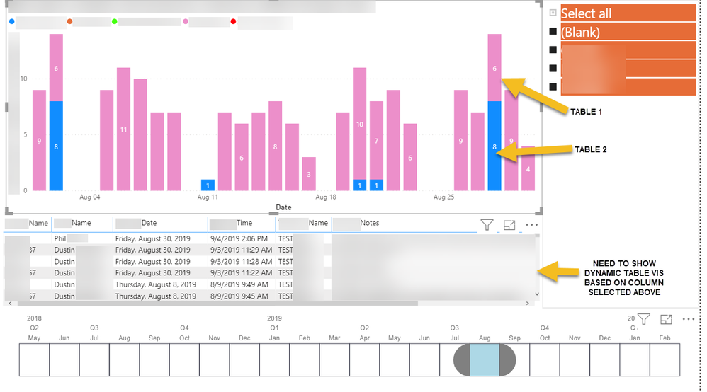
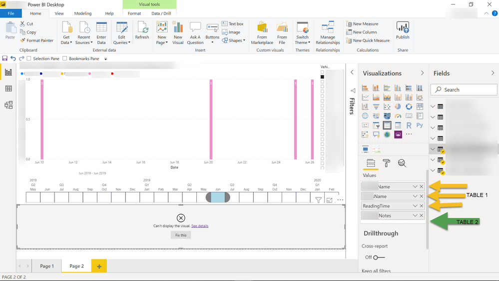
- Stacked Column Chart with "Values" columns from 5 different tables
- Tables are related to a single "Vehicle Table" (see model below)
- When user clicks on a column in the chart, I want to show a Table visualization with details for the given records
- When I combine columns to the Table vis, from the 4 data tables, I get an error that there is no relationship
- Data Model
(EDIT 1: Added Photos)
(EDIT 2: Added Data Model)
(EDIT 3: Added better example)
- Mark as New
- Bookmark
- Subscribe
- Mute
- Subscribe to RSS Feed
- Permalink
- Report Inappropriate Content
a couple of things..
1) Have you made the relationship between Table 1 and Vehicles Table bi-directional for some specific reason? if not, change it to single
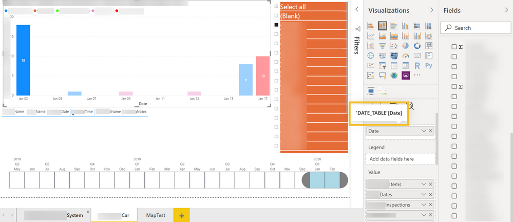
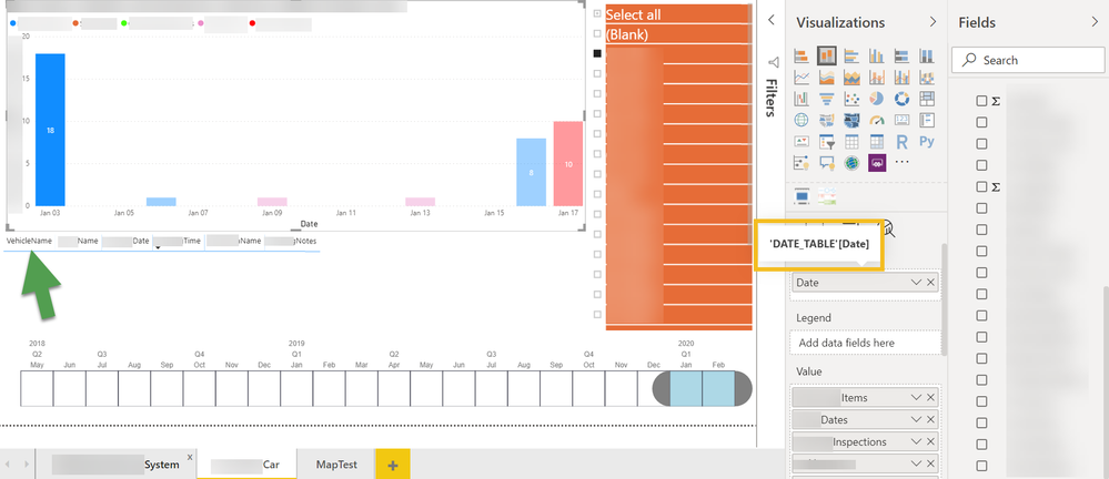
2) for the interaction betwen your Stacked column chart and the table visualisation to work, the date field in the chart x axis and in your table must be from your date table. Similarly, your table visual should include a row context from your Vehicle Field for the visual to filter all related tables.
3) If you have any other common fileds in your tables (name? etc..) I would suggest you create lookup tables (same principal as the Vehicle Table) and use these in all your measures, filters, slicers..This ensures that the filter context throughout you model is consistent and allows you to do calculations across tables etc..
Not sure if that helps, but without seeing more details about fields used in the table visual, where they are coming from and how you have built the measures it is hard to be more precise.
It would help if you could mash up a mock sample of data representing your model with which we can work with within Desktop to provide better advice. If you can (no need for thousands of rows or all the tables even; just a representation of the data), share the Excel file (or PBIX file) via OneDrive, Google Drive, Dropbox...
Did I answer your question? Mark my post as a solution!
In doing so, you are also helping me. Thank you!
Proud to be a Super User!
Paul on Linkedin.
- Mark as New
- Bookmark
- Subscribe
- Mute
- Subscribe to RSS Feed
- Permalink
- Report Inappropriate Content
Thank you @PaulDBrown for putting some thought into this.
- RE: BiDirectional Relationship:
- I changed this back to Single direction
- Was bi-directional while I was experimenting
- RE: X-axis from DATE_TABLE:
- Yes, the x-axis is from the DATE_TABLE
- RE: Table visualization should have a VehicleName column:
- It does. This column is the only common column among all 5 of the tables I want to visualize here
- The remaining columns are UNIQUE to each respective table. This is the issue
I think the answer might be showing and hiding 5 Table Visualizations depending on the type of data clicked on in the column chart.
I don't think its possible to show different tables in a single Table visualization.
- Mark as New
- Bookmark
- Subscribe
- Mute
- Subscribe to RSS Feed
- Permalink
- Report Inappropriate Content
Can you please share:
1) samples in table format of your data tables
2) the relatioships between these tables and any lookup/dimension tables (modeling view snapshot)
Thanks,
Did I answer your question? Mark my post as a solution!
In doing so, you are also helping me. Thank you!
Proud to be a Super User!
Paul on Linkedin.
- Mark as New
- Bookmark
- Subscribe
- Mute
- Subscribe to RSS Feed
- Permalink
- Report Inappropriate Content
Anyone run across a solution for this?
Thank you
Helpful resources

New to Fabric Survey
If you have recently started exploring Fabric, we'd love to hear how it's going. Your feedback can help with product improvements.

Power BI DataViz World Championships - June 2026
A new Power BI DataViz World Championship is coming this June! Don't miss out on submitting your entry.

| User | Count |
|---|---|
| 47 | |
| 44 | |
| 39 | |
| 20 | |
| 15 |
| User | Count |
|---|---|
| 68 | |
| 68 | |
| 31 | |
| 27 | |
| 24 |


