FabCon is coming to Atlanta
Join us at FabCon Atlanta from March 16 - 20, 2026, for the ultimate Fabric, Power BI, AI and SQL community-led event. Save $200 with code FABCOMM.
Register now!- Power BI forums
- Get Help with Power BI
- Desktop
- Service
- Report Server
- Power Query
- Mobile Apps
- Developer
- DAX Commands and Tips
- Custom Visuals Development Discussion
- Health and Life Sciences
- Power BI Spanish forums
- Translated Spanish Desktop
- Training and Consulting
- Instructor Led Training
- Dashboard in a Day for Women, by Women
- Galleries
- Data Stories Gallery
- Themes Gallery
- Contests Gallery
- Quick Measures Gallery
- Notebook Gallery
- Translytical Task Flow Gallery
- TMDL Gallery
- R Script Showcase
- Webinars and Video Gallery
- Ideas
- Custom Visuals Ideas (read-only)
- Issues
- Issues
- Events
- Upcoming Events
Calling all Data Engineers! Fabric Data Engineer (Exam DP-700) live sessions are back! Starting October 16th. Sign up.
- Power BI forums
- Forums
- Get Help with Power BI
- Desktop
- Simple IBCS Bar Chart
- Subscribe to RSS Feed
- Mark Topic as New
- Mark Topic as Read
- Float this Topic for Current User
- Bookmark
- Subscribe
- Printer Friendly Page
- Mark as New
- Bookmark
- Subscribe
- Mute
- Subscribe to RSS Feed
- Permalink
- Report Inappropriate Content
Simple IBCS Bar Chart
Hey everyone,
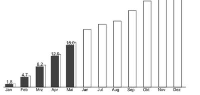
i want to create a simple Bar Chart with Actual and Plan like this
It seems That there is no way to make a white Bar with a black border. It is only possible to set the Color of the Bar. I Use a Live Connection to analysis Services. So i cannot use any Modeling options.
It would be Great if anyone can help
Solved! Go to Solution.
- Mark as New
- Bookmark
- Subscribe
- Mute
- Subscribe to RSS Feed
- Permalink
- Report Inappropriate Content
To help improve Power BI, you may leave a comment and vote this idea up.
If this post helps, then please consider Accept it as the solution to help the other members find it more quickly.
- Mark as New
- Bookmark
- Subscribe
- Mute
- Subscribe to RSS Feed
- Permalink
- Report Inappropriate Content
- Mark as New
- Bookmark
- Subscribe
- Mute
- Subscribe to RSS Feed
- Permalink
- Report Inappropriate Content
Hi @dpack,
If you're looking to do IBCS-compliant charts, I suggest you have a look at Zebra BI in the custom visuals Marketplace - it is a commercial custom visual but the convenience trade-off is worth the cost IMHO, particularly as it's the only IBCS-certified visual that Power BI has and they are the gold standard for financial reporting. They have more information over on their website if you wish to know more. They offer a 30 day free trial so you can see if it suits your needs.
If you're not looking to purchase a license, but can afford the time to explore, it's possible that you could use Charticulator to design it (the trade-off being that not all Power BI features are present in exported visuals), or you can look into developing a custom visual (but this is a time-expensive and skill-intensive option).
Good luck!
Daniel
If my post helps, then please consider accepting as a solution to help other forum members find the answer more quickly 🙂
Did I answer your question? Mark my post as a solution!
Proud to be a Super User!
On how to ask a technical question, if you really want an answer (courtesy of SQLBI)
- Mark as New
- Bookmark
- Subscribe
- Mute
- Subscribe to RSS Feed
- Permalink
- Report Inappropriate Content
My goal now is to find out how fare I can go with the on Board tools. I cannot believe that it is not possible to make a border around a bar.
I have tried Charticulator but the output cannot use a Dimension from a cube in the Axis. I don't know why.
Thanks for your reply.
Helpful resources

FabCon Global Hackathon
Join the Fabric FabCon Global Hackathon—running virtually through Nov 3. Open to all skill levels. $10,000 in prizes!

Power BI Monthly Update - September 2025
Check out the September 2025 Power BI update to learn about new features.


