Join us at FabCon Vienna from September 15-18, 2025
The ultimate Fabric, Power BI, SQL, and AI community-led learning event. Save €200 with code FABCOMM.
Get registered- Power BI forums
- Get Help with Power BI
- Desktop
- Service
- Report Server
- Power Query
- Mobile Apps
- Developer
- DAX Commands and Tips
- Custom Visuals Development Discussion
- Health and Life Sciences
- Power BI Spanish forums
- Translated Spanish Desktop
- Training and Consulting
- Instructor Led Training
- Dashboard in a Day for Women, by Women
- Galleries
- Data Stories Gallery
- Themes Gallery
- Contests Gallery
- Quick Measures Gallery
- Notebook Gallery
- Translytical Task Flow Gallery
- TMDL Gallery
- R Script Showcase
- Webinars and Video Gallery
- Ideas
- Custom Visuals Ideas (read-only)
- Issues
- Issues
- Events
- Upcoming Events
Enhance your career with this limited time 50% discount on Fabric and Power BI exams. Ends September 15. Request your voucher.
- Power BI forums
- Forums
- Get Help with Power BI
- Desktop
- Shows data partially based on percentage selected ...
- Subscribe to RSS Feed
- Mark Topic as New
- Mark Topic as Read
- Float this Topic for Current User
- Bookmark
- Subscribe
- Printer Friendly Page
- Mark as New
- Bookmark
- Subscribe
- Mute
- Subscribe to RSS Feed
- Permalink
- Report Inappropriate Content
Shows data partially based on percentage selected in slicer
Hi!
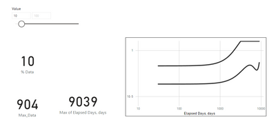
So i hava data of app index per day. I want to show it in graph, consist of app index in y-axis and elapsed day in x-axis.
I want to show the data based on the selected data percentage in slicer. For example, I have in total 9039 data. if i select 10% they will only show 10% of the data from the back which is data 8135 to 9039 (Total 904 data showed). How do i make it on dax?
Thanks in advance!
Solved! Go to Solution.
- Mark as New
- Bookmark
- Subscribe
- Mute
- Subscribe to RSS Feed
- Permalink
- Report Inappropriate Content
Hi @Farrah24 ,
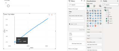
Here I suggest you to create a measure and add this measure as a visual level filter in your line chart. In my sample, I create a percentage slicer by what if parameter.
Filter =
VAR _PERCENTAGE =
    DIVIDE ( SELECTEDVALUE ( Percentage[Percentage] ), 100 )
VAR _MAXINDEX =
    CALCULATE ( MAX ( 'Table'[Index] ), ALL ( 'Table' ) )
VAR _ROUNDUP =
    ROUNDUP ( _MAXINDEX * _PERCENTAGE, 0 )
VAR _RESULT =
    IF ( MAX ( 'Table'[Index] ) >= _MAXINDEX - _ROUNDUP, 1, 0 )
RETURN
   _RESULT
Result is as below.
Best Regards,
Rico Zhou
If this post helps, then please consider Accept it as the solution to help the other members find it more quickly.
- Mark as New
- Bookmark
- Subscribe
- Mute
- Subscribe to RSS Feed
- Permalink
- Report Inappropriate Content
@Farrah24 , One you mutiple measure by 10%
[Measure]*[Parameter value]/100
or use this parameter with pareto logic, refer my filter example at end
Continue to explore Power BI Window function- Pareto Analysis, 80% of sales, Order by on Measure: https://www.youtube.com/watch?v=UVxiLc_AzSs
This mean 10% contribution
Helpful resources
| User | Count |
|---|---|
| 71 | |
| 63 | |
| 60 | |
| 49 | |
| 26 |
| User | Count |
|---|---|
| 117 | |
| 75 | |
| 62 | |
| 55 | |
| 43 |


