Join us at FabCon Vienna from September 15-18, 2025
The ultimate Fabric, Power BI, SQL, and AI community-led learning event. Save €200 with code FABCOMM.
Get registered- Power BI forums
- Get Help with Power BI
- Desktop
- Service
- Report Server
- Power Query
- Mobile Apps
- Developer
- DAX Commands and Tips
- Custom Visuals Development Discussion
- Health and Life Sciences
- Power BI Spanish forums
- Translated Spanish Desktop
- Training and Consulting
- Instructor Led Training
- Dashboard in a Day for Women, by Women
- Galleries
- Data Stories Gallery
- Themes Gallery
- Contests Gallery
- Quick Measures Gallery
- Notebook Gallery
- Translytical Task Flow Gallery
- TMDL Gallery
- R Script Showcase
- Webinars and Video Gallery
- Ideas
- Custom Visuals Ideas (read-only)
- Issues
- Issues
- Events
- Upcoming Events
Enhance your career with this limited time 50% discount on Fabric and Power BI exams. Ends September 15. Request your voucher.
- Power BI forums
- Forums
- Get Help with Power BI
- Desktop
- Showing % of cluster & not the entire data set in ...
- Subscribe to RSS Feed
- Mark Topic as New
- Mark Topic as Read
- Float this Topic for Current User
- Bookmark
- Subscribe
- Printer Friendly Page
- Mark as New
- Bookmark
- Subscribe
- Mute
- Subscribe to RSS Feed
- Permalink
- Report Inappropriate Content
Showing % of cluster & not the entire data set in clustered column chart
HI,
I have below shown clustered chart created where I want to show % instead of numbers. If I use 'Show value as %' option available in Value field (right click), it calculates the % of the entire data set. But I want to calculate the % between each light blue & dark blue seperately. Example, I want to see in first light blue & dark blue % as 40% & 60% & not 2 &3.
How can I do this. Pls help
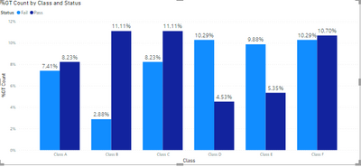
Using 'Show value as %' option available in Value field (right click), gives result as below which I don't want. It is considering entire dataset as 100% then deviding all the bars in 100%. I want to consider each light blue & dark blue set of bars seperately as 100%
Solved! Go to Solution.
- Mark as New
- Bookmark
- Subscribe
- Mute
- Subscribe to RSS Feed
- Permalink
- Report Inappropriate Content
Hi @harshadrokade ,
Create this measure:
If I answered your question, please mark it as a solution to help other members find it more quickly.
- Mark as New
- Bookmark
- Subscribe
- Mute
- Subscribe to RSS Feed
- Permalink
- Report Inappropriate Content
Hi,
You may download my PBI file from here.
Hope this helps.
Regards,
Ashish Mathur
http://www.ashishmathur.com
https://www.linkedin.com/in/excelenthusiasts/
- Mark as New
- Bookmark
- Subscribe
- Mute
- Subscribe to RSS Feed
- Permalink
- Report Inappropriate Content
- Mark as New
- Bookmark
- Subscribe
- Mute
- Subscribe to RSS Feed
- Permalink
- Report Inappropriate Content
Hi @harshadrokade ,
Can you give some example data from your table? Doesn't need to be with real numbers.
- Mark as New
- Bookmark
- Subscribe
- Mute
- Subscribe to RSS Feed
- Permalink
- Report Inappropriate Content
Hi,
Share the link from where i can download your PBI file.
Regards,
Ashish Mathur
http://www.ashishmathur.com
https://www.linkedin.com/in/excelenthusiasts/
- Mark as New
- Bookmark
- Subscribe
- Mute
- Subscribe to RSS Feed
- Permalink
- Report Inappropriate Content
@Ashish_Mathur Sorry Sir, My organisation doesn't allow uplaoding the files anywhere & so I can;t share the PBIx file or link for the same. Will you be able to help me without PBIx file sir, pls
- Mark as New
- Bookmark
- Subscribe
- Mute
- Subscribe to RSS Feed
- Permalink
- Report Inappropriate Content
Hi,
Please prepeare a dummy dataset and show the problem clearly on that dataset.
Regards,
Ashish Mathur
http://www.ashishmathur.com
https://www.linkedin.com/in/excelenthusiasts/
- Mark as New
- Bookmark
- Subscribe
- Mute
- Subscribe to RSS Feed
- Permalink
- Report Inappropriate Content
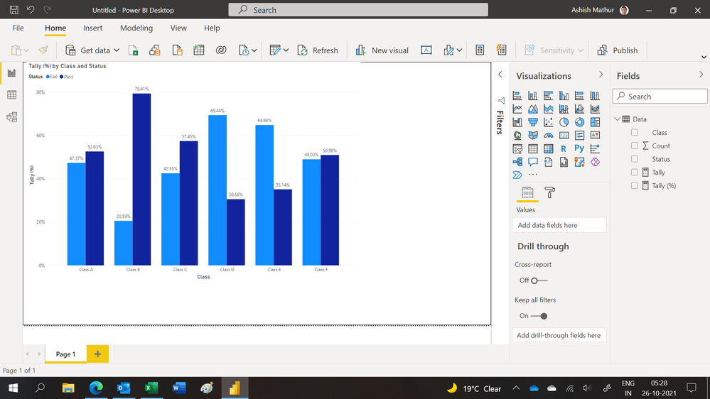
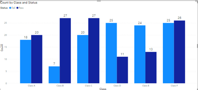
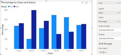
Pls refer below data. I have drawn the clustered column chart also as shown below which is giving wrong %. I want % to be shown on cluster as shown in the table.
Table name - Class
Columns as below-
| 'Class | 'Status | 'Count | '% to be shown on Clustered column chart |
| Class A | Pass | 20 | 53% |
| Class A | Fail | 18 | 47% |
| Class B | Pass | 27 | 79% |
| Class B | Fail | 7 | 21% |
| Class C | Pass | 27 | 57% |
| Class C | Fail | 20 | 43% |
| Class D | Pass | 11 | 31% |
| Class D | Fail | 25 | 69% |
| Class E | Pass | 13 | 35% |
| Class E | Fail | 24 | 65% |
| Class F | Pass | 26 | 51% |
| Class F | Fail | 25 | 49% |
Power bi visual with count-
Power bi visual with % (% appearing here is wrong. I want the % as shown in table)-
- Mark as New
- Bookmark
- Subscribe
- Mute
- Subscribe to RSS Feed
- Permalink
- Report Inappropriate Content
Hi,
You may download my PBI file from here.
Hope this helps.
Regards,
Ashish Mathur
http://www.ashishmathur.com
https://www.linkedin.com/in/excelenthusiasts/
- Mark as New
- Bookmark
- Subscribe
- Mute
- Subscribe to RSS Feed
- Permalink
- Report Inappropriate Content
- Mark as New
- Bookmark
- Subscribe
- Mute
- Subscribe to RSS Feed
- Permalink
- Report Inappropriate Content
You are welcome.
Regards,
Ashish Mathur
http://www.ashishmathur.com
https://www.linkedin.com/in/excelenthusiasts/
- Mark as New
- Bookmark
- Subscribe
- Mute
- Subscribe to RSS Feed
- Permalink
- Report Inappropriate Content
Hi @harshadrokade ,
Create this measure:

If I answered your question, please mark it as a solution to help other members find it more quickly.
Helpful resources
| User | Count |
|---|---|
| 65 | |
| 61 | |
| 60 | |
| 54 | |
| 30 |
| User | Count |
|---|---|
| 180 | |
| 88 | |
| 72 | |
| 48 | |
| 46 |


