FabCon is coming to Atlanta
Join us at FabCon Atlanta from March 16 - 20, 2026, for the ultimate Fabric, Power BI, AI and SQL community-led event. Save $200 with code FABCOMM.
Register now!- Power BI forums
- Get Help with Power BI
- Desktop
- Service
- Report Server
- Power Query
- Mobile Apps
- Developer
- DAX Commands and Tips
- Custom Visuals Development Discussion
- Health and Life Sciences
- Power BI Spanish forums
- Translated Spanish Desktop
- Training and Consulting
- Instructor Led Training
- Dashboard in a Day for Women, by Women
- Galleries
- Data Stories Gallery
- Themes Gallery
- Contests Gallery
- Quick Measures Gallery
- Notebook Gallery
- Translytical Task Flow Gallery
- TMDL Gallery
- R Script Showcase
- Webinars and Video Gallery
- Ideas
- Custom Visuals Ideas (read-only)
- Issues
- Issues
- Events
- Upcoming Events
Join the Fabric FabCon Global Hackathon—running virtually through Nov 3. Open to all skill levels. $10,000 in prizes! Register now.
- Power BI forums
- Forums
- Get Help with Power BI
- Desktop
- Showing Percentages in Stacked Column chart (inste...
- Subscribe to RSS Feed
- Mark Topic as New
- Mark Topic as Read
- Float this Topic for Current User
- Bookmark
- Subscribe
- Printer Friendly Page
- Mark as New
- Bookmark
- Subscribe
- Mute
- Subscribe to RSS Feed
- Permalink
- Report Inappropriate Content
Showing Percentages in Stacked Column chart (instead of absolute values)
Hello All,
I'm trying to implement a Stacked Column chart where instead of showing absolute numbers, I wanted the break-up by percentages.
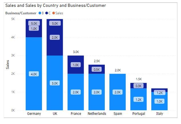
Please note, I don't want a 100% Stacked column chart as I don't want all X-axis values to amount to 100% rather it should be their absolute values which determine the length of the data bars.
Please refer the dummy data set and the graph I'm trying to depict. For now, I have achieved this by showing in Tooltips (using ALLEXCEPT) but the users tend to take printouts than use the dashboards ☹️ . This implies I need to present percentages in the graph and not in tooltips.
| Country | Sales | Business/Customer |
| France | 2000 | B |
| France | 1000 | C |
| UK | 3000 | B |
| UK | 2000 | C |
| Germany | 4000 | B |
| Germany | 1000 | C |
| Spain | 2000 | B |
| Netherlands | 2000 | B |
| Netherlands | 500 | C |
| Italy | 1000 | B |
| Italy | 200 | C |
| Portugal | 1200 | B |
| Portugal | 300 | C |
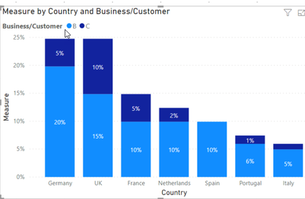
The visual I'm trying to generate is provided below.
Note: I have posted this in DAX group a month back, and I haven't got a clear answer. I'm keen to know, if this can be done in Power BI.
Thanks,
Varun
Solved! Go to Solution.
- Mark as New
- Bookmark
- Subscribe
- Mute
- Subscribe to RSS Feed
- Permalink
- Report Inappropriate Content
@Anonymous I don;t think it is not possible, basically you want Y - Axis values to be absolute number but show % as data label, and currently it is not possible to show custom data labels. Having said that, add this as an ideas forum or vote for an existing idea if exists.
Subscribe to the @PowerBIHowTo YT channel for an upcoming video on List and Record functions in Power Query!!
Learn Power BI and Fabric - subscribe to our YT channel - Click here: @PowerBIHowTo
If my solution proved useful, I'd be delighted to receive Kudos. When you put effort into asking a question, it's equally thoughtful to acknowledge and give Kudos to the individual who helped you solve the problem. It's a small gesture that shows appreciation and encouragement! ❤
Did I answer your question? Mark my post as a solution. Proud to be a Super User! Appreciate your Kudos 🙂
Feel free to email me with any of your BI needs.
- Mark as New
- Bookmark
- Subscribe
- Mute
- Subscribe to RSS Feed
- Permalink
- Report Inappropriate Content
@Anonymous is this what you want? What you mean by %
Subscribe to the @PowerBIHowTo YT channel for an upcoming video on List and Record functions in Power Query!!
Learn Power BI and Fabric - subscribe to our YT channel - Click here: @PowerBIHowTo
If my solution proved useful, I'd be delighted to receive Kudos. When you put effort into asking a question, it's equally thoughtful to acknowledge and give Kudos to the individual who helped you solve the problem. It's a small gesture that shows appreciation and encouragement! ❤
Did I answer your question? Mark my post as a solution. Proud to be a Super User! Appreciate your Kudos 🙂
Feel free to email me with any of your BI needs.
- Mark as New
- Bookmark
- Subscribe
- Mute
- Subscribe to RSS Feed
- Permalink
- Report Inappropriate Content
Many thanks for your response.
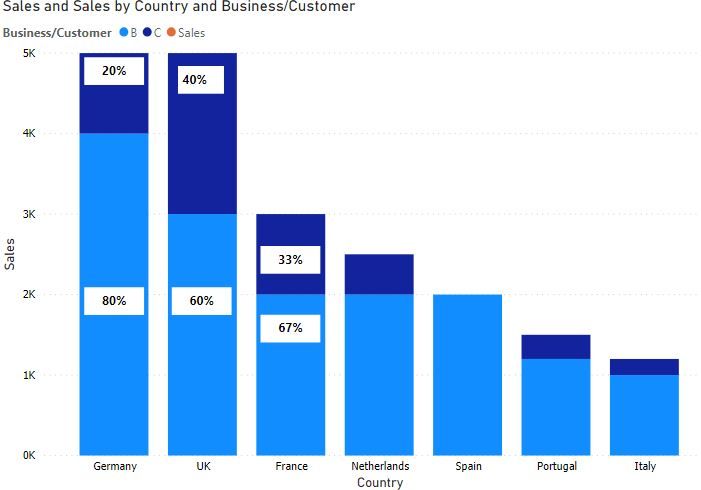
I'm more looking something like this:
The bar length would be based on the absolute country sales, whereas the percentages would amount to 100% for each country.
Thanks,
Varun
- Mark as New
- Bookmark
- Subscribe
- Mute
- Subscribe to RSS Feed
- Permalink
- Report Inappropriate Content
@Anonymous I don;t think it is not possible, basically you want Y - Axis values to be absolute number but show % as data label, and currently it is not possible to show custom data labels. Having said that, add this as an ideas forum or vote for an existing idea if exists.
Subscribe to the @PowerBIHowTo YT channel for an upcoming video on List and Record functions in Power Query!!
Learn Power BI and Fabric - subscribe to our YT channel - Click here: @PowerBIHowTo
If my solution proved useful, I'd be delighted to receive Kudos. When you put effort into asking a question, it's equally thoughtful to acknowledge and give Kudos to the individual who helped you solve the problem. It's a small gesture that shows appreciation and encouragement! ❤
Did I answer your question? Mark my post as a solution. Proud to be a Super User! Appreciate your Kudos 🙂
Feel free to email me with any of your BI needs.
- Mark as New
- Bookmark
- Subscribe
- Mute
- Subscribe to RSS Feed
- Permalink
- Report Inappropriate Content
Many thanks. Will check and update this in the Idea forum.
Thanks for the help.
Regards,
Varun
- Mark as New
- Bookmark
- Subscribe
- Mute
- Subscribe to RSS Feed
- Permalink
- Report Inappropriate Content
@parry2k Any updates on that? We are still stuck trying to make this work and clearly cannot be done. Another feature needs to be added... this can easily be done on Excel but not powerbi


