FabCon is coming to Atlanta
Join us at FabCon Atlanta from March 16 - 20, 2026, for the ultimate Fabric, Power BI, AI and SQL community-led event. Save $200 with code FABCOMM.
Register now!- Power BI forums
- Get Help with Power BI
- Desktop
- Service
- Report Server
- Power Query
- Mobile Apps
- Developer
- DAX Commands and Tips
- Custom Visuals Development Discussion
- Health and Life Sciences
- Power BI Spanish forums
- Translated Spanish Desktop
- Training and Consulting
- Instructor Led Training
- Dashboard in a Day for Women, by Women
- Galleries
- Data Stories Gallery
- Themes Gallery
- Contests Gallery
- QuickViz Gallery
- Quick Measures Gallery
- Visual Calculations Gallery
- Notebook Gallery
- Translytical Task Flow Gallery
- TMDL Gallery
- R Script Showcase
- Webinars and Video Gallery
- Ideas
- Custom Visuals Ideas (read-only)
- Issues
- Issues
- Events
- Upcoming Events
The Power BI Data Visualization World Championships is back! Get ahead of the game and start preparing now! Learn more
- Power BI forums
- Forums
- Get Help with Power BI
- Desktop
- Showing Likert Scale data in one table
- Subscribe to RSS Feed
- Mark Topic as New
- Mark Topic as Read
- Float this Topic for Current User
- Bookmark
- Subscribe
- Printer Friendly Page
- Mark as New
- Bookmark
- Subscribe
- Mute
- Subscribe to RSS Feed
- Permalink
- Report Inappropriate Content
Showing Likert Scale data in one table
Hi there,
Newbie here, so apologies if this is a super easy question. I cannot find the answer anywhere.
I am working on a survey which asks the user their satisfaction with a number of services. The data is 4 point likert scale > extremely satisfied to extremely dissatisfied).
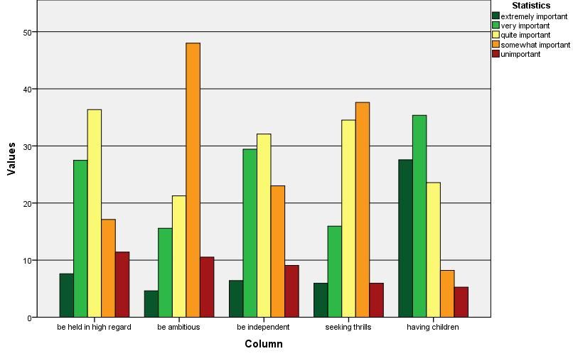
There are 6 services, and I would like to show these in one bar chart graph, side by side to compare each.
X axis to be 6 services, with 4 bars in each (extremely satisfied, satisfied, dissatisfied, Extremely dissatisfied),
Y Axis shows the count of each rating.
Is this possible in Power Bi? or is there another way of doing this? I cannot seem to get more than one service. I have found a visual to demonstrate what im looking for below. Any assistance is greatly apprecated. Thank you.
Solved! Go to Solution.
- Mark as New
- Bookmark
- Subscribe
- Mute
- Subscribe to RSS Feed
- Permalink
- Report Inappropriate Content
"Do i need to format my data a different way?" Yes
| service | extremely satisfied | satisfied | dissatisfied | Extremely dissatisfied |
| Service 1 | 1 | 23 | 4 | 7 |
| Service 2 | 3 | 12 | 5 | 2 |
| service 3 | 1 | 4 | 5 | 7 |
Powerbi can manipulate data in all sorts of ways. However, make it easy on yourself, get the data in a format that means you can concentrate on easily making/designing/altering the visualisations. Don't get to the report page in powerbi with long lists of text values that need to be manipulated differently for different visualisations
Powerbi works best with aggregations.
That picture you posted can't be anything like your real data. Individual responses to each service are all the same and there's one more response in each column than the one before. If i'm wrong, i apologise.
Try and get your data in the format i've shown. If you can't then
post some masked data (not a picture of it), i'll put it in a pbix and send a link back to you
- Mark as New
- Bookmark
- Subscribe
- Mute
- Subscribe to RSS Feed
- Permalink
- Report Inappropriate Content
I think I've found a decent solution. It's not a perfect approach, but here's what I did...
First, in Power Query I copied the query, Chose Columns to include only the ID and the Likert Items, and then unpivoted the Likert scale so that I had a zillion rows of Attribute/Value pairs. Then, I added a Conditional Column (cheating using Column from Examples) to give a numeric value to each of my values. In my case, Strongly Disagree = -2, Disagree = 1, Neither Agree nor Disagree = 0, Agree = 1, Strongly Agree = 2.
Loading this into the data model, Power BI auto-detected the ID as a key field and built the relationship between my main table and my "Likert Question" table.
To visualize, I just used a horizontal barchart using the Question for the axis and the "Response_Numeric" for the values (using the "Average" summarization), plus a custom X axis label (with a bunch of underscores, since PBI ignored multiple spaces). I also force-set the X axis so that the Min was -2 and the Max was 2 so that the scale stayed true to the feedback.
It doesn't give the full nuance that the native MS Forms tool does and it's not super-pretty, but it does show the gist of the data as you apply filters based on other demographics. Here's what it looked like (note that this was just a subset of my data, but it highlights how it looks):
- Mark as New
- Bookmark
- Subscribe
- Mute
- Subscribe to RSS Feed
- Permalink
- Report Inappropriate Content
Yes, it's possible. There are probably other ways but if your data has
service | extremely satisfied | satisfied | dissatis.. | extremely dis... as the column headings.
and the service name on each row, along with the totals.
You then choose clustered column chart, with service on the axis and the other column headings in Values.
If you can't work it out, post some masked data and i'll put it in a pbix
- Mark as New
- Bookmark
- Subscribe
- Mute
- Subscribe to RSS Feed
- Permalink
- Report Inappropriate Content
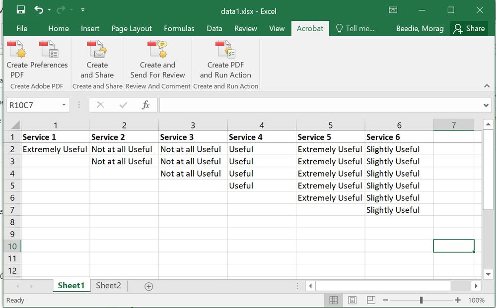
My data is as follows (i have simplified)
I have tried the clustered graph, however:
- pull service 1 into Axis and value - this looks fine.
- When I try to pull service 2 into value the count changes - and the same when i pull in the rest (service 3-6). The count value doesnt show the right counts.
So confused! Do i need to format my data a different way?
- Mark as New
- Bookmark
- Subscribe
- Mute
- Subscribe to RSS Feed
- Permalink
- Report Inappropriate Content
"Do i need to format my data a different way?" Yes
| service | extremely satisfied | satisfied | dissatisfied | Extremely dissatisfied |
| Service 1 | 1 | 23 | 4 | 7 |
| Service 2 | 3 | 12 | 5 | 2 |
| service 3 | 1 | 4 | 5 | 7 |
Powerbi can manipulate data in all sorts of ways. However, make it easy on yourself, get the data in a format that means you can concentrate on easily making/designing/altering the visualisations. Don't get to the report page in powerbi with long lists of text values that need to be manipulated differently for different visualisations
Powerbi works best with aggregations.
That picture you posted can't be anything like your real data. Individual responses to each service are all the same and there's one more response in each column than the one before. If i'm wrong, i apologise.
Try and get your data in the format i've shown. If you can't then
post some masked data (not a picture of it), i'll put it in a pbix and send a link back to you
Helpful resources

Power BI Dataviz World Championships
The Power BI Data Visualization World Championships is back! Get ahead of the game and start preparing now!

| User | Count |
|---|---|
| 38 | |
| 36 | |
| 33 | |
| 31 | |
| 28 |
| User | Count |
|---|---|
| 129 | |
| 88 | |
| 79 | |
| 68 | |
| 63 |


