Fabric Data Days starts November 4th!
Advance your Data & AI career with 50 days of live learning, dataviz contests, hands-on challenges, study groups & certifications and more!
Get registered- Power BI forums
- Get Help with Power BI
- Desktop
- Service
- Report Server
- Power Query
- Mobile Apps
- Developer
- DAX Commands and Tips
- Custom Visuals Development Discussion
- Health and Life Sciences
- Power BI Spanish forums
- Translated Spanish Desktop
- Training and Consulting
- Instructor Led Training
- Dashboard in a Day for Women, by Women
- Galleries
- Data Stories Gallery
- Themes Gallery
- Contests Gallery
- Quick Measures Gallery
- Visual Calculations Gallery
- Notebook Gallery
- Translytical Task Flow Gallery
- TMDL Gallery
- R Script Showcase
- Webinars and Video Gallery
- Ideas
- Custom Visuals Ideas (read-only)
- Issues
- Issues
- Events
- Upcoming Events
Get Fabric Certified for FREE during Fabric Data Days. Don't miss your chance! Learn more
- Power BI forums
- Forums
- Get Help with Power BI
- Desktop
- Show timestamp values but grouping in x axis
- Subscribe to RSS Feed
- Mark Topic as New
- Mark Topic as Read
- Float this Topic for Current User
- Bookmark
- Subscribe
- Printer Friendly Page
- Mark as New
- Bookmark
- Subscribe
- Mute
- Subscribe to RSS Feed
- Permalink
- Report Inappropriate Content
Show timestamp values but grouping in x axis
Hi everyone,
I'm newbie on PBI and I want to create a chart which I have already have on excel.
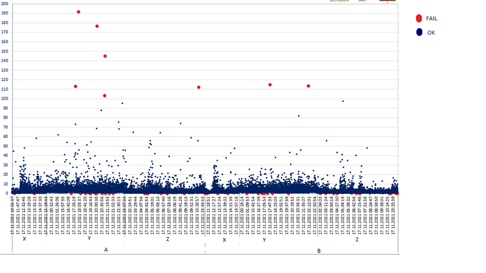
I have a dataset with timestamp values. The timestamp values are so frequent I want to show them all on one view, but I couldn't do that. As far as I know I need to group timestamp on x axis but I need to show all labels on scatter chart.
My dataset looks like;
| DateTime | DIM1 | DIM2 | DIM3 | Measure |
| 11/28/2021 0:00 | A | X | FAIL | 55.98 |
| 11/28/2021 0:01 | A | X | OK | 10.28 |
| 11/28/2021 0:02 | A | X | OK | 11.86 |
| 11/28/2021 0:03 | A | Y | FAIL | 27.93 |
| 11/28/2021 0:04 | A | Y | OK | 16.52 |
| 11/28/2021 0:05 | B | Z | OK | 28.18 |
| 11/28/2021 0:06 | B | Z | FAIL | 53.45 |
| 11/28/2021 0:07 | B | Z | OK | 67.48 |
| 11/28/2021 0:08 | B | T | OK | 63.27 |
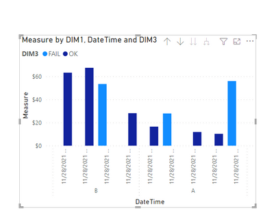
The view which It need to be looks like.
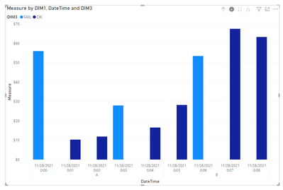
I tried to group timestamp values like 30-40 minutes interval but when I do that I couldn't show all values on the chart. It always needs aggregation. I don't want to aggregate my measure. I need them separetly.
You can find the all dataset and pbix file on this drive link.
- Mark as New
- Bookmark
- Subscribe
- Mute
- Subscribe to RSS Feed
- Permalink
- Report Inappropriate Content
Hi @Anonymous ,
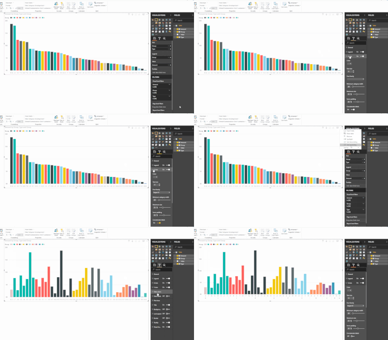
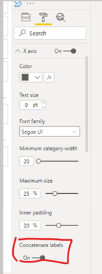
You need to setting 'sort by' x axis fields before turn off this option, then label will been expanded to multiple rows.
Operation steps:
Fianl outpur result:
Refer: https://community.powerbi.com/t5/Desktop/concatenate-Labels-does-not-work-properly/td-p/415010
https://www.youtube.com/watch?v=pUoW2gAK0Xo
And you also could try like below:
Step1,create hierachy.
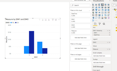
Step 2, create visual:
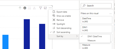
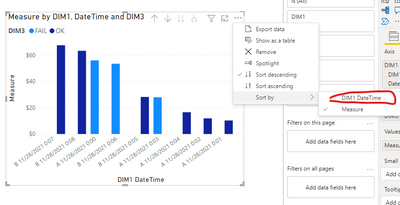
Step3,click as the below,and short by x column:
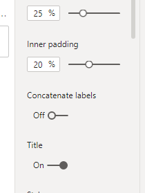
Step 4, close concatenate labels:
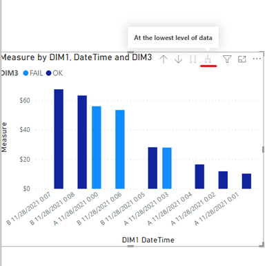
Final output:
Did I answer your question? Mark my post as a solution!
Best Regards
Lucien
- Mark as New
- Bookmark
- Subscribe
- Mute
- Subscribe to RSS Feed
- Permalink
- Report Inappropriate Content
It isn't working for scatter chart.
I have still 2 problem for scatter chart
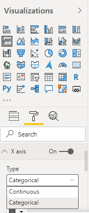
1- Continuous X axis
2- Don't Concatenate Label for X axis.
- Mark as New
- Bookmark
- Subscribe
- Mute
- Subscribe to RSS Feed
- Permalink
- Report Inappropriate Content
I need help about that. Could anyone give idea ?
- Mark as New
- Bookmark
- Subscribe
- Mute
- Subscribe to RSS Feed
- Permalink
- Report Inappropriate Content
@Anonymous , You need have DateTime on X axis as categorical . In all other option it will group data .
Scatter visual , In that if you want use some time bucket then you can use datetime as details
- Mark as New
- Bookmark
- Subscribe
- Mute
- Subscribe to RSS Feed
- Permalink
- Report Inappropriate Content
Hi @amitchandak ,
Thank you for your answer but It doesn't work for me.
I think It was about 2 reason.
1- When you have more than 1 dimension in x axis, continuous option is not working.
2- It still not working even you have only 1 dimension(timestamp) on scatter chart.
I need x axis like that,
But It always shows like that.
Helpful resources

Fabric Data Days
Advance your Data & AI career with 50 days of live learning, contests, hands-on challenges, study groups & certifications and more!

Power BI Monthly Update - October 2025
Check out the October 2025 Power BI update to learn about new features.

| User | Count |
|---|---|
| 84 | |
| 49 | |
| 36 | |
| 31 | |
| 30 |
