Join us at FabCon Vienna from September 15-18, 2025
The ultimate Fabric, Power BI, SQL, and AI community-led learning event. Save €200 with code FABCOMM.
Get registered- Power BI forums
- Get Help with Power BI
- Desktop
- Service
- Report Server
- Power Query
- Mobile Apps
- Developer
- DAX Commands and Tips
- Custom Visuals Development Discussion
- Health and Life Sciences
- Power BI Spanish forums
- Translated Spanish Desktop
- Training and Consulting
- Instructor Led Training
- Dashboard in a Day for Women, by Women
- Galleries
- Data Stories Gallery
- Themes Gallery
- Contests Gallery
- Quick Measures Gallery
- Notebook Gallery
- Translytical Task Flow Gallery
- TMDL Gallery
- R Script Showcase
- Webinars and Video Gallery
- Ideas
- Custom Visuals Ideas (read-only)
- Issues
- Issues
- Events
- Upcoming Events
Enhance your career with this limited time 50% discount on Fabric and Power BI exams. Ends August 31st. Request your voucher.
- Power BI forums
- Forums
- Get Help with Power BI
- Desktop
- Show points/line in a line chart only for a certai...
- Subscribe to RSS Feed
- Mark Topic as New
- Mark Topic as Read
- Float this Topic for Current User
- Bookmark
- Subscribe
- Printer Friendly Page
- Mark as New
- Bookmark
- Subscribe
- Mute
- Subscribe to RSS Feed
- Permalink
- Report Inappropriate Content
Show points/line in a line chart only for a certain time period
Hello,
I have two tables:
Table [Concentration]
Date / Nges
1.1 / 5
2.1 / 10
3.1 / 8
4.1 / 20
Table [Global]
GW Nges
10
So table Global only consists of one row as a limit value
So now I want to visualise the table Concentration over the time with a line chart and visualise the limit value GW Nges as well. Thats no problem, but I want to visualise the limit value "GW Nges" only for a certain perdiod in the year. From the 01.05 till 01.11.
But not only for one specific year, it should be transferable for every year. So when i visualise the years 2018 to 2021, the limit should be only visible within the certain time period.
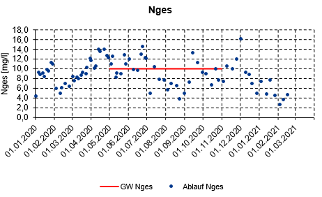
Id like to have something like that:
I think its possible with a DAX measure, but this need exceeds my skills. I appreciate any help.
Solved! Go to Solution.
- Mark as New
- Bookmark
- Subscribe
- Mute
- Subscribe to RSS Feed
- Permalink
- Report Inappropriate Content
Hi @Clout ,
You can just set the limitations for the month and days in the measure:
Gw Nges =
VAR _date =
    SELECTEDVALUE ( Concentration[Date] )
RETURN
    IF (
        MONTH ( _date ) = 1
            && DAY ( _date ) >= 5
            && DAY ( _date ) <= 11,
        SUM ( 'Global'[GW Nges] )
    )
Use a Line chart and change some settings for it to show the result.
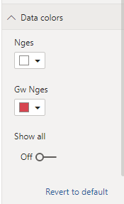
Adjust data color in Data colors tab:
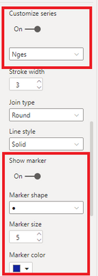
Under Shapes tab:
Result:
Attached a sample file in the below, hopes it could help.
Best Regards,
Community Support Team _ Yingjie Li
If this post helps, then please consider Accept it as the solution to help the other members find it more quickly.
- Mark as New
- Bookmark
- Subscribe
- Mute
- Subscribe to RSS Feed
- Permalink
- Report Inappropriate Content
- Mark as New
- Bookmark
- Subscribe
- Mute
- Subscribe to RSS Feed
- Permalink
- Report Inappropriate Content
Hello @amitchandak
thank you, this works for the year 2020. But is it possible to doesn't exclude the other years? So is it possible to dont set a specific year and visualise the limit for the year 2019, 2021 and in the future for 2022, 2023 etc. too?
- Mark as New
- Bookmark
- Subscribe
- Mute
- Subscribe to RSS Feed
- Permalink
- Report Inappropriate Content
Hi @Clout ,
You can just set the limitations for the month and days in the measure:
Gw Nges =
VAR _date =
    SELECTEDVALUE ( Concentration[Date] )
RETURN
    IF (
        MONTH ( _date ) = 1
            && DAY ( _date ) >= 5
            && DAY ( _date ) <= 11,
        SUM ( 'Global'[GW Nges] )
    )
Use a Line chart and change some settings for it to show the result.
Adjust data color in Data colors tab:
Under Shapes tab:
Result:
Attached a sample file in the below, hopes it could help.
Best Regards,
Community Support Team _ Yingjie Li
If this post helps, then please consider Accept it as the solution to help the other members find it more quickly.
- Mark as New
- Bookmark
- Subscribe
- Mute
- Subscribe to RSS Feed
- Permalink
- Report Inappropriate Content
Hello @v-yingjl
thank your for your suggestion, it helped me very much to get on the solution!
My data format is DD/MM/YYYY, and your suggestion holds only the 1th Month and the the 5th and 11th Day. (I think there was a little misunterstanding between the different data formats, I should hint at it). But I wanted the limit to be visible for the beginning of the 5th Month till the 11th Month.
So my solution looks now like this:
Helpful resources
| User | Count |
|---|---|
| 74 | |
| 70 | |
| 39 | |
| 30 | |
| 28 |
| User | Count |
|---|---|
| 104 | |
| 95 | |
| 51 | |
| 48 | |
| 46 |


