Join us at FabCon Vienna from September 15-18, 2025
The ultimate Fabric, Power BI, SQL, and AI community-led learning event. Save €200 with code FABCOMM.
Get registered- Power BI forums
- Get Help with Power BI
- Desktop
- Service
- Report Server
- Power Query
- Mobile Apps
- Developer
- DAX Commands and Tips
- Custom Visuals Development Discussion
- Health and Life Sciences
- Power BI Spanish forums
- Translated Spanish Desktop
- Training and Consulting
- Instructor Led Training
- Dashboard in a Day for Women, by Women
- Galleries
- Data Stories Gallery
- Themes Gallery
- Contests Gallery
- Quick Measures Gallery
- Notebook Gallery
- Translytical Task Flow Gallery
- TMDL Gallery
- R Script Showcase
- Webinars and Video Gallery
- Ideas
- Custom Visuals Ideas (read-only)
- Issues
- Issues
- Events
- Upcoming Events
Compete to become Power BI Data Viz World Champion! First round ends August 18th. Get started.
- Power BI forums
- Forums
- Get Help with Power BI
- Desktop
- Show multiple series from different tables in same...
- Subscribe to RSS Feed
- Mark Topic as New
- Mark Topic as Read
- Float this Topic for Current User
- Bookmark
- Subscribe
- Printer Friendly Page
- Mark as New
- Bookmark
- Subscribe
- Mute
- Subscribe to RSS Feed
- Permalink
- Report Inappropriate Content
Show multiple series from different tables in same line chart
I have several data sets, all of which have the same column layout:
- Property Name
- 2015 Cost (£)
- 2016 Cost (£)
- 2017 Cost (£)
- 2018 Cost (£)
Each data set represents a different kind of cost. One data set is 'rent', another is 'security costs', etc. But, they're all financial and have the same column layout.
I want to create a line chart that shows each of these costs as different series. I am able to do this for each data set individually by unpivoting the columns. But when I place more than one value into the line chart (from another data set), it simply puts a line through the chart that isn't correct for the data.
Any help would be much appreciated,
Thanks
Solved! Go to Solution.
- Mark as New
- Bookmark
- Subscribe
- Mute
- Subscribe to RSS Feed
- Permalink
- Report Inappropriate Content
@shaunguyverYou could add a new column to each of your facts(sheets) which tells the category(i.e. Rent etc) and then union all the facts into 1 table. When you are drawing the line chart after this you can add the category in the legend field.
- Mark as New
- Bookmark
- Subscribe
- Mute
- Subscribe to RSS Feed
- Permalink
- Report Inappropriate Content
- Mark as New
- Bookmark
- Subscribe
- Mute
- Subscribe to RSS Feed
- Permalink
- Report Inappropriate Content
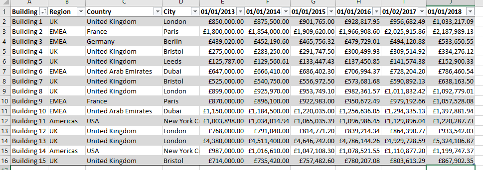
Thanks for your quick reply - the first screenshot is an example of the Excel data my data sets are feeding from. The second screenshot is the data set in query editor once it has been un-pivoted so that I can create line charts.
- Mark as New
- Bookmark
- Subscribe
- Mute
- Subscribe to RSS Feed
- Permalink
- Report Inappropriate Content
@shaunguyverYou could add a new column to each of your facts(sheets) which tells the category(i.e. Rent etc) and then union all the facts into 1 table. When you are drawing the line chart after this you can add the category in the legend field.


