Huge last-minute discounts for FabCon Vienna from September 15-18, 2025
Supplies are limited. Contact info@espc.tech right away to save your spot before the conference sells out.
Get your discount- Power BI forums
- Get Help with Power BI
- Desktop
- Service
- Report Server
- Power Query
- Mobile Apps
- Developer
- DAX Commands and Tips
- Custom Visuals Development Discussion
- Health and Life Sciences
- Power BI Spanish forums
- Translated Spanish Desktop
- Training and Consulting
- Instructor Led Training
- Dashboard in a Day for Women, by Women
- Galleries
- Data Stories Gallery
- Themes Gallery
- Contests Gallery
- Quick Measures Gallery
- Notebook Gallery
- Translytical Task Flow Gallery
- TMDL Gallery
- R Script Showcase
- Webinars and Video Gallery
- Ideas
- Custom Visuals Ideas (read-only)
- Issues
- Issues
- Events
- Upcoming Events
Score big with last-minute savings on the final tickets to FabCon Vienna. Secure your discount
- Power BI forums
- Forums
- Get Help with Power BI
- Desktop
- Show last 13 months based on user single slicer se...
- Subscribe to RSS Feed
- Mark Topic as New
- Mark Topic as Read
- Float this Topic for Current User
- Bookmark
- Subscribe
- Printer Friendly Page
- Mark as New
- Bookmark
- Subscribe
- Mute
- Subscribe to RSS Feed
- Permalink
- Report Inappropriate Content
Show last 13 months based on user single slicer selection
Hi all,
I am building a rolling 13 month net revenue chart and I've came across a requirement to show the last 13 month in x axis based in what month (YYYYMM) the user selected in a YYYYMM slicer.
The chart below is the one I want:
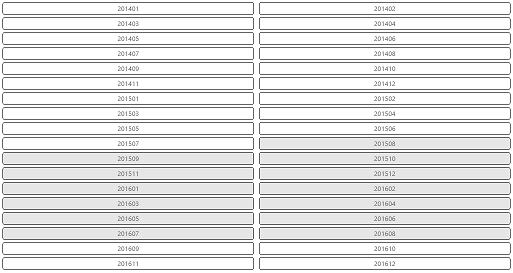
In order to get the intended behaviour, currently I need to select each one of the 13 month in YYYYMM slicer:
Any ideas on how I can get this to work in Power BI so that the user just have to select the base month?
Thanks in advance,
Cristhian.
Solved! Go to Solution.
- Mark as New
- Bookmark
- Subscribe
- Mute
- Subscribe to RSS Feed
- Permalink
- Report Inappropriate Content
Hi again 🙂
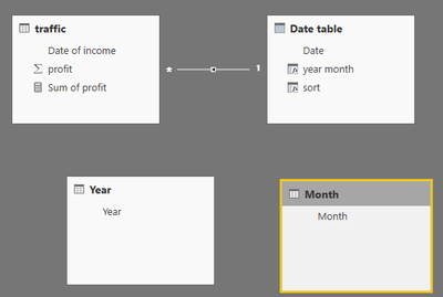
I understand now, and I tried second approach. I created two tables, which are not related to any of tables. One is Year, with one column (values: 2010, 2011, 2012... 2016). Another is Month, with one column (values: 1,2,3...12).
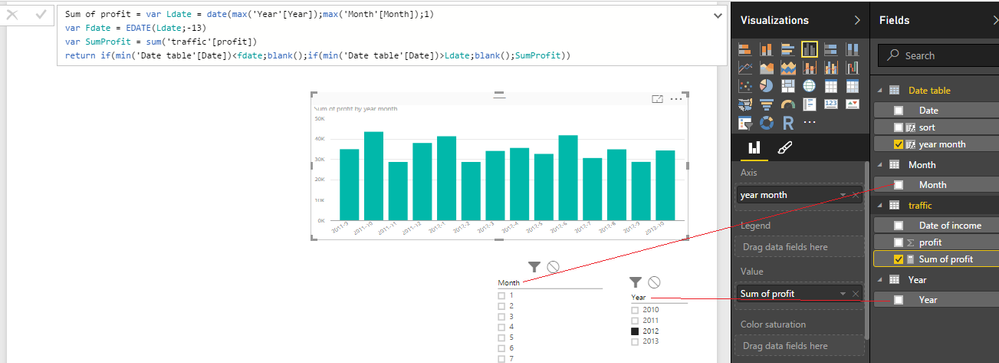
Then I created this measure:
Sum of profit =
var Ldate = date(max('Year'[Year]);max('Month'[Month]);1) //Last date

var Fdate = EDATE(Ldate;-13) //First date

var SumProfit = sum('traffic'[profit]) //Calculation

return

 if(min('Date table'[Date])<fdate;
         blank();
         if(min('Date table'[Date])>Ldate;
                   blank();
                   SumProfit))
On x axis I added all months and years (2010-1, 2010-2 .... 2016-12) and in value I added measure.
Show items with no data must be unchecked.
- Mark as New
- Bookmark
- Subscribe
- Mute
- Subscribe to RSS Feed
- Permalink
- Report Inappropriate Content
Hi @cneumann
Create Measure
#Last 13 Month =
VAR MaxDate = MAX('Data'[Date])
VAR MaxDate_12MonthAgo = EOMONTH(MaxDate, -12 )
VAR Result =
IF(
HASONEVALUE(Data[Year-Month]) &&
MAX('Data'[Date]) <= MaxDate &&
MIN('Data'[Date]) > MaxDate_12MonthAgo,
CALCULATE(
[Total sales],
FILTER((ALL(Data[Month],'Data'[year],'Data'[YYYYMM]),
'Data'[Calendar]= VALUE('Data'[Calendar]) &&
'Data'[Year1]= VALUE('Data'[Year1]))
),
BLANK()
))
If your requirement is solved, please make THIS ANSWER a SOLUTION ✔️ and help other users find the solution quickly. Please hit the LIKE 👍 button if this comment helps you.
- Mark as New
- Bookmark
- Subscribe
- Mute
- Subscribe to RSS Feed
- Permalink
- Report Inappropriate Content
Hi @cneumann
I had a similar challenge today and although you've already gotten an answer for this and it has been well accepted, it didn't really seem to work for me and my requirements; I'm not exactly sure why but the syntax just wasn't accepted my end, it didn't like referencing the Ldate in the next var amongst other issues and, even if I could have debugged it and gotten it to work, I was hoping for a slightly more elegant solution that didn't involve creating tables and hard-coding my existing measures.
So, I had to muddle through (I'm still really new, only started learning PowerBI and DAX in the last month) and have spent all day on a solution that works for me and I wanted to share it in case anyone else might find it useful for solving this problem. It's a single Measure that can be used against any date field:
Within13MonthRange_Date = IF (
    DATEDIFF(
        MAX('Table'[Date]),
	    CALCULATE(
		    MAX('Table'[Date]),
		    ALLSELECTED()),
        MONTH) <= 13,
    1,
    0)
This returns 1 or 0.
Replace 'Table'[Date] with whatever date you are slicing on (in your case whatever date is on your revenue table) and it'll return 1 whenever the data in the visual has a date filter context within 13 months of the maximum date you've selected on your slicer OR, if you've not selected anything, the maximum 13 months of your entire data set.
You then filter your visual on the measure: is 1 and is not 0.
I used this specifically to limit tooltip visuals dynamically to the most recent 12-13 months' data, depending on slicers affecting the page; without this, when you have nothing sliced, the tooltip visual (for example with bar charts with months along the X axis) can show too much data and will be cropped to the first 12-13 months of data, which isn't useful. Using the above measure applied as a filter to the tooltip visual, the visual always represents the last 12-13 months data up until the maximum date sliced, so always shows relevant data dynamically. You can change it to whatever you like (days, months, years and any value) all within a single DAX expression.
The result is I went from this:
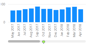
To this:
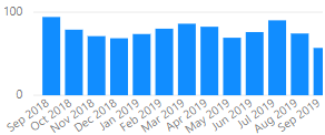
Hope this helps anyone.
- Mark as New
- Bookmark
- Subscribe
- Mute
- Subscribe to RSS Feed
- Permalink
- Report Inappropriate Content
Hello @Ydiss
I've been using BI for about two weeks, so bare with me. Could you explain how I can put this slicer to work. It's just what I need for my report but I can't figure out is how to implement it.
Thanks in advance
- Mark as New
- Bookmark
- Subscribe
- Mute
- Subscribe to RSS Feed
- Permalink
- Report Inappropriate Content
My problem Is how to fix the selector from a period slicer ( example Year-Month) on each row changes, REgards.
- Mark as New
- Bookmark
- Subscribe
- Mute
- Subscribe to RSS Feed
- Permalink
- Report Inappropriate Content
Hey,
if i understand your question right, here is one idea with dax function:
Measure = var LastDate = max(datetable[date])
var FirstDate = date(year(edate(LastDate;-13));month(edate(LastDate;-13));1)
return calculate(yourcalculation;datesbetween(datetable[date];FirstDate;LastDate))
Something like this. Let me know if this helps you.
- Mark as New
- Bookmark
- Subscribe
- Mute
- Subscribe to RSS Feed
- Permalink
- Report Inappropriate Content
Hi matemusic,
I tried your approach but it didn't solve my problem.
My measure is already correct, it gives me the rolling 12 month sum based on the X axis month.
The point here is that I have to restrict the Date table to show only the 13 months before the selected month. I think that writing a measure for this won't help since I cannot put a measure in the X axis.
I've tried the follwing based on your reply:
Last13Months =
VAR
	LDATE = MAX ( 'msc DimDate'[Date] )
VAR
	FDATE = DATE ( YEAR ( EDATE ( [LastDate]; -13 ) ); MONTH ( EDATE ( [LastDate] ; -13 ) ); 1 )
RETURN
	DATESBETWEEN ( 'msc DimDate'[Date]; FDATE; LDATE )
Note that I removed the CALCULATE function since I don't have to calculate a total based on a filter, what I need is to calculte the last 13 months to put this in the X axis.
- Mark as New
- Bookmark
- Subscribe
- Mute
- Subscribe to RSS Feed
- Permalink
- Report Inappropriate Content
where does the [Lastdate] comes from?
- Mark as New
- Bookmark
- Subscribe
- Mute
- Subscribe to RSS Feed
- Permalink
- Report Inappropriate Content
What is the Year Month calculation?
- Mark as New
- Bookmark
- Subscribe
- Mute
- Subscribe to RSS Feed
- Permalink
- Report Inappropriate Content
Hi again 🙂
I understand now, and I tried second approach. I created two tables, which are not related to any of tables. One is Year, with one column (values: 2010, 2011, 2012... 2016). Another is Month, with one column (values: 1,2,3...12).
Then I created this measure:
Sum of profit =
var Ldate = date(max('Year'[Year]);max('Month'[Month]);1) //Last date

var Fdate = EDATE(Ldate;-13) //First date

var SumProfit = sum('traffic'[profit]) //Calculation

return

 if(min('Date table'[Date])<fdate;
         blank();
         if(min('Date table'[Date])>Ldate;
                   blank();
                   SumProfit))
On x axis I added all months and years (2010-1, 2010-2 .... 2016-12) and in value I added measure.
Show items with no data must be unchecked.
- Mark as New
- Bookmark
- Subscribe
- Mute
- Subscribe to RSS Feed
- Permalink
- Report Inappropriate Content
This was a great solution, I had a slightly different measure for distinct count, but overall a perfect fit for what I was lookng to do.
- Mark as New
- Bookmark
- Subscribe
- Mute
- Subscribe to RSS Feed
- Permalink
- Report Inappropriate Content
Hey, do you know if there is a way to do this with just ONE slicer?
I am doing something similar though I am only using one slicer to show MMM YY so want to see if it can do the same thing
- Mark as New
- Bookmark
- Subscribe
- Mute
- Subscribe to RSS Feed
- Permalink
- Report Inappropriate Content
Hi @matemusic ,
just wanted to let you know that your solution helped me to achieve the requirement of my end user.
Kudos to you!!
- Mark as New
- Bookmark
- Subscribe
- Mute
- Subscribe to RSS Feed
- Permalink
- Report Inappropriate Content
Hello,
I found this very helpful. now can you please help me how to show the selected month value in card visual.(without connecting year table and date table)? i use yyyymmm slicer... am using year and month from one table itself
- Mark as New
- Bookmark
- Subscribe
- Mute
- Subscribe to RSS Feed
- Permalink
- Report Inappropriate Content
Hey @matemusic
You have really an excellent solution.
I need to have 2 tables:
1. First table: Should show exactly what you created (it works).
2. Second table: If month selected then it should only show that month. If month is not selected then it should show all dates for that year.
Sum of profit (month) =
var Ldate = date(max('Year'[Year]);max('Month'[Month]);1) //Last date

var Fdate = EDATE(Ldate;0) //First date

var SumProfit = sum(traffic[Amount]) //Calculation

return

 IF(HASONEVALUE('Month'[Month]);
     if(min('Date table'[Date])<fdate;
         blank();
         if(min('Date table'[Date])>Ldate;
                   blank();
                   SumProfit));
                   [profit])
I get right with the month part, but I cannot find out how I can find out the year part. Do you have any ideas?
Here is the file
- Mark as New
- Bookmark
- Subscribe
- Mute
- Subscribe to RSS Feed
- Permalink
- Report Inappropriate Content
Hi, maybe this will help. I added new coumn Year in the calendar table. Bold blue text in the code represent new code
Sum of profit (month) =
var Ldate = date(max('Year'[Year]);max('Month'[Month]);1) //Last date

var Fdate = EDATE(Ldate;0) //First date
VAR SYear = CALCULATE(max('Year'[Year]);ALLSELECTED()) -- it can be without calculate and allselected, i am just used to work in that way
VAR SumProfitYear = CALCULATE([profit];'Date table'[Year]=SYear)
var SumProfit = sum(traffic[Amount]) //Calculation
return
 IF(HASONEVALUE('Month'[Month]);
     if(min('Date table'[Date])<fdate;
         blank();
         if(min('Date table'[Date])>Ldate;
                   blank();
                   SumProfit));
                   SumProfitYear)
- Mark as New
- Bookmark
- Subscribe
- Mute
- Subscribe to RSS Feed
- Permalink
- Report Inappropriate Content
Thanks for the solution!
I tried to apply your solution, but with 1 slicer that has the Month+Year combined. It did not work for some reason.
I still got it working tough by creating 2 tables
Table1:
Month - "01"
Year - "2017"
MonthYear - "201701"
Table2:
Month - "01"
Now I can use the YearMonth column in my slicer and your solutions still does the rest 🙂
- Mark as New
- Bookmark
- Subscribe
- Mute
- Subscribe to RSS Feed
- Permalink
- Report Inappropriate Content
- Mark as New
- Bookmark
- Subscribe
- Mute
- Subscribe to RSS Feed
- Permalink
- Report Inappropriate Content
Hi @matemusic
Excellent solution.
Cheers
CheenuSing
Proud to be a Datanaut!
- Mark as New
- Bookmark
- Subscribe
- Mute
- Subscribe to RSS Feed
- Permalink
- Report Inappropriate Content
Hi There,
You can use timeline visuals slicer for your specific requirement.
This is can be downloaded at
https://app.powerbi.com/visuals/
This video blog by amir netz will give you more information on how to leverage that visual for your specific requirement.
https://powerbi.microsoft.com/en-us/blog/visual-awesomeness-unlocked-the-timeline-slicer/
Thanks & Regards,
Bhavesh
Bhavesh
Love the Self Service BI.
Please use the 'Mark as answer' link to mark a post that answers your question. If you find a reply helpful, please remember to give Kudos.
- Mark as New
- Bookmark
- Subscribe
- Mute
- Subscribe to RSS Feed
- Permalink
- Report Inappropriate Content
Hi Bhavesh,
I have already seen this custom visual but it "visually" doesn't fit very well in the reports, since it occupy too much space in the report view.
Also, it does not fully cover the requirements since it is necessary to select the range, not just select the base month and the visual slices the base month plus the last 12 months.
In the PowerBI Ideas forum, there is a post requesting better date range filters, which I expect to make timeslicer visual more applicable.
Thank you for your response,
Cristhian.

