- Subscribe to RSS Feed
- Mark Topic as New
- Mark Topic as Read
- Float this Topic for Current User
- Bookmark
- Subscribe
- Printer Friendly Page
- Mark as New
- Bookmark
- Subscribe
- Mute
- Subscribe to RSS Feed
- Permalink
- Report Inappropriate Content
Show all scale division marks in graph
Hi, everyone!
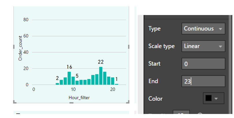
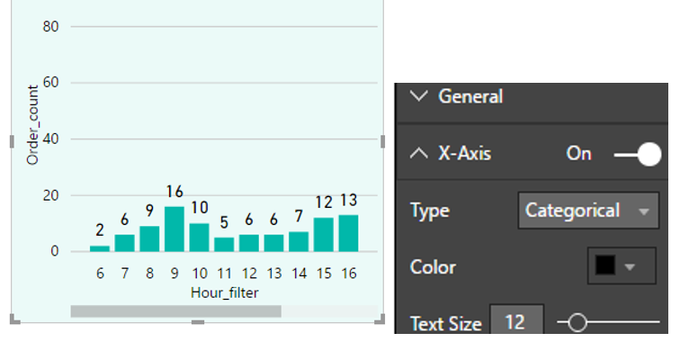
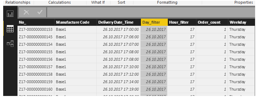
I am trying to show average count of ‘orders’ through ‘hours’ axis, which has all 24 hours at one graph. However, some of the ‘hours’ is not exist, so, graph does not show all 24 hours on X-axe. I tried make ‘Continuous’ type of X-axe, but result is (screenshot 1). I am trying to catch (screenshot 2) with one addition, that I want see all 24 hours on scale division. Any solutions? Also, I am attaching screenshot 3 with dataset, may be that will help


Thank you,
Regards.
Solved! Go to Solution.
- Mark as New
- Bookmark
- Subscribe
- Mute
- Subscribe to RSS Feed
- Permalink
- Report Inappropriate Content
yes it can be achieved, you need following:
- an hour dimension table with field hour with 24 records for each hour and connect to your data table on hour
- drop hour from your hour dimension on x axixs and with down arrow on next to hour field on x axis, choose show with no data.
i guess this will do it.
Subscribe to the @PowerBIHowTo YT channel for an upcoming video on List and Record functions in Power Query!!
Learn Power BI and Fabric - subscribe to our YT channel - Click here: @PowerBIHowTo
If my solution proved useful, I'd be delighted to receive Kudos. When you put effort into asking a question, it's equally thoughtful to acknowledge and give Kudos to the individual who helped you solve the problem. It's a small gesture that shows appreciation and encouragement! ❤
Did I answer your question? Mark my post as a solution. Proud to be a Super User! Appreciate your Kudos 🙂
Feel free to email me with any of your BI needs.
- Mark as New
- Bookmark
- Subscribe
- Mute
- Subscribe to RSS Feed
- Permalink
- Report Inappropriate Content
Thanks a lot! Did not think about making key table, will use further
Helpful resources

Join us at the Microsoft Fabric Community Conference
March 31 - April 2, 2025, in Las Vegas, Nevada. Use code MSCUST for a $150 discount!

Power BI Monthly Update - February 2025
Check out the February 2025 Power BI update to learn about new features.

| Subject | Author | Posted | |
|---|---|---|---|
| 09-04-2024 11:11 PM | |||
| 07-31-2024 09:28 AM | |||
| 05-13-2024 05:27 AM | |||
| 09-17-2024 06:33 AM | |||
| 07-22-2024 09:39 PM |
| User | Count |
|---|---|
| 87 | |
| 81 | |
| 53 | |
| 38 | |
| 35 |
