FabCon is coming to Atlanta
Join us at FabCon Atlanta from March 16 - 20, 2026, for the ultimate Fabric, Power BI, AI and SQL community-led event. Save $200 with code FABCOMM.
Register now!- Power BI forums
- Get Help with Power BI
- Desktop
- Service
- Report Server
- Power Query
- Mobile Apps
- Developer
- DAX Commands and Tips
- Custom Visuals Development Discussion
- Health and Life Sciences
- Power BI Spanish forums
- Translated Spanish Desktop
- Training and Consulting
- Instructor Led Training
- Dashboard in a Day for Women, by Women
- Galleries
- Data Stories Gallery
- Themes Gallery
- Contests Gallery
- Quick Measures Gallery
- Notebook Gallery
- Translytical Task Flow Gallery
- TMDL Gallery
- R Script Showcase
- Webinars and Video Gallery
- Ideas
- Custom Visuals Ideas (read-only)
- Issues
- Issues
- Events
- Upcoming Events
To celebrate FabCon Vienna, we are offering 50% off select exams. Ends October 3rd. Request your discount now.
- Power BI forums
- Forums
- Get Help with Power BI
- Desktop
- Show Total in Stacked Column Chart with legend
- Subscribe to RSS Feed
- Mark Topic as New
- Mark Topic as Read
- Float this Topic for Current User
- Bookmark
- Subscribe
- Printer Friendly Page
- Mark as New
- Bookmark
- Subscribe
- Mute
- Subscribe to RSS Feed
- Permalink
- Report Inappropriate Content
Show Total in Stacked Column Chart with legend
Hi Community
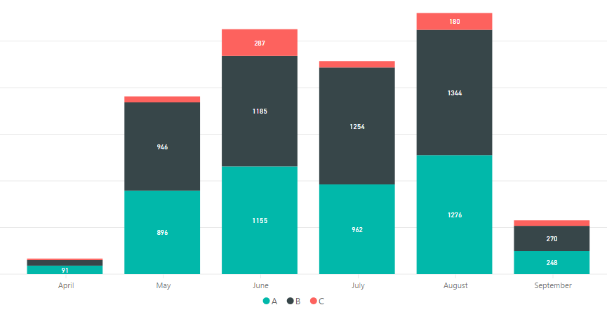
I have a stacked column chart showing the number of docs checked by month, separated in categories A, B and C.
I get each individual value, but I also need the graphic to show the total (A + B + C) for each month (on top of each column).
Is this possible?
Solved! Go to Solution.
- Mark as New
- Bookmark
- Subscribe
- Mute
- Subscribe to RSS Feed
- Permalink
- Report Inappropriate Content
@ADC,
Create another three measures in your table, and create Stacked Column chart as shown in the screenshot below.
A = CALCULATE(SUM(Table[docs number]),FILTER(Table,Table[Category]="A"))
B = CALCULATE(SUM(Table[docs number]),FILTER(Table,Table[Category]="B"))
C = CALCULATE(SUM(Table[docs number]),FILTER(Table,Table[Category]="C"))
Regards,
Lydia
- Mark as New
- Bookmark
- Subscribe
- Mute
- Subscribe to RSS Feed
- Permalink
- Report Inappropriate Content
If you use a line and stacked column chart visual, then you can make the line be the total amount. Go to the formatting section for the visual and expand the Shapes section, then change the Stroke width to 0 so the line won't show. Next go to the Data labels section and turn on Customize series. Then you can change the color and font size of the total value so it is different than the other data labels.
- Mark as New
- Bookmark
- Subscribe
- Mute
- Subscribe to RSS Feed
- Permalink
- Report Inappropriate Content
If you go to the formatting for the bar chart with a line, expand the Shapes section, and change the Stroke width to 0, then the line doesn't show
- Mark as New
- Bookmark
- Subscribe
- Mute
- Subscribe to RSS Feed
- Permalink
- Report Inappropriate Content
@ADC,
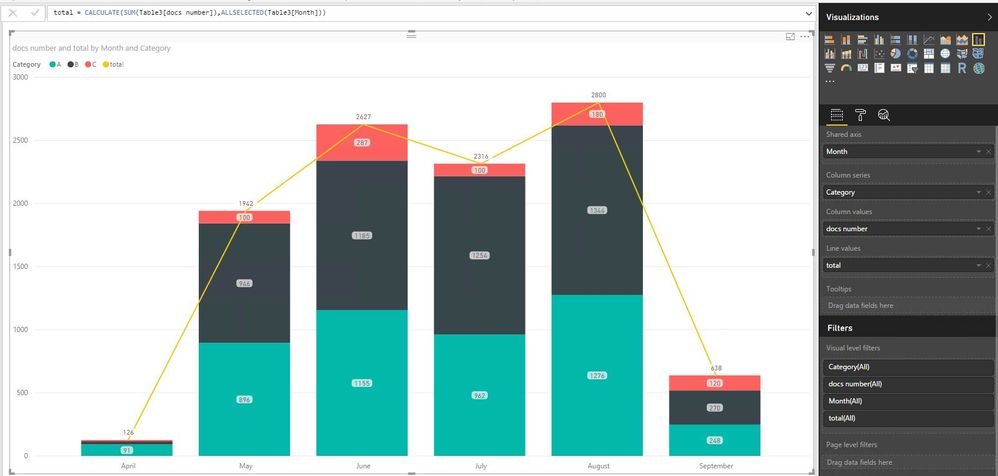
You can create a measure as follows to calculate the total docs number for each month.
total = CALCULATE(SUM(Table[docs number]),ALLSELECTED(Table[Month]))
However, in stacked column chart, when you drag field to Legend, it is not possible to drag more than one fields to Values. You can switch to use Line and stacked column chart and create the chart as shown in the following screenshot.
Regards,
Lydia
- Mark as New
- Bookmark
- Subscribe
- Mute
- Subscribe to RSS Feed
- Permalink
- Report Inappropriate Content
Lydia,
Thanks a lot for your answer.
It is a nice workaround and I get the total sum shown in the graphic that way.
However, I was wandering if the total sum of the categories can be shown in each column, on top of the column.
I need that very frequently and the Line sometimes generates confusion on the audience.
Any other way to handle it?
Thanks again.
Regards.
Alejandro
- Mark as New
- Bookmark
- Subscribe
- Mute
- Subscribe to RSS Feed
- Permalink
- Report Inappropriate Content
@ADC,
Create another three measures in your table, and create Stacked Column chart as shown in the screenshot below.
A = CALCULATE(SUM(Table[docs number]),FILTER(Table,Table[Category]="A"))
B = CALCULATE(SUM(Table[docs number]),FILTER(Table,Table[Category]="B"))
C = CALCULATE(SUM(Table[docs number]),FILTER(Table,Table[Category]="C"))
Regards,
Lydia
- Mark as New
- Bookmark
- Subscribe
- Mute
- Subscribe to RSS Feed
- Permalink
- Report Inappropriate Content
@Anonymous
This works if you only have a few values, but if you have hundreds of values this becomes tedious
- Mark as New
- Bookmark
- Subscribe
- Mute
- Subscribe to RSS Feed
- Permalink
- Report Inappropriate Content
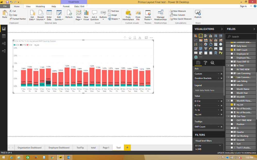
Filters are not working for indvidual category it select whole x axis as filter.
- Mark as New
- Bookmark
- Subscribe
- Mute
- Subscribe to RSS Feed
- Permalink
- Report Inappropriate Content
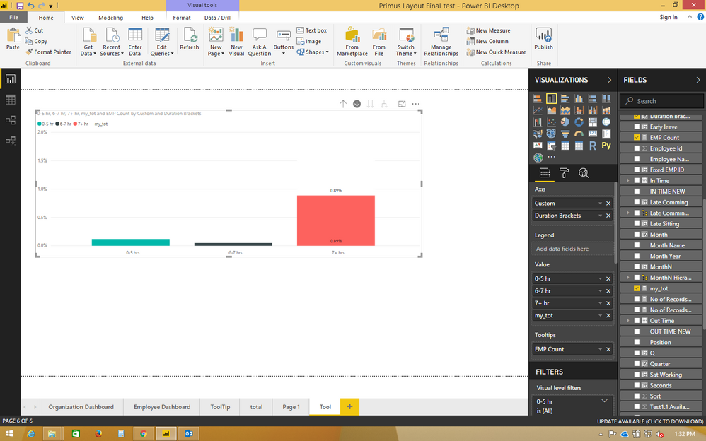
we can use drill down feature of power bi to filter seleted pane so we can filter that selected pane data.
for filter purpose use category of the given pane in axis field.


