- Subscribe to RSS Feed
- Mark Topic as New
- Mark Topic as Read
- Float this Topic for Current User
- Bookmark
- Subscribe
- Printer Friendly Page
- Mark as New
- Bookmark
- Subscribe
- Mute
- Subscribe to RSS Feed
- Permalink
- Report Inappropriate Content

Share your thoughts on the new format pane (preview)
Hit Reply to tell us what you think about the new format pane so we can continue to improve.
For example:
- What changes would you like to see?
- If you turned off the preview switch, why?
- Any suggestions for addititional settings or capabilities?
Thanks,
-Power BI team
To read more about the feature see the announcement in the Power BI Product Blog
- Mark as New
- Bookmark
- Subscribe
- Mute
- Subscribe to RSS Feed
- Permalink
- Report Inappropriate Content

I still experience the bug, where characters is missed because of typing too fast. There also is some sort of input delay, when e.g. pressing backspace on the keyboard.
Regarding the selection pane issue, is is what you are describing.
- Mark as New
- Bookmark
- Subscribe
- Mute
- Subscribe to RSS Feed
- Permalink
- Report Inappropriate Content

Great because I didnt know if this was a bug or was actually typing too fast and have had all manner of issues typing in titles on charts so good to know this is on your radar.
- Mark as New
- Bookmark
- Subscribe
- Mute
- Subscribe to RSS Feed
- Permalink
- Report Inappropriate Content

I'm really confused...
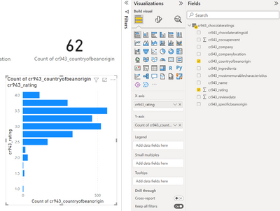
Using April 2020 Desktop, I go to put Country of Origin on Y-Axis (E.g. Australia, USA...), and a value (count of id or rating) on X-Axis, and they appear to graph the wrong way around!!
Did I answer your question? Mark my post as a solution!
Proud to be a Super User!
- Mark as New
- Bookmark
- Subscribe
- Mute
- Subscribe to RSS Feed
- Permalink
- Report Inappropriate Content

Thanks for reporting, this one is pretty severe. The axes should be flipped for bar charts, we're getting a fix in ASAP. Apologies this was not caught sooner. Thank you for using the new format pane and helping us improve.
- Mark as New
- Bookmark
- Subscribe
- Mute
- Subscribe to RSS Feed
- Permalink
- Report Inappropriate Content

Please do not depreciate the existing formatting pane. I have been using Power BI for over 5 years and it is frustrating to see Microsoft roll out inferior updates.
I've tested the new formatting pane for 6 weeks and was disappointed, it doesn't have all of the formatting capabilities as the existing format pane.
- Mark as New
- Bookmark
- Subscribe
- Mute
- Subscribe to RSS Feed
- Permalink
- Report Inappropriate Content

It would be helpful if the search box in the new formatting pane was a bit more robust. For example, I could not find the setting to change the decimal place in the values of my Table. I forgot the actual name in the old pane of 'Display Units' so I entered 'decimal' in the Search box and nothing was found. I know it is not a name match, but for those of us who haven't memorized all the setting names, it would be helpful to have an easier way to find it via some sort of mapping somewhere of old to new. Appreciate anything you can do so it won't take me so long to make updates and new Power BI reports with this change to the formatting pane.
- Mark as New
- Bookmark
- Subscribe
- Mute
- Subscribe to RSS Feed
- Permalink
- Report Inappropriate Content

Really hope there's an option to keep the old view. Do not like the new view whatsoever.
- Mark as New
- Bookmark
- Subscribe
- Mute
- Subscribe to RSS Feed
- Permalink
- Report Inappropriate Content

On the slicer visual, using the old format pane, I can turn off the Responsive toggle and the slider will have bars instead of circles. This fits with our reports much better, but I can't do this in the new format pane.
- Mark as New
- Bookmark
- Subscribe
- Mute
- Subscribe to RSS Feed
- Permalink
- Report Inappropriate Content

Happy to report this has been fixed for the upcoming April release.
- Mark as New
- Bookmark
- Subscribe
- Mute
- Subscribe to RSS Feed
- Permalink
- Report Inappropriate Content

In Matrix visual you cannot change the Subtotal labels. If you have multiple sub totals they all are all labeled "Total". Went back to the original format pane to chnage labels. I am using Desktop March 2022.
- Mark as New
- Bookmark
- Subscribe
- Mute
- Subscribe to RSS Feed
- Permalink
- Report Inappropriate Content

Thank you for this feedback. Are you referring to row subtotals or column subtotals? The old pane supported column subtotal labels per series, but for row subtotals, the old pane only supported the ability to toggle row subtotals per series hence the new pane should have parity. We did fix a cursor issue with column subtotal labels input, it appears as though you can't modify the label but when you start typing it should work. For April release, this cursor issue should be fixed. Let us know if you're still experiencing this issue.
- Mark as New
- Bookmark
- Subscribe
- Mute
- Subscribe to RSS Feed
- Permalink
- Report Inappropriate Content

I have just run into this issue myself with the Row Subtotal labels. It definitely needs to be fixed.
Thanks,
Scott
- Mark as New
- Bookmark
- Subscribe
- Mute
- Subscribe to RSS Feed
- Permalink
- Report Inappropriate Content

Fortunately, I was able to revert to the old format menu. Whew!
- Mark as New
- Bookmark
- Subscribe
- Mute
- Subscribe to RSS Feed
- Permalink
- Report Inappropriate Content

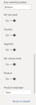
Just to add more clarity, the old and new pane both do not support row subtotal label renames by series, see how the input is missing here for the per row level, but is available for per column level:
You should be able to set the labels for both row and column subtotals for "all" series:
But I hear you, the new format pane makes this gap in functionality more obvious. I've added a feature request to get subtotal labels by series supported. Please let me know if this captures your ask here.
- Mark as New
- Bookmark
- Subscribe
- Mute
- Subscribe to RSS Feed
- Permalink
- Report Inappropriate Content

That sounds like it.
Thanks
Scott
- Mark as New
- Bookmark
- Subscribe
- Mute
- Subscribe to RSS Feed
- Permalink
- Report Inappropriate Content

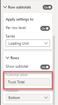
In the Matrix I am using Row Subtotals for some of the items added to the row section. As shown below the Row subtotals are on and one of the series I want to subtotal is on. But, the Subtotal label is greyed out and cannot be changed. I set the label shown by going back to the original format pane.
- Mark as New
- Bookmark
- Subscribe
- Mute
- Subscribe to RSS Feed
- Permalink
- Report Inappropriate Content

Hi,
What changes would you like to see?
I would like to see improved accessibility with the new format pane. At present, it is taking a lot of additional steps and clicking to do what used to take a small number of steps in the old pane.
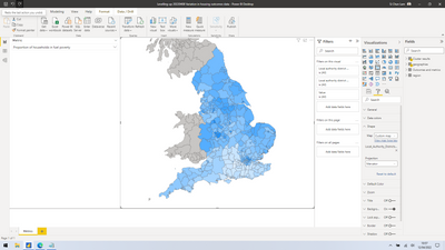
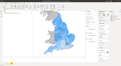
For example, on Shape Maps, if I were to add a custom map, I would:
Old pane: Format-->Shape-->Add Map-->choose topoJSON file (four steps)
New pane: Format your visual-->Visual-->Map settings-->Custom map-->Browse-->choose topoJSON (six steps)
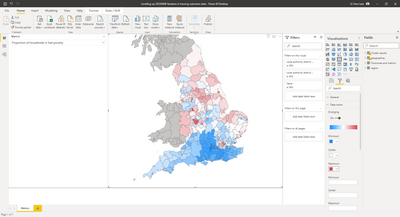
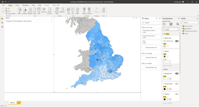
Ideally, what I would like to see improved is a format pane that reduces the number of clicks it takes to do things --- not increase it. I get that you're trying to reduce the number of scrollbars -- however, in my view, the split between "visual" and "general" does not make much sense, especially as now I have to search for options across two panes, rather than scroll down a single list. It is, however, much easier in my opinion to scroll down through one list, in one dimension, rather than have to go through a two dimensional spatial list to find things.
Visualised below:
If you turned off the preview switch, why?
Features previously available and essential to my workflow in the old pane are nowhere to be found in the new one.
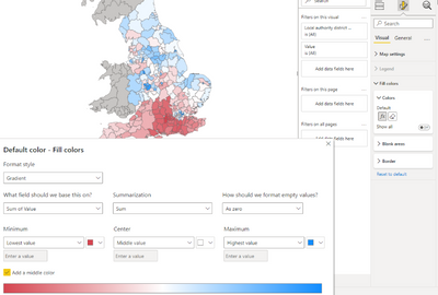
For instance, the old pane contained a Data Colours field allowing me to choose colours to illustrate the datapoints based on its values:
The new pane does not contain this option, so it is not possible to do so.
I understand that shape maps is indeed in "preview" -- but it has been in preview for the past three years, so has become part and parcel of our workflow ever since Google Fusion Tables stopped existing and we moved onto Microsoft Power BI instead.
Any suggestions for addititional settings or capabilities?
The new pane is not visually in line with the rest of Power BI. For instance, Power BI uses a yellow underline to illustrate what option is selected:
In contrast, the new pane introduces a new ^ indicator to show what option is being selected:
Some more consistency between the two would be appreciated.
Thank you for considering my comments!
- Mark as New
- Bookmark
- Subscribe
- Mute
- Subscribe to RSS Feed
- Permalink
- Report Inappropriate Content

Thank you for taking the time to submit this feedback!
- Understood. The added clicks has been a theme in this forum that we are planning to address with a new user preference setting allowing you to keep all the subcategories expanded. However for your particular scenario, you're right that we added 1 extra click but not 2. Format >map settings > custom map > browse. You should land on the visual pivot without needing to click it. Perhaps we can optimize this to operate like the old pane, if you add your own map, we flip the map type for you. I'll bring this to the team.
- We have heard the 2 pivots are causing a bit of confusion, we are evaluating as a team on how to address this. For context, the change was made to make it easier to see what is consistent across all the visuals (general) vs. unique (visual).
- Happy to share we have fixed the custom color for shape map for the upcoming April release.
- Actually the yellow underline was flagged as not accessible as color alone cannot be the focus indicator which is why we added the ^. This works fine for the ribbon as the pivot is also bold. Our product is going through accessibility review and these changes will be added gradually.
- Mark as New
- Bookmark
- Subscribe
- Mute
- Subscribe to RSS Feed
- Permalink
- Report Inappropriate Content

Thank you for responding to my feedback! It is really helpful understanding the thought process, e.g. behind adding the ^ focus indicator instead of the colour and I can now see why that's why it's done that way.
I'm really pleased to hear that the custom colour for shape map issue is fixed for the April release (and hopefully, one day, a final release of Shape Maps too!). I've also learnt of (via Power BI Premium support) a workaround which is to remove the indicator from the colour saturation field and use the fill colours option. This seems to work for now (but is also a lot more steps)!
Thank you for your reply and looking forward to the next release.
- Mark as New
- Bookmark
- Subscribe
- Mute
- Subscribe to RSS Feed
- Permalink
- Report Inappropriate Content

I'm not such a big fan of the new format pane. It's not that user friendly.
- Mark as New
- Bookmark
- Subscribe
- Mute
- Subscribe to RSS Feed
- Permalink
- Report Inappropriate Content

There's a theme here, anyone who identifies a specific defect is being told the defect is / will be fixed. For those of us who fail to understand the rationale for making it less usable (unusable?), we are seemingly ignored. I fear this will be forced upon us as an "improvement". Is anyone @Microsoft @ Power BI Team taking the usability comments seriously and is there any intent to make any improvements?
Helpful resources
| Subject | Author | Posted | |
|---|---|---|---|
| 06-17-2017 05:47 AM | |||
| 09-06-2024 12:17 AM | |||
| 05-12-2024 05:57 PM | |||
| 10-23-2024 09:02 PM | |||
| 09-05-2024 08:34 PM |
| User | Count |
|---|---|
| 127 | |
| 99 | |
| 82 | |
| 52 | |
| 46 |
