cancel
Showing results for 
Search instead for 
Did you mean: 

July 7 - July 17 | Round 2 of the Power BI Dataviz World Championships. Don't miss your chance! Learn more

Reply
Anonymous
Not applicable

Setting Average Line

I would like to add an average line to my visualization.  The issue I'm running into is this average can be variable depending on the client selected.  How do I get the line to change for each client automatically rather than having a measure that would need to be manually changed?


2018-08-27_15-44-52.jpg

1 ACCEPTED SOLUTION
Anonymous
Not applicable

Hi @Anonymous,


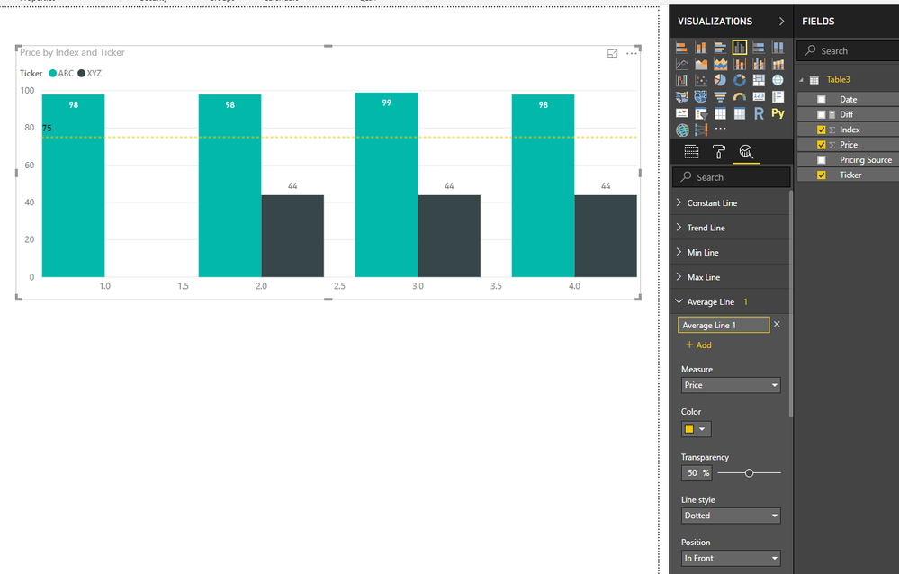
You can click on analytics panel to add average line based amount column, it will dynamic changes based on current item.

18.PNG


Notice: average line only show summary average value based on selected column, it not affect by current group and can't generate multiple average lines based on category column.


Regards,

Xiaoxin Sheng

View solution in original post

3 REPLIES 3
Anonymous
Not applicable

Hi @Anonymous,


You can click on analytics panel to add average line based amount column, it will dynamic changes based on current item.

18.PNG


Notice: average line only show summary average value based on selected column, it not affect by current group and can't generate multiple average lines based on category column.


Regards,

Xiaoxin Sheng

Anonymous
Not applicable

Hi @Anonymous - I played around with the data and visualizations some more and was able to accomplish what you suggested as the solution.  Thanks!

Anonymous
Not applicable

Hi @Anonymous - I'm needing to accomplish what I want to do in a Line and Clustered Column chart as I have a count on the left Y-axis and aging of those counts on the right Y-axis.  I'm wanting to do the average of the aging on the right Y-axis to show which item's aging are falling above or below the average line.  It seems in order to do what you showed is using a Clustered Column chart which ends up eliminating one of the data points.  If there is a better visualization that could be used to accomplish this, I'm open to changing it.  Thanks for the help.

Helpful resources

Announcements
FabCon and SQLCon Barcelona 2026

FabCon & SQLCon – Barcelona 2026

Join us in Barcelona for FabCon and SQLCon, the Fabric, Power BI, SQL, and AI community event. Save €200 with code FABCMTY200.

July Power BI Update Carousel

Power BI Monthly Update - July 2026

Check out the July 2026 Power BI update to learn about new features.

60 days of Data Days Carousel

Data Days 2026

Join Data Days 2026: 60 days of free live/on-demand sessions, challenges, study groups, and certification opportunities.

Power BI DataViz World Championships carousel

Power BI DataViz World Championships - June 2026

A new Power BI DataViz World Championship is coming this June! Don't miss out on submitting your entry.

Top Solution Authors