Party with Power BI’s own Guy in a Cube
Power BI is turning 10! Tune in for a special live episode on July 24 with behind-the-scenes stories, product evolution highlights, and a sneak peek at what’s in store for the future.
Save the date- Power BI forums
- Get Help with Power BI
- Desktop
- Service
- Report Server
- Power Query
- Mobile Apps
- Developer
- DAX Commands and Tips
- Custom Visuals Development Discussion
- Health and Life Sciences
- Power BI Spanish forums
- Translated Spanish Desktop
- Training and Consulting
- Instructor Led Training
- Dashboard in a Day for Women, by Women
- Galleries
- Webinars and Video Gallery
- Data Stories Gallery
- Themes Gallery
- Contests Gallery
- Quick Measures Gallery
- Notebook Gallery
- Translytical Task Flow Gallery
- R Script Showcase
- Ideas
- Custom Visuals Ideas (read-only)
- Issues
- Issues
- Events
- Upcoming Events
Enhance your career with this limited time 50% discount on Fabric and Power BI exams. Ends August 31st. Request your voucher.
- Power BI forums
- Forums
- Get Help with Power BI
- Desktop
- Set field parameter value based on filtering of an...
- Subscribe to RSS Feed
- Mark Topic as New
- Mark Topic as Read
- Float this Topic for Current User
- Bookmark
- Subscribe
- Printer Friendly Page
- Mark as New
- Bookmark
- Subscribe
- Mute
- Subscribe to RSS Feed
- Permalink
- Report Inappropriate Content
Set field parameter value based on filtering of another slicer
Hello,
I was wondering if it's possible to set value in Field parameter based on filtering of another slicer. My report is based on following table (example):
| Department | Business_key | Plan |
| Admin | AD1 | 40 |
| Admin | AD2 | 20 |
| Admin | AD3 | 30 |
| Finance | FI1 | 50 |
| Finance | FI2 | 10 |
| IT | IT1 | 30 |
| IT | IT2 | 20 |
| IT | IT3 | 40 |
| IT | IT4 | 80 |
| IT | IT5 | 60 |
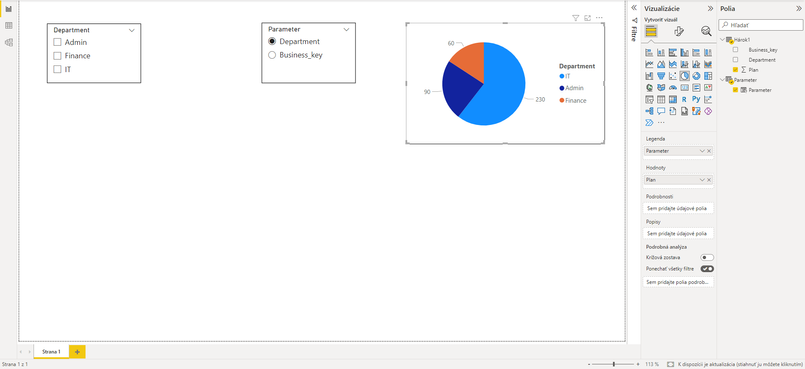
I created a new filed parameter which contains two fields: Department and Business_key and I also added new slicer based od this parameter to the page. Then I created a new pie chart which contains Parameter as Legend and Plan as Value.
I also added a new slicer based on the Department field - I need this slicer for filtering some other visuals on this page. Everything works fine so far and my report looks like this:
My scenario is: IF(ISFILTERED('Hárok1'[Department]; Parameter[Parameter] = Business_key; Parameter[Parameter] = Department)
I realize of course that the formula above is wrong but I would like to say: if Department slicer is filtered, show me values filtering by Business Key, otherwise by Department in pie chart.
Thanks.
- Mark as New
- Bookmark
- Subscribe
- Mute
- Subscribe to RSS Feed
- Permalink
- Report Inappropriate Content
Has anybody found a solution to this problem?
- Mark as New
- Bookmark
- Subscribe
- Mute
- Subscribe to RSS Feed
- Permalink
- Report Inappropriate Content
Hi Jianbo Li,
thanks for the reply but it doesn't match my scenario. You replaced my Department slicer with new "Value" slicer changing based on Attribute slicer , but as i mentioned above, I need Department slicer unchanged with only departments values becasue this slicer is used to filter other visuals on this page (I didn't show them in my example).
Regards
JozefR
- Mark as New
- Bookmark
- Subscribe
- Mute
- Subscribe to RSS Feed
- Permalink
- Report Inappropriate Content
Hi @JozefR ,
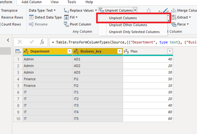
You can achieve your goal by using Unpivot in Power Query.
Please try:
Here is the M code:
let
    Source = Table.FromRows(Json.Document(Binary.Decompress(Binary.FromText("i45WckzJzcxT0lFydDEEkiYGSrE6yIJGQNIIXdAYSBpDBN0y8xLzklOBAm6eIANMMYVBRhhChD1DgGzPEEOEfqgIkjVQEWOEa6AiJkDSAkXEFEiaAUViAQ==", BinaryEncoding.Base64), Compression.Deflate)), let _t = ((type nullable text) meta [Serialized.Text = true]) in type table [Department = _t, Business_key = _t, Plan = _t]),
    #"Changed Type" = Table.TransformColumnTypes(Source,{{"Department", type text}, {"Business_key", type text}, {"Plan", Int64.Type}}),
    #"Unpivoted Columns" = Table.UnpivotOtherColumns(#"Changed Type", {"Plan"}, "Attribute", "Value")
in
    #"Unpivoted Columns"
Then create visuals:
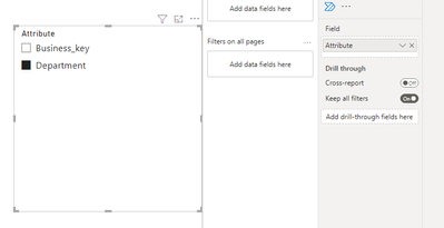
Create a slicer for Attribute:
Turn on the single select option:
Then create a slicer for value:
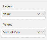
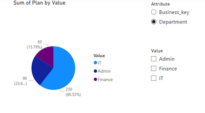
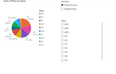
Create a Pie chart:
Final output:
Best Regards,
Jianbo Li
If this post helps, then please consider Accept it as the solution to help the other members find it more quickly.
Helpful resources

Power BI Monthly Update - July 2025
Check out the July 2025 Power BI update to learn about new features.

Join our Fabric User Panel
This is your chance to engage directly with the engineering team behind Fabric and Power BI. Share your experiences and shape the future.

| User | Count |
|---|---|
| 68 | |
| 64 | |
| 52 | |
| 39 | |
| 26 |
| User | Count |
|---|---|
| 80 | |
| 57 | |
| 45 | |
| 44 | |
| 35 |
