Fabric Data Days starts November 4th!
Advance your Data & AI career with 50 days of live learning, dataviz contests, hands-on challenges, study groups & certifications and more!
Get registered- Power BI forums
- Get Help with Power BI
- Desktop
- Service
- Report Server
- Power Query
- Mobile Apps
- Developer
- DAX Commands and Tips
- Custom Visuals Development Discussion
- Health and Life Sciences
- Power BI Spanish forums
- Translated Spanish Desktop
- Training and Consulting
- Instructor Led Training
- Dashboard in a Day for Women, by Women
- Galleries
- Data Stories Gallery
- Themes Gallery
- Contests Gallery
- QuickViz Gallery
- Quick Measures Gallery
- Visual Calculations Gallery
- Notebook Gallery
- Translytical Task Flow Gallery
- TMDL Gallery
- R Script Showcase
- Webinars and Video Gallery
- Ideas
- Custom Visuals Ideas (read-only)
- Issues
- Issues
- Events
- Upcoming Events
Get Fabric Certified for FREE during Fabric Data Days. Don't miss your chance! Request now
- Power BI forums
- Forums
- Get Help with Power BI
- Desktop
- Select single criteria then display 10 nearest val...
- Subscribe to RSS Feed
- Mark Topic as New
- Mark Topic as Read
- Float this Topic for Current User
- Bookmark
- Subscribe
- Printer Friendly Page
- Mark as New
- Bookmark
- Subscribe
- Mute
- Subscribe to RSS Feed
- Permalink
- Report Inappropriate Content
Select single criteria then display 10 nearest values in a list-Finding peers
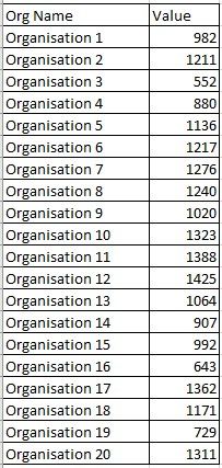
This is an example dataset. I have several hundered organisations each with a value. When a user selects an organisation I would like the 10 organisations that are nearest in value (Either positive or negative) to be shown in a list (or used in several visualisations). The numbers don't change, it's essentially a fixed reference table.
To add an additional complication I would like to use the organisation select sync slicer from another page which sets up every page. A single sync slicer would mean a simple filtered list of organisations wouldn't work unless you could turn off the organsiation sync slicer for certain visualisations
So the questions I have are:
Can you turn off the sync slicer on certain visualisations but have it acting on the rest of the page?
If you can't turn off the sync on certain visualisations is there a way to pull the (sync)selected organisation name and hold it to use it across the entire dashboard (eg storing it in a table) so you don't need to use sync slicer but can achieve the same effect?
How do you create a "nearest 10 values" (smaller or larger values, just the 10 closest in size) I can think of some pretty longhand ways of doing (giant matrix table) it but there must be a smarter way.
I appreciate this is a specific ask but I can see quite a lot of uses to auto selecting a peer group based on a selected criteria. Many thanks for looking.
- Mark as New
- Bookmark
- Subscribe
- Mute
- Subscribe to RSS Feed
- Permalink
- Report Inappropriate Content
You may try using RANKX Function to add a measure and take a look at Change how visuals interact in a report.
If this post helps, then please consider Accept it as the solution to help the other members find it more quickly.
- Mark as New
- Bookmark
- Subscribe
- Mute
- Subscribe to RSS Feed
- Permalink
- Report Inappropriate Content
I'll post this as separate replies->
First part is solved how the sync slicers work.
I understood they worked as page level filter on any pages you applied them to. This is incorrect.
They work in the same way as any other on page filter so they can be applied to a page then made visible. Then all the usual "Edit Interactions" can be used. This means I can create a selection page and have it apply to only certain visuals on any synced dashboard page. Then going back to the synced slicer on the selection page you can make it non visible on your dashboard page.
Thanks. Still working on part 2, will post progress.
Helpful resources

Power BI Monthly Update - November 2025
Check out the November 2025 Power BI update to learn about new features.

Fabric Data Days
Advance your Data & AI career with 50 days of live learning, contests, hands-on challenges, study groups & certifications and more!

| User | Count |
|---|---|
| 98 | |
| 72 | |
| 50 | |
| 49 | |
| 44 |

