Huge last-minute discounts for FabCon Vienna from September 15-18, 2025
Supplies are limited. Contact info@espc.tech right away to save your spot before the conference sells out.
Get your discount- Power BI forums
- Get Help with Power BI
- Desktop
- Service
- Report Server
- Power Query
- Mobile Apps
- Developer
- DAX Commands and Tips
- Custom Visuals Development Discussion
- Health and Life Sciences
- Power BI Spanish forums
- Translated Spanish Desktop
- Training and Consulting
- Instructor Led Training
- Dashboard in a Day for Women, by Women
- Galleries
- Data Stories Gallery
- Themes Gallery
- Contests Gallery
- Quick Measures Gallery
- Notebook Gallery
- Translytical Task Flow Gallery
- TMDL Gallery
- R Script Showcase
- Webinars and Video Gallery
- Ideas
- Custom Visuals Ideas (read-only)
- Issues
- Issues
- Events
- Upcoming Events
Score big with last-minute savings on the final tickets to FabCon Vienna. Secure your discount
- Power BI forums
- Forums
- Get Help with Power BI
- Desktop
- Select column to show in a graph/card
- Subscribe to RSS Feed
- Mark Topic as New
- Mark Topic as Read
- Float this Topic for Current User
- Bookmark
- Subscribe
- Printer Friendly Page
- Mark as New
- Bookmark
- Subscribe
- Mute
- Subscribe to RSS Feed
- Permalink
- Report Inappropriate Content
Select column to show in a graph/card
Good afternoon.
I'm quite new to PBI, then I need some help to do one thing:
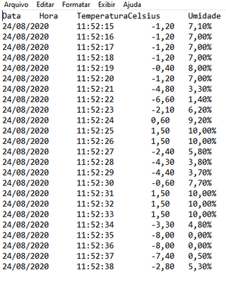
I have a system that measures temperature and humidity and records it into a .txt file, separating columns by "tab".
But I want to make possible that the user can select the temperature unit.
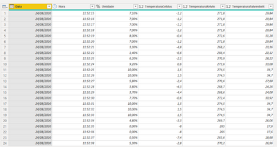
I have, originally, on the .txt, a column with temperatures in Celsius, and made two other ones, where the PBI will calculate the respective values in Kelvin and Fahrenheit units.
I want to show it into a graph, and also show the maximum, minimum and average values in a day, but for it I want to use a combo box, where the user will select the temperature unit.
And there is my problem: How can I select a column to show into something, depending on the selection of the user?
I'll send some prints for you to understand it better:
In this last print, I only want to show one of these columns, selected by the user. How can I do it?
Solved! Go to Solution.
- Mark as New
- Bookmark
- Subscribe
- Mute
- Subscribe to RSS Feed
- Permalink
- Report Inappropriate Content
This video also walks through it, and this is a YouTube channel (Curbal) that a lot of people starting out get a lot from. Please see this video and the earlier ones to get started.
https://www.youtube.com/watch?v=gYbGNeYD4OY
If this works for you, please mark it as the solution. Kudos are appreciated too. Please let me know if not.
Regards,
Pat
Did I answer your question? Mark my post as a solution! Kudos are also appreciated!
To learn more about Power BI, follow me on Twitter or subscribe on YouTube.
@mahoneypa HoosierBI on YouTube
- Mark as New
- Bookmark
- Subscribe
- Mute
- Subscribe to RSS Feed
- Permalink
- Report Inappropriate Content
To do this, you can use the approach described in this article.
https://www.fourmoo.com/2017/11/21/power-bi-using-a-slicer-to-show-different-measures/
Also, you don't need to make calculated columns for Kelvin and Farenheit. You can just have a measure for each. For example,
Farenheit Temp = [Celsius Temp] * 9/5 + 32
Where [Celsius Temp] is the measure on your Celsius temp column (e.g., AVERAGE(Table[TemperaturaCelsius]). If each data point on the chart is a single value, the aggregation won't matter (max, min, sum, average).
You can then have a SWITCH measure that returns the result of one of the measures (Celsius, Kelvin, Farenheit).
If this works for you, please mark it as the solution. Kudos are appreciated too. Please let me know if not.
Regards,
Pat
Did I answer your question? Mark my post as a solution! Kudos are also appreciated!
To learn more about Power BI, follow me on Twitter or subscribe on YouTube.
@mahoneypa HoosierBI on YouTube
- Mark as New
- Bookmark
- Subscribe
- Mute
- Subscribe to RSS Feed
- Permalink
- Report Inappropriate Content
Thank you for the incredibly quick answer. I've thought about using measures, but I really don't know how.
When I've tried it, the measure was only using average/sum values, and I don't want it. I want all the values to be plotted. I not even know how to properly create a measure.
The switch function I also don't know how to use.
Can you help me with it?
- Mark as New
- Bookmark
- Subscribe
- Mute
- Subscribe to RSS Feed
- Permalink
- Report Inappropriate Content
This video also walks through it, and this is a YouTube channel (Curbal) that a lot of people starting out get a lot from. Please see this video and the earlier ones to get started.
https://www.youtube.com/watch?v=gYbGNeYD4OY
If this works for you, please mark it as the solution. Kudos are appreciated too. Please let me know if not.
Regards,
Pat
Did I answer your question? Mark my post as a solution! Kudos are also appreciated!
To learn more about Power BI, follow me on Twitter or subscribe on YouTube.
@mahoneypa HoosierBI on YouTube


