Join us at the 2025 Microsoft Fabric Community Conference
March 31 - April 2, 2025, in Las Vegas, Nevada. Use code MSCUST for a $150 discount! Early bird discount ends December 31.
Register Now- Power BI forums
- Get Help with Power BI
- Desktop
- Service
- Report Server
- Power Query
- Mobile Apps
- Developer
- DAX Commands and Tips
- Custom Visuals Development Discussion
- Health and Life Sciences
- Power BI Spanish forums
- Translated Spanish Desktop
- Training and Consulting
- Instructor Led Training
- Dashboard in a Day for Women, by Women
- Galleries
- Community Connections & How-To Videos
- COVID-19 Data Stories Gallery
- Themes Gallery
- Data Stories Gallery
- R Script Showcase
- Webinars and Video Gallery
- Quick Measures Gallery
- 2021 MSBizAppsSummit Gallery
- 2020 MSBizAppsSummit Gallery
- 2019 MSBizAppsSummit Gallery
- Events
- Ideas
- Custom Visuals Ideas
- Issues
- Issues
- Events
- Upcoming Events
Be one of the first to start using Fabric Databases. View on-demand sessions with database experts and the Microsoft product team to learn just how easy it is to get started. Watch now
- Power BI forums
- Forums
- Get Help with Power BI
- Desktop
- Scattered Plot
- Subscribe to RSS Feed
- Mark Topic as New
- Mark Topic as Read
- Float this Topic for Current User
- Bookmark
- Subscribe
- Printer Friendly Page
- Mark as New
- Bookmark
- Subscribe
- Mute
- Subscribe to RSS Feed
- Permalink
- Report Inappropriate Content
Scattered Plot
Hi All,
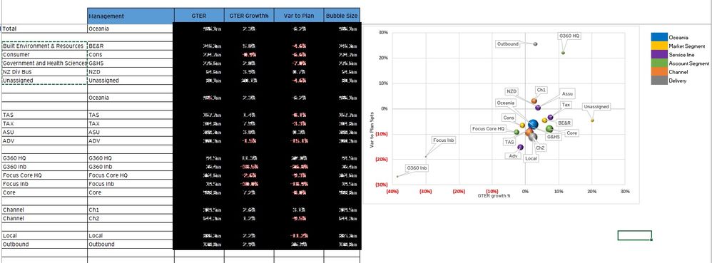
Just Wondering if i can show the multiple parameter with one matrix in the scatterd plot.
This is something that is customized in the Excel report.
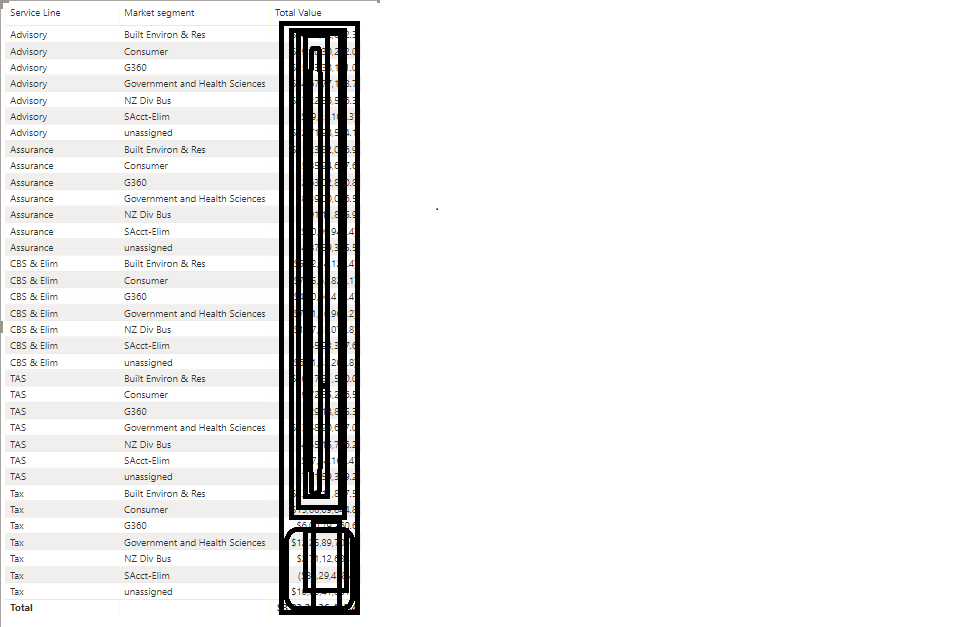
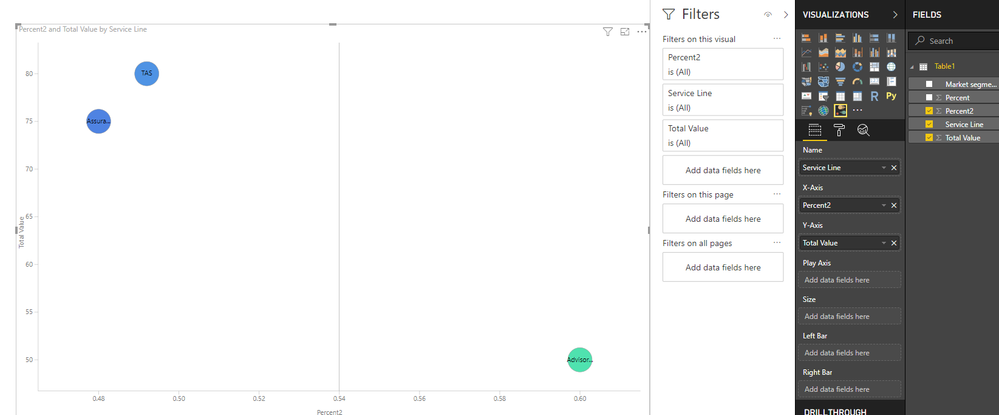
This is the Power Bi Screenshot. i just wanted to see my Serviceline and the market segment in the scsattered plot based on my total value.
i tried creating but it wasn't showing properly as i wanted.
Please let me know if this can be done using the power bi.
Regards,
Ranjan
Solved! Go to Solution.
- Mark as New
- Bookmark
- Subscribe
- Mute
- Subscribe to RSS Feed
- Permalink
- Report Inappropriate Content
Hi @RanjanThammaiah ,
I am afraid the scatterd plot may not show the different label, you could refer to using "Impact Bubble Chart":https://appsource.microsoft.com/en-us/product/power-bi-visuals/WA104381151?tab=Overview
Regards,
Daniel He
If this post helps, then please consider Accept it as the solution to help the other members find it more quickly.
- Mark as New
- Bookmark
- Subscribe
- Mute
- Subscribe to RSS Feed
- Permalink
- Report Inappropriate Content
Hi @RanjanThammaiah ,
Could you please tell me if your problem has been solved? If it is, could you please mark the helpful replies as Answered to close this topic?
Regards,
Daniel He
If this post helps, then please consider Accept it as the solution to help the other members find it more quickly.
- Mark as New
- Bookmark
- Subscribe
- Mute
- Subscribe to RSS Feed
- Permalink
- Report Inappropriate Content
Hi @RanjanThammaiah ,
I am afraid the scatterd plot may not show the different label, you could refer to using "Impact Bubble Chart":https://appsource.microsoft.com/en-us/product/power-bi-visuals/WA104381151?tab=Overview
Regards,
Daniel He
If this post helps, then please consider Accept it as the solution to help the other members find it more quickly.
Helpful resources

Join us at the Microsoft Fabric Community Conference
March 31 - April 2, 2025, in Las Vegas, Nevada. Use code MSCUST for a $150 discount!

Microsoft Fabric Community Conference 2025
Arun Ulag shares exciting details about the Microsoft Fabric Conference 2025, which will be held in Las Vegas, NV.

| User | Count |
|---|---|
| 115 | |
| 76 | |
| 57 | |
| 52 | |
| 44 |
| User | Count |
|---|---|
| 164 | |
| 116 | |
| 63 | |
| 57 | |
| 50 |


