- Power BI forums
- Updates
- News & Announcements
- Get Help with Power BI
- Desktop
- Service
- Report Server
- Power Query
- Mobile Apps
- Developer
- DAX Commands and Tips
- Custom Visuals Development Discussion
- Health and Life Sciences
- Power BI Spanish forums
- Translated Spanish Desktop
- Power Platform Integration - Better Together!
- Power Platform Integrations (Read-only)
- Power Platform and Dynamics 365 Integrations (Read-only)
- Training and Consulting
- Instructor Led Training
- Dashboard in a Day for Women, by Women
- Galleries
- Community Connections & How-To Videos
- COVID-19 Data Stories Gallery
- Themes Gallery
- Data Stories Gallery
- R Script Showcase
- Webinars and Video Gallery
- Quick Measures Gallery
- 2021 MSBizAppsSummit Gallery
- 2020 MSBizAppsSummit Gallery
- 2019 MSBizAppsSummit Gallery
- Events
- Ideas
- Custom Visuals Ideas
- Issues
- Issues
- Events
- Upcoming Events
- Community Blog
- Power BI Community Blog
- Custom Visuals Community Blog
- Community Support
- Community Accounts & Registration
- Using the Community
- Community Feedback
Register now to learn Fabric in free live sessions led by the best Microsoft experts. From Apr 16 to May 9, in English and Spanish.
- Power BI forums
- Forums
- Get Help with Power BI
- Desktop
- Re: Scatter with straight lines and markers (excel...
- Subscribe to RSS Feed
- Mark Topic as New
- Mark Topic as Read
- Float this Topic for Current User
- Bookmark
- Subscribe
- Printer Friendly Page
- Mark as New
- Bookmark
- Subscribe
- Mute
- Subscribe to RSS Feed
- Permalink
- Report Inappropriate Content
Scatter with straight lines and markers (excel) in PowerBI?
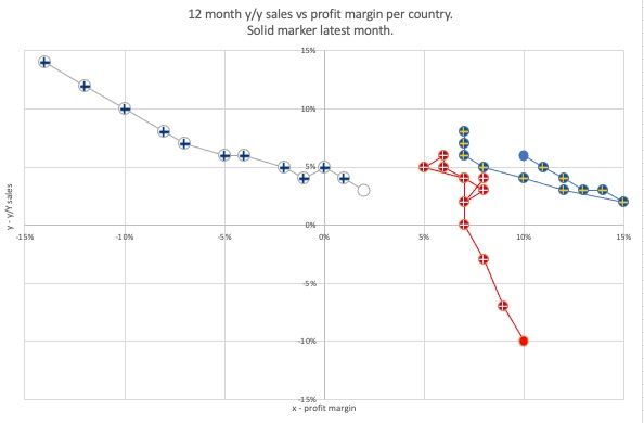
Going a bit crazy here... subject line says it all. Is it not possible to achieve this type of chart in PowerBI?
Specifically then it is the lines I am not finding how to incorporate in the scatter chart.
Use case is for example having y/y sales % on one axis and profit margin % on the other and each dot representing a certain time period.
Animation is nice but I want to see the whole history represented by dots connected by a line. Perhaps a moving dot following the lines from start month to end month in my chart would be an additional "Dashboard" feature.
Thanks
- Mark as New
- Bookmark
- Subscribe
- Mute
- Subscribe to RSS Feed
- Permalink
- Report Inappropriate Content
Thank you Allan, I added it as a topic at the Ideas Forum! I also added the example of the chart in this post and linked it in the forum. The THe line chart uncomfortably does not allow me to have a separate x-axis like the chart I published. At least I haven't found a way to use the line chart in a similar way.
Best regards
Henrik
- Mark as New
- Bookmark
- Subscribe
- Mute
- Subscribe to RSS Feed
- Permalink
- Report Inappropriate Content
Thank you Allan, I added it as a topic in the Ideas Forum! I also added the example of the chart in this post and linked it in the forum. THe line chart uncomfortably does not allow me to have independent x-axis like the chart I published. At least I haven't found a way to use the line chart in a similar way.
Best regards
Henrik
- Mark as New
- Bookmark
- Subscribe
- Mute
- Subscribe to RSS Feed
- Permalink
- Report Inappropriate Content
Thank you Allan, I have added it as a topic in the Idea Forum! I also added the chart example in this post and linked to it in the forum. THe line chart unfortunatly does not let me have independent x axis like the chart I posted. At least I haven't found a way to use the line chart in a similar way.
Best regards,
Henrik
- Mark as New
- Bookmark
- Subscribe
- Mute
- Subscribe to RSS Feed
- Permalink
- Report Inappropriate Content
Hi. @henrikgronwall
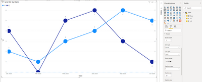
It is unsupported to achieve this with scatter chart in Power BI currently. You may try line chart like below.
I'd like to suggest you post a new idea in Idea Forum and add your comments there to improve Power BI for making this feature coming sooner.
Best Regards
Allan
If this post helps, then please consider Accept it as the solution to help the other members find it more quickly.
Helpful resources

Microsoft Fabric Learn Together
Covering the world! 9:00-10:30 AM Sydney, 4:00-5:30 PM CET (Paris/Berlin), 7:00-8:30 PM Mexico City

Power BI Monthly Update - April 2024
Check out the April 2024 Power BI update to learn about new features.

| User | Count |
|---|---|
| 103 | |
| 101 | |
| 76 | |
| 66 | |
| 60 |
| User | Count |
|---|---|
| 142 | |
| 106 | |
| 103 | |
| 85 | |
| 70 |


