Join the #PBI10 DataViz contest
Power BI is turning 10, and we’re marking the occasion with a special community challenge. Use your creativity to tell a story, uncover trends, or highlight something unexpected.
Get started- Power BI forums
- Get Help with Power BI
- Desktop
- Service
- Report Server
- Power Query
- Mobile Apps
- Developer
- DAX Commands and Tips
- Custom Visuals Development Discussion
- Health and Life Sciences
- Power BI Spanish forums
- Translated Spanish Desktop
- Training and Consulting
- Instructor Led Training
- Dashboard in a Day for Women, by Women
- Galleries
- Webinars and Video Gallery
- Data Stories Gallery
- Themes Gallery
- Contests Gallery
- Quick Measures Gallery
- Notebook Gallery
- Translytical Task Flow Gallery
- R Script Showcase
- Ideas
- Custom Visuals Ideas (read-only)
- Issues
- Issues
- Events
- Upcoming Events
Join us for an expert-led overview of the tools and concepts you'll need to become a Certified Power BI Data Analyst and pass exam PL-300. Register now.
- Power BI forums
- Forums
- Get Help with Power BI
- Desktop
- Scatter plot with non-aggregated data? Display cur...
- Subscribe to RSS Feed
- Mark Topic as New
- Mark Topic as Read
- Float this Topic for Current User
- Bookmark
- Subscribe
- Printer Friendly Page
- Mark as New
- Bookmark
- Subscribe
- Mute
- Subscribe to RSS Feed
- Permalink
- Report Inappropriate Content
Scatter plot with non-aggregated data? Display current and desired ratings on a scale with icons
Power BI Community,
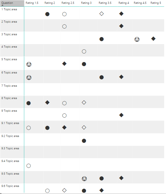
I'm attempting to create a visual that plots current and desired values across the X axis associated with a various topic areas as the Y axis. Each topic area contains 4 questions, with answers as a text rating which map to a numerical value (1 to 5, .5 increments) defined by a category: Snapshot (current and desired) and a Viewpoint (current and desired). Ideally I'd like to visually represent the data like a scatter plot and if one or more of the categories have the same rating the icons can be stacked on top each other.
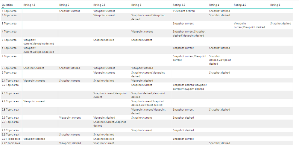
With a measure I've concatenated the Snapshots/Viewpoints be grouped together in a matrix table but understand images cannot be used in this visual. I've also tried a scatter plot to no avail since it requires numerical values that are aggregated.
Is there a workaround for this or a way to achieve this scenario? I've browsed custom visuals and none seem to address my use case. Any help or suggestions would be greatly appreciated. Happy to send sample data if needed.
Thanks
Kevin
Below you will find a populated matrix table and the desired visual I'd like to achieve in Power BI that was mocked up in Excel.
Matrix table in PBI:
Desired outcome mocked up in Excel:
Solved! Go to Solution.
- Mark as New
- Bookmark
- Subscribe
- Mute
- Subscribe to RSS Feed
- Permalink
- Report Inappropriate Content
Hi @kevcurtis,
How about using other icons instead? You can see it from my test.
replacewithicon =
VAR quantity =
    SUM ( 'Sales'[Quantity] )
RETURN
    IF (
        quantity < 200,
        UNICHAR ( "9733" ),
        IF (
            quantity < 600,
            UNICHAR ( "10026" ),
            IF (
                quantity < 1500,
                UNICHAR ( "9885" ),
                IF ( quantity < 10000, UNICHAR ( "9913" ), UNICHAR ( "10057" ) )
            )
        )
    )
You can refer to this site for other icons.
Best Regards!
Dale
If this post helps, then please consider Accept it as the solution to help the other members find it more quickly.
- Mark as New
- Bookmark
- Subscribe
- Mute
- Subscribe to RSS Feed
- Permalink
- Report Inappropriate Content
Hi @v-jiascu-msft,
Thank you for the suggestion! This has helped me get one step further to solving my use case. I used a measure on top of a measure to define unicode icons for each status. This works on the premise there would only be 6 statuses in total which I needed to define an icon for:
Snapshot current
Snapshot desired
Viewpoint current
Viewpoint desired
Snapshot current, Snapshot desired
Viewpoint current, Viewpoint desired
Problem:
Essentially I'm hard coding in the icons for each status value which works for the above scenario BUT in the actual data set there will be many permutations for each person in which defining an icon for each does not work (and I can't define a color for each).
Ideal solution:
I'd like to define 4 images or shapes that have transparency so they can be stacked on top of each other, dynamically, creating a shape that will define unique statuses (similar to the Excel mockup in my original post).
In the short term this could work for some scenarios but with the amount of data I have I don't believe it will scale very well. Any feedback or suggestions are welcomed!
Measure used:
MStatusIcons =
IF([MultCategory] = "Snapshot current",UNICHAR ("9679"),"")&IF([MultCategory] = "Snapshot desired",UNICHAR ("9670"),"")&
IF([MultCategory] = "Viewpoint current",UNICHAR ("9675"),"")&
IF([MultCategory] = "Viewpoint desired",UNICHAR ("9671"),"")&
IF([MultCategory] = "Snapshot current,Snapshot desired",UNICHAR ("9055"),"")&
IF([MultCategory] = "Viewpoint current,Viewpoint desired",UNICHAR ("9098"),"")
Original measure:
MultCategory = CONCATENATEX(VALUES(Assessment[Category_CurrentDesired]),Assessment[Category_CurrentDesired],",")
Output:
- Mark as New
- Bookmark
- Subscribe
- Mute
- Subscribe to RSS Feed
- Permalink
- Report Inappropriate Content
Hi @kevcurtis,
I'm a little confused. You already have the Matrix. I thought the only thing is changing the words with shapes. Maybe you can try a measure like below. Then you can define four groups or more.
MStatusIcons =
IF (
    [MultCategory] IN { "Snapshot current", "Snapshot desired" },
    UNICHAR ( "9670" ),
    IF (
        [MultCategory] IN { "Viewpoint current", "Viewpoint desired" },
        UNICHAR ( "9671" ),
        IF (
            [MultCategory] IN { "Snapshot current", "Snapshot desired" },
            UNICHAR ( "9055" ),
            IF (
                [MultCategory] IN { "Viewpoint current", "Viewpoint desired" },
                UNICHAR ( "9098" ),
                ""
            )
        )
    )
)
Best Regards!
Dale
If this post helps, then please consider Accept it as the solution to help the other members find it more quickly.
- Mark as New
- Bookmark
- Subscribe
- Mute
- Subscribe to RSS Feed
- Permalink
- Report Inappropriate Content
Hi @v-jiascu-msft,
Thanks for your response.
Correct, I do already have the Matrix and I did achieve changing the words with shapes by using unicode characters. The measure created does provide a solution for the list of statuses (6 total) defined in MStatusIcons.
My matrix displays one respondents’ (out of 50) answers at a time using a slicer. The data is dynamic and the challenge is, when two or more statues have the same rating, I would need to define a completely new shape to represent it visually...
Example:
Referencing the original matrix screenshot: e.g. 9.2 Topic area; three statuses are equal to ‘Rating 3.5’
Snapshot current = 3
Snapshot desired = 3.5
Viewpoint current = 3.5
Viewpoint desired = 3.5
Shape 1: Snapshot current (shape already defined: 9679)
Shape 2: Snapshot desired, Viewpoint current, Viewpoint desired (new shape needs to be defined)
The legend for each shape would become a long list with many more than 6 shapes in total (and it would be hard to understand the status at-a-glance).
When I mentioned having the ability to define 4 images/shapes that have transparency and can be stacked on top of each other would avoid the need to define a shape for each the possible combination of statuses.
Hope that helps your understanding. I realize this a very specific use case and somewhat difficult to provide clarity on the details. Either way, I’d consider your original response to my thread a solution and may need to create a new thread for the additional challenges.
Thanks
Kevin
- Mark as New
- Bookmark
- Subscribe
- Mute
- Subscribe to RSS Feed
- Permalink
- Report Inappropriate Content
Hi @v-jiascu-msft,
I was able to achieve a solution to this challenge with the standard scatter plot visual. Took a bit more time working through it with some inspiration from the community.
Thread:
How to achieve this Tableau visual in Power BI?
Thanks
Kevin
Helpful resources

Join our Fabric User Panel
This is your chance to engage directly with the engineering team behind Fabric and Power BI. Share your experiences and shape the future.

Power BI Monthly Update - June 2025
Check out the June 2025 Power BI update to learn about new features.

| User | Count |
|---|---|
| 56 | |
| 54 | |
| 54 | |
| 37 | |
| 29 |
| User | Count |
|---|---|
| 77 | |
| 63 | |
| 45 | |
| 40 | |
| 40 |


