FabCon is coming to Atlanta
Join us at FabCon Atlanta from March 16 - 20, 2026, for the ultimate Fabric, Power BI, AI and SQL community-led event. Save $200 with code FABCOMM.
Register now!- Power BI forums
- Get Help with Power BI
- Desktop
- Service
- Report Server
- Power Query
- Mobile Apps
- Developer
- DAX Commands and Tips
- Custom Visuals Development Discussion
- Health and Life Sciences
- Power BI Spanish forums
- Translated Spanish Desktop
- Training and Consulting
- Instructor Led Training
- Dashboard in a Day for Women, by Women
- Galleries
- Data Stories Gallery
- Themes Gallery
- Contests Gallery
- QuickViz Gallery
- Quick Measures Gallery
- Visual Calculations Gallery
- Notebook Gallery
- Translytical Task Flow Gallery
- TMDL Gallery
- R Script Showcase
- Webinars and Video Gallery
- Ideas
- Custom Visuals Ideas (read-only)
- Issues
- Issues
- Events
- Upcoming Events
The Power BI Data Visualization World Championships is back! It's time to submit your entry. Live now!
- Power BI forums
- Forums
- Get Help with Power BI
- Desktop
- Scatter plot 60 points only?
- Subscribe to RSS Feed
- Mark Topic as New
- Mark Topic as Read
- Float this Topic for Current User
- Bookmark
- Subscribe
- Printer Friendly Page
- Mark as New
- Bookmark
- Subscribe
- Mute
- Subscribe to RSS Feed
- Permalink
- Report Inappropriate Content
Scatter plot 60 points only?
Hi folks,
I feel a little bit weird asking this, but could it be that a scatter plot can display at most 60 points at once? I would like to have a quick visual inspection of my data in terms of clustering, outliers, trend lines and I have a few thousand entries easily in my dataset which I would all like to be displayed at once of course.
In my previous work, where I had a MATLAB license, I would just quickly do a spy / scatter whenever I loaded a large dataset to see where I am at and take it from there.
Am I doing something wrong here?
Cheers, AB
Solved! Go to Solution.
- Mark as New
- Bookmark
- Subscribe
- Mute
- Subscribe to RSS Feed
- Permalink
- Report Inappropriate Content
@Anonymous , I think the limit is much bigger
refer : https://docs.microsoft.com/en-us/power-bi/visuals/power-bi-data-points
- Mark as New
- Bookmark
- Subscribe
- Mute
- Subscribe to RSS Feed
- Permalink
- Report Inappropriate Content
@Anonymous , I think the limit is much bigger
refer : https://docs.microsoft.com/en-us/power-bi/visuals/power-bi-data-points
- Mark as New
- Bookmark
- Subscribe
- Mute
- Subscribe to RSS Feed
- Permalink
- Report Inappropriate Content
I eat my words.
I recreated the report, with the same filters and visuals and it works like a charm now. I must have set the wrong tickmark somewhere when instead I wanted "don't summarize"... Cannot really reproduce the error now.
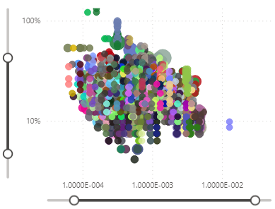
Anyways, for future reference, this is how many data points I see now:
... enough for my purpose.
@amitchandak Thanks again for the quick reply.
Cheers, AB
- Mark as New
- Bookmark
- Subscribe
- Mute
- Subscribe to RSS Feed
- Permalink
- Report Inappropriate Content
Hi,
thanks for the quick reply. As far as I undestand it, what you are referring to is the limit of data points that is sampled from the underlying datasets to calculate the intended summation (or averaging or counting or whatever), for each point. Since the underlying dataset can easily have millions of entries, it might not be neccessary or fast enough to to the precise calculation for the reason of plotting alone so the data that goes into computing the bubble size is only sampled from the data in the model.
So let's say I have points (x,y) with sales data from specific products where x represents the age that an item is targeted at and y represents the color code, then I could have bubble sizes that represent the overall sales revenue for each combination but not all data in the source is effectively summed up (or averaged or counted) to calculate each bubble.
So my original question still stays the same: Can anyone show me a scatter plot that has more than 60 circles visible like this one?
Or am I doing something wrong?
Cheers, AB
Helpful resources

Power BI Dataviz World Championships
The Power BI Data Visualization World Championships is back! It's time to submit your entry.

Power BI Monthly Update - January 2026
Check out the January 2026 Power BI update to learn about new features.

| User | Count |
|---|---|
| 64 | |
| 44 | |
| 31 | |
| 25 | |
| 23 |
| User | Count |
|---|---|
| 136 | |
| 115 | |
| 58 | |
| 39 | |
| 35 |


