- Power BI forums
- Updates
- News & Announcements
- Get Help with Power BI
- Desktop
- Service
- Report Server
- Power Query
- Mobile Apps
- Developer
- DAX Commands and Tips
- Custom Visuals Development Discussion
- Health and Life Sciences
- Power BI Spanish forums
- Translated Spanish Desktop
- Power Platform Integration - Better Together!
- Power Platform Integrations (Read-only)
- Power Platform and Dynamics 365 Integrations (Read-only)
- Training and Consulting
- Instructor Led Training
- Dashboard in a Day for Women, by Women
- Galleries
- Community Connections & How-To Videos
- COVID-19 Data Stories Gallery
- Themes Gallery
- Data Stories Gallery
- R Script Showcase
- Webinars and Video Gallery
- Quick Measures Gallery
- 2021 MSBizAppsSummit Gallery
- 2020 MSBizAppsSummit Gallery
- 2019 MSBizAppsSummit Gallery
- Events
- Ideas
- Custom Visuals Ideas
- Issues
- Issues
- Events
- Upcoming Events
- Community Blog
- Power BI Community Blog
- Custom Visuals Community Blog
- Community Support
- Community Accounts & Registration
- Using the Community
- Community Feedback
Register now to learn Fabric in free live sessions led by the best Microsoft experts. From Apr 16 to May 9, in English and Spanish.
- Power BI forums
- Forums
- Get Help with Power BI
- Desktop
- Re: Scatter chart with smooth lines
- Subscribe to RSS Feed
- Mark Topic as New
- Mark Topic as Read
- Float this Topic for Current User
- Bookmark
- Subscribe
- Printer Friendly Page
- Mark as New
- Bookmark
- Subscribe
- Mute
- Subscribe to RSS Feed
- Permalink
- Report Inappropriate Content
Scatter chart with smooth lines
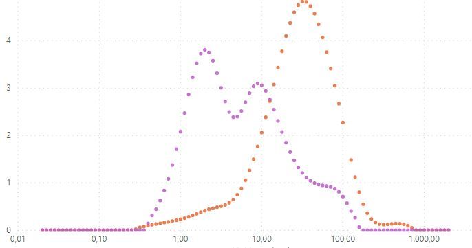
In my company we desperatly need a scatter chart with smooth lines option. We are able to plot out data in form of dots but would love an option to connect those dots. Any Microsoft in-house solutions on horizion? Excel can do that without any problems for more than a decade now.
I found one from pbivizedit but it comes with quite some drawbacks (no color scheme, no option to disable data labels).
- Mark as New
- Bookmark
- Subscribe
- Mute
- Subscribe to RSS Feed
- Permalink
- Report Inappropriate Content
Hi @davidz106
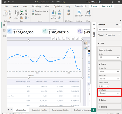
From the july 2023 release - smooth lines are available as a line type for line and area charts.
See release note : Release note july 2023
or the snippet from the release note below to see how you can change line type to smooth:
Kind regards!
If this solved your problem, consider marking this answer as a solution.
- Mark as New
- Bookmark
- Subscribe
- Mute
- Subscribe to RSS Feed
- Permalink
- Report Inappropriate Content
Hi @davidz106 ,
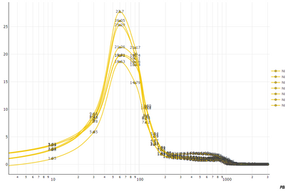
It is possible to do in PBIVizEdit. Regarding drawbacks:
1. no color scheme: It is possible to define colors either programmatically or statically in the tool. Colors can be changed from Power BI too.
2. no option to disable data labels: It is possible to remove data labels altogether.
Please contact support with the exact requirements and some sample data. It should be possible what you are requesting.
Thanks.
-R
- Mark as New
- Bookmark
- Subscribe
- Mute
- Subscribe to RSS Feed
- Permalink
- Report Inappropriate Content
Hi, can you give me some pointers how to remove data labels from the plot (not axis) and how to apply power bi report coloring for data series (catergorical by which I mean the same that other build-in apps use)? Or is this available only as custom solution?
- Mark as New
- Bookmark
- Subscribe
- Mute
- Subscribe to RSS Feed
- Permalink
- Report Inappropriate Content
Hi @davidz106 ,
1. Two ways to remove labels, either do not bind anything for Label field OR switch the label off (Visual Attributes -> plot_{index} -> Label (in the pbivizedit service and not visual).
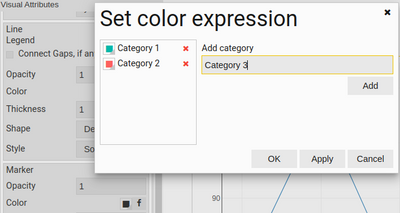
2. I think, you are using single series and binding legend to the field. If that is correct, bind the same field with Marker color too. And then in the Marker->color-> Categorical colors. This will open Set color expression dialog. You can define your categories and colors. (Again, in pbivizedit service and not visual) Though this is limited in terms of functionality, but works for the time being.
Once you do this, export your visual. Let me know, if this works.
Thanks,
Radhey
- Mark as New
- Bookmark
- Subscribe
- Mute
- Subscribe to RSS Feed
- Permalink
- Report Inappropriate Content
Thanks Radhey!
First solution (remove labels) works great once I set it up online.
I still cannot work around the line colouring (I don't use Markers either). You are correct, I am using single series and binding legend to the field. Like you mentioned there is a way to define categories manually online but I guess currently there is no functionalty to use category colors from Power BI original theme, right? If I were to do it manually, I would have to define n categories and when I use this visual for different project change it again (there are 100+ sample data derived from legened field).
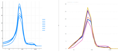
Ideal scenario for me would be a smooth line chart (left) but with coloring of built-in line chart in right.
Thanks in advance,
David
- Mark as New
- Bookmark
- Subscribe
- Mute
- Subscribe to RSS Feed
- Permalink
- Report Inappropriate Content
This doesn't solve my problem. I would need a visualization that connects the dots of scatter plot, i.e. scatter plot with smooth lines in Excel terms.
Wonder how there is a relativly low intrest in this.
- Mark as New
- Bookmark
- Subscribe
- Mute
- Subscribe to RSS Feed
- Permalink
- Report Inappropriate Content
Are you trying to connect the dots or draw a line of best fit?
Did I answer your question? Mark my post as a solution!
Proud to be a Super User!
- Mark as New
- Bookmark
- Subscribe
- Mute
- Subscribe to RSS Feed
- Permalink
- Report Inappropriate Content
Hello,
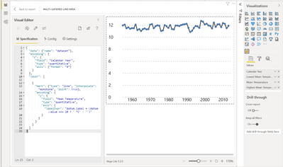
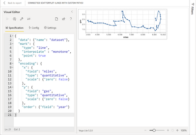
Deneb Custom visual can offer line interpolation options, see these examples...
Line interpolation - EXPLORATIONS IN DATA STORYTELLING WITH POWER BI (kerrykolosko.com)
Chart Templates - EXPLORATIONS IN DATA STORYTELLING WITH POWER BI (kerrykolosko.com)
More about the Deneb Custom Visual...
Deneb - Declarative Visualization in Power BI (deneb-viz.github.io)
Did I answer your question? Mark my post as a solution!
Proud to be a Super User!
Helpful resources

Microsoft Fabric Learn Together
Covering the world! 9:00-10:30 AM Sydney, 4:00-5:30 PM CET (Paris/Berlin), 7:00-8:30 PM Mexico City

Power BI Monthly Update - April 2024
Check out the April 2024 Power BI update to learn about new features.

| User | Count |
|---|---|
| 111 | |
| 109 | |
| 89 | |
| 76 | |
| 67 |
| User | Count |
|---|---|
| 125 | |
| 111 | |
| 100 | |
| 83 | |
| 71 |
