- Power BI forums
- Get Help with Power BI
- Desktop
- Service
- Report Server
- Power Query
- Mobile Apps
- Developer
- DAX Commands and Tips
- Custom Visuals Development Discussion
- Health and Life Sciences
- Power BI Spanish forums
- Translated Spanish Desktop
- Training and Consulting
- Instructor Led Training
- Dashboard in a Day for Women, by Women
- Galleries
- Community Connections & How-To Videos
- COVID-19 Data Stories Gallery
- Themes Gallery
- Data Stories Gallery
- R Script Showcase
- Webinars and Video Gallery
- Quick Measures Gallery
- 2021 MSBizAppsSummit Gallery
- 2020 MSBizAppsSummit Gallery
- 2019 MSBizAppsSummit Gallery
- Events
- Ideas
- Custom Visuals Ideas
- Issues
- Issues
- Events
- Upcoming Events
- Community Blog
- Power BI Community Blog
- Power BI 中文博客
- Community Support
- Community Accounts & Registration
- Using the Community
- Community Feedback
Get certified in Microsoft Fabric—for free! For a limited time, the Microsoft Fabric Community team will be offering free DP-600 exam vouchers. Prepare now
- Power BI forums
- Forums
- Get Help with Power BI
- Desktop
- Same period last year visual
- Subscribe to RSS Feed
- Mark Topic as New
- Mark Topic as Read
- Float this Topic for Current User
- Bookmark
- Subscribe
- Printer Friendly Page
- Mark as New
- Bookmark
- Subscribe
- Mute
- Subscribe to RSS Feed
- Permalink
- Report Inappropriate Content
Same period last year visual
Hi!
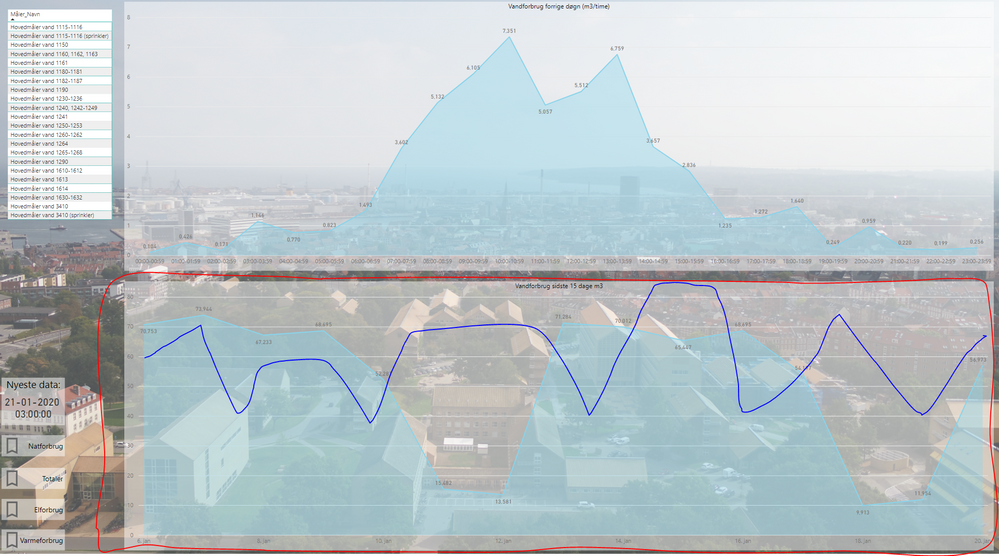
I have this chart showing the water consumption for the last 15 days (red marking):
I would like to add a chart for the same 15 days last year (blue line). Can someone please explain to me how to do that? 🙂
- Mark as New
- Bookmark
- Subscribe
- Mute
- Subscribe to RSS Feed
- Permalink
- Report Inappropriate Content
Hi @MRN8840
You can use Measure like below.
Sales Last Year =
CALCULATE(
    [Sales],
    SAMEPERIODLASTYEAR( 'Calendar'[Date] )
)Mariusz
If this post helps, then please consider Accepting it as the solution.
- Mark as New
- Bookmark
- Subscribe
- Mute
- Subscribe to RSS Feed
- Permalink
- Report Inappropriate Content
Thank you so much for you reply!
It almost works - I would like it to automatically show the same day last year (today 21. of january), and the previous 15 days - just like the chart. How to write that in DAX? 😕
- Mark as New
- Bookmark
- Subscribe
- Mute
- Subscribe to RSS Feed
- Permalink
- Report Inappropriate Content
- Mark as New
- Bookmark
- Subscribe
- Mute
- Subscribe to RSS Feed
- Permalink
- Report Inappropriate Content
Thanks again 🙂
I'm not completely understanding. You wrote that I should use my Previous 15 day measure as an argument, but the the 15 day measure in my screenshot is just a filter on the trend? 🙂
Helpful resources

Power BI Monthly Update - October 2024
Check out the October 2024 Power BI update to learn about new features.

Microsoft Fabric & AI Learning Hackathon
Learn from experts, get hands-on experience, and win awesome prizes.

| User | Count |
|---|---|
| 113 | |
| 96 | |
| 91 | |
| 82 | |
| 69 |
| User | Count |
|---|---|
| 159 | |
| 125 | |
| 116 | |
| 111 | |
| 95 |

