FabCon is coming to Atlanta
Join us at FabCon Atlanta from March 16 - 20, 2026, for the ultimate Fabric, Power BI, AI and SQL community-led event. Save $200 with code FABCOMM.
Register now!- Power BI forums
- Get Help with Power BI
- Desktop
- Service
- Report Server
- Power Query
- Mobile Apps
- Developer
- DAX Commands and Tips
- Custom Visuals Development Discussion
- Health and Life Sciences
- Power BI Spanish forums
- Translated Spanish Desktop
- Training and Consulting
- Instructor Led Training
- Dashboard in a Day for Women, by Women
- Galleries
- Data Stories Gallery
- Themes Gallery
- Contests Gallery
- QuickViz Gallery
- Quick Measures Gallery
- Visual Calculations Gallery
- Notebook Gallery
- Translytical Task Flow Gallery
- TMDL Gallery
- R Script Showcase
- Webinars and Video Gallery
- Ideas
- Custom Visuals Ideas (read-only)
- Issues
- Issues
- Events
- Upcoming Events
Get Fabric Certified for FREE during Fabric Data Days. Don't miss your chance! Request now
- Power BI forums
- Forums
- Get Help with Power BI
- Desktop
- Same period each year in chart? (Timeline Slicer +...
- Subscribe to RSS Feed
- Mark Topic as New
- Mark Topic as Read
- Float this Topic for Current User
- Bookmark
- Subscribe
- Printer Friendly Page
- Mark as New
- Bookmark
- Subscribe
- Mute
- Subscribe to RSS Feed
- Permalink
- Report Inappropriate Content
Same period each year in chart? (Timeline Slicer + Line Chart)
Hello all!
I am using a Timeline Slicer through a calendar table to extract the total of sales in a measure I have called "SumSalesTY":
SumSalesTY =
VAR LimMin = FIRSTDATE(Calendar[MonYear])
VAR LimMax = LASTDATE(Calendar[MonYear])

RETURN CALCULATE(
       SUM(Table1[Sales]),
       ALLEXCEPT(Table1,Table1[Date],Table1[Unit]),
       Table1[Date]>=LimMin,
       Table1[Date]<=LimMax
       )
It works well in a card visual, but I'm stuck as to how I can use it in a line chart.
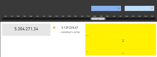
Here's how my report looks so far:
The timeline slices through Calendar[MonYear] and is filtered to show only the "last" 24 months (actually jan-dec 2018 and 2019).
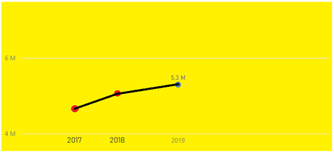
The yellow chart is only showing the sales total for Mar-Apr/2019, but actually I wanted it to show previous years as well (sales total for march+april each year):
How would I achieve that?
- Mark as New
- Bookmark
- Subscribe
- Mute
- Subscribe to RSS Feed
- Permalink
- Report Inappropriate Content
You may apply virtual relationship in DAX measure.
- https://community.powerbi.com/t5/Desktop/Tricky-Slicer-Options/m-p/573381#M270846
- https://community.powerbi.com/t5/Desktop/Use-a-date-slicer-to-filter-on-a-period-instead-of-a-single...
If this post helps, then please consider Accept it as the solution to help the other members find it more quickly.
- Mark as New
- Bookmark
- Subscribe
- Mute
- Subscribe to RSS Feed
- Permalink
- Report Inappropriate Content
Thanks @v-chuncz-msft , but how would I do that? My timeline slices through Calendar[MonYear], which is (indirectly, I guess?) in a real relationship with Table1[MonYear]. (I say indirectly because in fact, I've linked Calendar[Date] with Table1[Date], though both tables also have "MonYear" columns.)
I can attest that the relationship works because I've checked that 5.3 M really is the total of sales for March+April 2019 (as in the example above).
Helpful resources

Power BI Monthly Update - November 2025
Check out the November 2025 Power BI update to learn about new features.

Fabric Data Days
Advance your Data & AI career with 50 days of live learning, contests, hands-on challenges, study groups & certifications and more!


