FabCon is coming to Atlanta
Join us at FabCon Atlanta from March 16 - 20, 2026, for the ultimate Fabric, Power BI, AI and SQL community-led event. Save $200 with code FABCOMM.
Register now!- Power BI forums
- Get Help with Power BI
- Desktop
- Service
- Report Server
- Power Query
- Mobile Apps
- Developer
- DAX Commands and Tips
- Custom Visuals Development Discussion
- Health and Life Sciences
- Power BI Spanish forums
- Translated Spanish Desktop
- Training and Consulting
- Instructor Led Training
- Dashboard in a Day for Women, by Women
- Galleries
- Data Stories Gallery
- Themes Gallery
- Contests Gallery
- QuickViz Gallery
- Quick Measures Gallery
- Visual Calculations Gallery
- Notebook Gallery
- Translytical Task Flow Gallery
- TMDL Gallery
- R Script Showcase
- Webinars and Video Gallery
- Ideas
- Custom Visuals Ideas (read-only)
- Issues
- Issues
- Events
- Upcoming Events
The Power BI Data Visualization World Championships is back! Get ahead of the game and start preparing now! Learn more
- Power BI forums
- Forums
- Get Help with Power BI
- Desktop
- Same column, multiple filters
- Subscribe to RSS Feed
- Mark Topic as New
- Mark Topic as Read
- Float this Topic for Current User
- Bookmark
- Subscribe
- Printer Friendly Page
- Mark as New
- Bookmark
- Subscribe
- Mute
- Subscribe to RSS Feed
- Permalink
- Report Inappropriate Content
Same column, multiple filters
Hi,
Is it possible to create multiple filters from the same column and use the input from both the filters to feed the chart. So its effectively the same column in the axis of the chart but the selection is coming from 2 filters. I can use interaction to isolate the selections from each filter. thanks
Solved! Go to Solution.
- Mark as New
- Bookmark
- Subscribe
- Mute
- Subscribe to RSS Feed
- Permalink
- Report Inappropriate Content
Hi @PBIfanatic ,
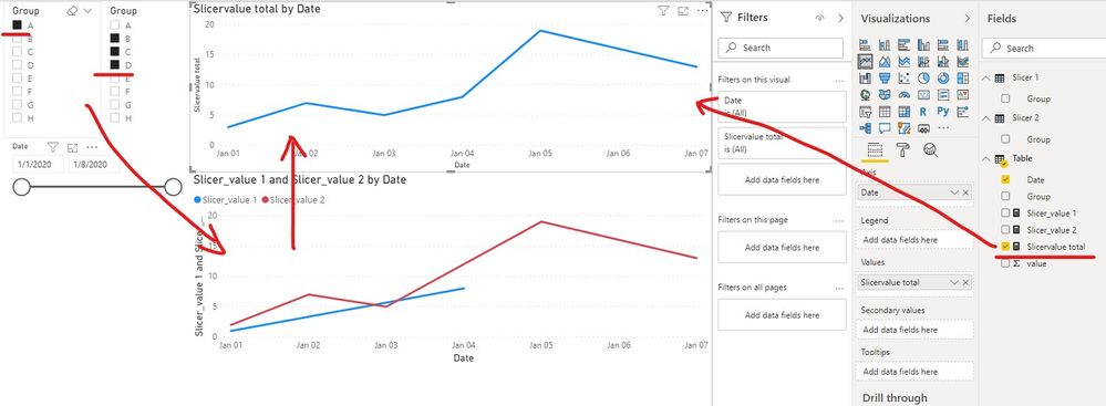
We can create a measure to meet your requirement.
The measure calculate the sum total between [Slicer_value 1] and [Slicer_value 2].
Slicervalue total =
var _selected1 = VALUES('Slicer 1'[Group])
var _selected2 = VALUES('Slicer 2'[Group])
var _value1 = CALCULATE(SUM('Table'[value]),FILTER('Table', 'Table'[Group] in _selected1))
var _value2 = CALCULATE(SUM('Table'[value]),FILTER('Table', 'Table'[Group] in _selected2))
return
_value1 + _value2
If it doesn’t meet your requirement, could you please show the exact expected result based on the table that we have shared?
BTW, pbix as attached.
Best regards,
Community Support Team _ zhenbw
If this post helps, then please consider Accept it as the solution to help the other members find it more quickly.
- Mark as New
- Bookmark
- Subscribe
- Mute
- Subscribe to RSS Feed
- Permalink
- Report Inappropriate Content
Hi @PBIfanatic ,
We can create two tables and two measures to meet your requirement.
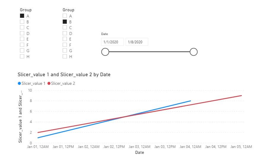
We create a sample, and want to see both selections have performed over time.
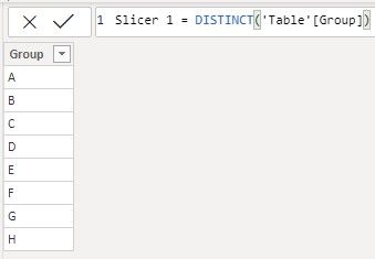
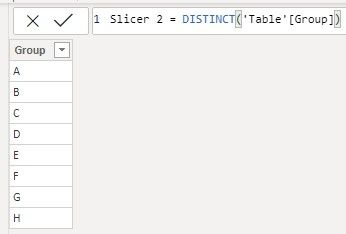
1. Create two tables that contain the distinct field you want to add a slicer. For the example, we want to add the GROUP field in slicer, so we need to create two Group tables.
Slicer 1 = DISTINCT('Table'[Group])Slicer 2 = DISTINCT('Table'[Group])
2. Then we create a line chart based on two measures.
Slicer_value 1 =
var _selected = VALUES('Slicer 1'[Group])
var _value = CALCULATE(SUM('Table'[value]),FILTER('Table', 'Table'[Group] in _selected))
return
_value
Slicer_value 2 =
var _selected = VALUES('Slicer 2'[Group])
var _value = CALCULATE(SUM('Table'[value]),FILTER('Table','Table'[Group] in _selected))
return
_value
If it doesn’t meet your requirement, could you please provide a mockup sample based on fake data?
It will be helpful if you can show us the exact expected result based on the tables.
Please upload your files to OneDrive For Business and share the link here. Please don't contain any Confidential Information or Real data in your reply.
BTW, pbix as attached.
Best regards,
Community Support Team _ zhenbw
If this post helps, then please consider Accept it as the solution to help the other members find it more quickly.
- Mark as New
- Bookmark
- Subscribe
- Mute
- Subscribe to RSS Feed
- Permalink
- Report Inappropriate Content
Thanks @v-zhenbw-msft , thats awesome.
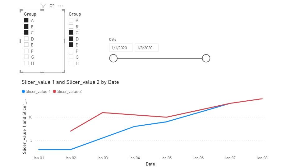
Its very close to what I need, is there a way to show the selected dimensions in the chart?
If I have a single selection from Slicer 1 and I select 3 from Slicer 2, is it possible to show all these 4 selections as separate lines in the chart?
- Mark as New
- Bookmark
- Subscribe
- Mute
- Subscribe to RSS Feed
- Permalink
- Report Inappropriate Content
Hi @PBIfanatic ,
We can create a measure to meet your requirement.
The measure calculate the sum total between [Slicer_value 1] and [Slicer_value 2].
Slicervalue total =
var _selected1 = VALUES('Slicer 1'[Group])
var _selected2 = VALUES('Slicer 2'[Group])
var _value1 = CALCULATE(SUM('Table'[value]),FILTER('Table', 'Table'[Group] in _selected1))
var _value2 = CALCULATE(SUM('Table'[value]),FILTER('Table', 'Table'[Group] in _selected2))
return
_value1 + _value2
If it doesn’t meet your requirement, could you please show the exact expected result based on the table that we have shared?
BTW, pbix as attached.
Best regards,
Community Support Team _ zhenbw
If this post helps, then please consider Accept it as the solution to help the other members find it more quickly.
- Mark as New
- Bookmark
- Subscribe
- Mute
- Subscribe to RSS Feed
- Permalink
- Report Inappropriate Content
HI, I have tried this approach and it worked, But
When no values are selected , its actually shows double the actual output.
like return value1+value2. Could you please suggest someting for that.
For slicer 1 and 2 i am using number values.
- Mark as New
- Bookmark
- Subscribe
- Mute
- Subscribe to RSS Feed
- Permalink
- Report Inappropriate Content
Hey,I have multiple slicers from multiple columns.Can this work for the same?
- Mark as New
- Bookmark
- Subscribe
- Mute
- Subscribe to RSS Feed
- Permalink
- Report Inappropriate Content
@PBIfanatic why would you do that, why not one slicer with multiple selections?
I would ❤ Kudos if my solution helped. 👉 If you can spend time posting the question, you can also make efforts to give Kudos whoever helped to solve your problem. It is a token of appreciation!
⚡Visit us at https://perytus.com, your one-stop shop for Power BI related projects/training/consultancy.⚡
Subscribe to the @PowerBIHowTo YT channel for an upcoming video on List and Record functions in Power Query!!
Learn Power BI and Fabric - subscribe to our YT channel - Click here: @PowerBIHowTo
If my solution proved useful, I'd be delighted to receive Kudos. When you put effort into asking a question, it's equally thoughtful to acknowledge and give Kudos to the individual who helped you solve the problem. It's a small gesture that shows appreciation and encouragement! ❤
Did I answer your question? Mark my post as a solution. Proud to be a Super User! Appreciate your Kudos 🙂
Feel free to email me with any of your BI needs.
- Mark as New
- Bookmark
- Subscribe
- Mute
- Subscribe to RSS Feed
- Permalink
- Report Inappropriate Content
@parry2k Its a requirement to show it in 2 filters...to have one selection as the core product and then other ones as a comparison.
Is this possible ?
- Mark as New
- Bookmark
- Subscribe
- Mute
- Subscribe to RSS Feed
- Permalink
- Report Inappropriate Content
@PBIfanatic yes you can surely have multiple slicers from the same column.
I would ❤ Kudos if my solution helped. 👉 If you can spend time posting the question, you can also make efforts to give Kudos whoever helped to solve your problem. It is a token of appreciation!
⚡Visit us at https://perytus.com, your one-stop shop for Power BI related projects/training/consultancy.⚡
Subscribe to the @PowerBIHowTo YT channel for an upcoming video on List and Record functions in Power Query!!
Learn Power BI and Fabric - subscribe to our YT channel - Click here: @PowerBIHowTo
If my solution proved useful, I'd be delighted to receive Kudos. When you put effort into asking a question, it's equally thoughtful to acknowledge and give Kudos to the individual who helped you solve the problem. It's a small gesture that shows appreciation and encouragement! ❤
Did I answer your question? Mark my post as a solution. Proud to be a Super User! Appreciate your Kudos 🙂
Feel free to email me with any of your BI needs.
- Mark as New
- Bookmark
- Subscribe
- Mute
- Subscribe to RSS Feed
- Permalink
- Report Inappropriate Content
@parry2k thanks!
How can I show both the selections in a single chart, lets say a line chart. I need to have both of the selections to show in legend. I have a measure and a time dimension as well, so this needs to fit in the legend and I need to see how both selections have performed over time.
Helpful resources

Power BI Dataviz World Championships
The Power BI Data Visualization World Championships is back! Get ahead of the game and start preparing now!

| User | Count |
|---|---|
| 41 | |
| 39 | |
| 37 | |
| 29 | |
| 24 |
| User | Count |
|---|---|
| 119 | |
| 100 | |
| 72 | |
| 69 | |
| 65 |
