New Offer! Become a Certified Fabric Data Engineer
Check your eligibility for this 50% exam voucher offer and join us for free live learning sessions to get prepared for Exam DP-700.
Get Started- Power BI forums
- Get Help with Power BI
- Desktop
- Service
- Report Server
- Power Query
- Mobile Apps
- Developer
- DAX Commands and Tips
- Custom Visuals Development Discussion
- Health and Life Sciences
- Power BI Spanish forums
- Translated Spanish Desktop
- Training and Consulting
- Instructor Led Training
- Dashboard in a Day for Women, by Women
- Galleries
- Community Connections & How-To Videos
- COVID-19 Data Stories Gallery
- Themes Gallery
- Data Stories Gallery
- R Script Showcase
- Webinars and Video Gallery
- Quick Measures Gallery
- 2021 MSBizAppsSummit Gallery
- 2020 MSBizAppsSummit Gallery
- 2019 MSBizAppsSummit Gallery
- Events
- Ideas
- Custom Visuals Ideas
- Issues
- Issues
- Events
- Upcoming Events
Don't miss out! 2025 Microsoft Fabric Community Conference, March 31 - April 2, Las Vegas, Nevada. Use code MSCUST for a $150 discount. Prices go up February 11th. Register now.
- Power BI forums
- Forums
- Get Help with Power BI
- Desktop
- Re: Sales by Day, week and month
- Subscribe to RSS Feed
- Mark Topic as New
- Mark Topic as Read
- Float this Topic for Current User
- Bookmark
- Subscribe
- Printer Friendly Page
- Mark as New
- Bookmark
- Subscribe
- Mute
- Subscribe to RSS Feed
- Permalink
- Report Inappropriate Content
Sales by Day, week and month
Hello all,
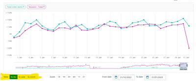
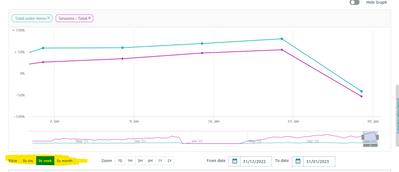
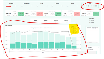
I have a sales overview chart which shows the adsales etc on the selected date range. I now have a requirement where the client wants to see data by day, by week abd by monthly as available in amazon accounts (screenshot attached).
I have created a filter measure (By day, By week and By month), however I am struck with how to proceed with the formula.
I am trying to use IF/Switch, for example,
SELECTEDVALUE('Filter Measure Sales'[Measure]) = "By Month", DATE(MONTH(TODAY()),
SELECTEDVALUE('Filter Measure Sales'[Measure]) ="By Week", DATE(WEEKDAY(TODAY()),
BLANK()))
Unsure how to correct the formulae, help me out please !
Solved! Go to Solution.
- Mark as New
- Bookmark
- Subscribe
- Mute
- Subscribe to RSS Feed
- Permalink
- Report Inappropriate Content
You can use a field parameter to allow the user to choose the date granularity. There's a video explaining it at https://www.youtube.com/watch?v=KReYWx5NXYg and that also explains how to automatically adjust the date range for the chart dependent on which granularity is chosen
- Mark as New
- Bookmark
- Subscribe
- Mute
- Subscribe to RSS Feed
- Permalink
- Report Inappropriate Content
Hi , @Anusha_Banda
According to your description, you want to add a slicer to select the dimension showing on the x-axis.
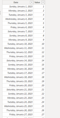
This is my test data:
We can create a date table as a dimension table and create relationship between two tables.
Date = ADDCOLUMNS(
CALENDAR(FIRSTDATE('Table'[Date]),LASTDATE('Table'[Date])),
"Year", YEAR ( [Date] ),
"Month", MONTH([Date]),
"Month_Name" , FORMAT([Date],"mmmm"),
"Week", weeknum([Date])& "week"
)
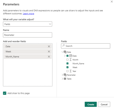
Then we can create a field parameter,like this:
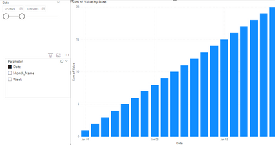
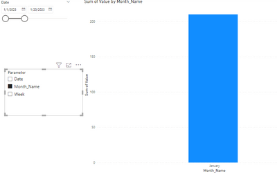
Then we can control the dimension on the x-asxi:
Thank you for your time and sharing, and thank you for your support and understanding of PowerBI!
Best Regards,
Aniya Zhang
If this post helps, then please consider Accept it as the solution to help the other members find it more quickly
- Mark as New
- Bookmark
- Subscribe
- Mute
- Subscribe to RSS Feed
- Permalink
- Report Inappropriate Content
Thank you for the quick response. It worked 🙂
- Mark as New
- Bookmark
- Subscribe
- Mute
- Subscribe to RSS Feed
- Permalink
- Report Inappropriate Content
Hi , @Anusha_Banda
According to your description, you want to add a slicer to select the dimension showing on the x-axis.
This is my test data:
We can create a date table as a dimension table and create relationship between two tables.
Date = ADDCOLUMNS(
CALENDAR(FIRSTDATE('Table'[Date]),LASTDATE('Table'[Date])),
"Year", YEAR ( [Date] ),
"Month", MONTH([Date]),
"Month_Name" , FORMAT([Date],"mmmm"),
"Week", weeknum([Date])& "week"
)
Then we can create a field parameter,like this:
Then we can control the dimension on the x-asxi:
Thank you for your time and sharing, and thank you for your support and understanding of PowerBI!
Best Regards,
Aniya Zhang
If this post helps, then please consider Accept it as the solution to help the other members find it more quickly
- Mark as New
- Bookmark
- Subscribe
- Mute
- Subscribe to RSS Feed
- Permalink
- Report Inappropriate Content
You can use a field parameter to allow the user to choose the date granularity. There's a video explaining it at https://www.youtube.com/watch?v=KReYWx5NXYg and that also explains how to automatically adjust the date range for the chart dependent on which granularity is chosen
Helpful resources

Join us at the Microsoft Fabric Community Conference
March 31 - April 2, 2025, in Las Vegas, Nevada. Use code MSCUST for a $150 discount! Prices go up Feb. 11th.

Power BI Monthly Update - January 2025
Check out the January 2025 Power BI update to learn about new features in Reporting, Modeling, and Data Connectivity.

| User | Count |
|---|---|
| 144 | |
| 76 | |
| 63 | |
| 51 | |
| 48 |
| User | Count |
|---|---|
| 211 | |
| 86 | |
| 64 | |
| 59 | |
| 56 |
