- Power BI forums
- Updates
- News & Announcements
- Get Help with Power BI
- Desktop
- Service
- Report Server
- Power Query
- Mobile Apps
- Developer
- DAX Commands and Tips
- Custom Visuals Development Discussion
- Health and Life Sciences
- Power BI Spanish forums
- Translated Spanish Desktop
- Power Platform Integration - Better Together!
- Power Platform Integrations (Read-only)
- Power Platform and Dynamics 365 Integrations (Read-only)
- Training and Consulting
- Instructor Led Training
- Dashboard in a Day for Women, by Women
- Galleries
- Community Connections & How-To Videos
- COVID-19 Data Stories Gallery
- Themes Gallery
- Data Stories Gallery
- R Script Showcase
- Webinars and Video Gallery
- Quick Measures Gallery
- 2021 MSBizAppsSummit Gallery
- 2020 MSBizAppsSummit Gallery
- 2019 MSBizAppsSummit Gallery
- Events
- Ideas
- Custom Visuals Ideas
- Issues
- Issues
- Events
- Upcoming Events
- Community Blog
- Power BI Community Blog
- Custom Visuals Community Blog
- Community Support
- Community Accounts & Registration
- Using the Community
- Community Feedback
Register now to learn Fabric in free live sessions led by the best Microsoft experts. From Apr 16 to May 9, in English and Spanish.
- Power BI forums
- Forums
- Get Help with Power BI
- Desktop
- Re: Ribbon chart to show both value and percentage...
- Subscribe to RSS Feed
- Mark Topic as New
- Mark Topic as Read
- Float this Topic for Current User
- Bookmark
- Subscribe
- Printer Friendly Page
- Mark as New
- Bookmark
- Subscribe
- Mute
- Subscribe to RSS Feed
- Permalink
- Report Inappropriate Content
Ribbon chart to show both value and percentage.
Hi Team,
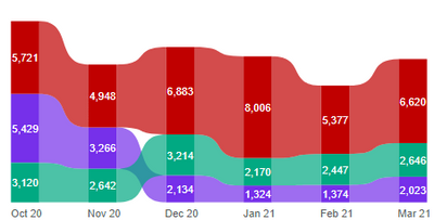
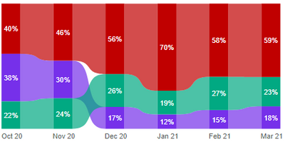
Below are 2 ribbon charts. Chart A is plotted with values and Chart B shows the same values in percentage of the catogories.
Both the charts are correct in its own way, however i want to show only one chart ie. Chart A but the label should show both values and percentage of the categories. like for eg 5,721(40%). I tried using Dax Studio, failed miserably.
Could anybody help me with this problem?
Thank you.
Chart A
Chart (B)
Solved! Go to Solution.
- Mark as New
- Bookmark
- Subscribe
- Mute
- Subscribe to RSS Feed
- Permalink
- Report Inappropriate Content
I have had some success with the Charticulator but just playing around with it. Nothing done in anger yet.
Its an inellegant solution but I have had success with overlaying one chart on another with the transparency set to 100% other than key parts. Its not great but I try to stay away from third party visuals after getting burnt a few times.
- Mark as New
- Bookmark
- Subscribe
- Mute
- Subscribe to RSS Feed
- Permalink
- Report Inappropriate Content
Hello, I dont believe there is a way to achieve what you are looking for. The closest would be to put the other measure in the tooltips so users would see it on hover.
- Mark as New
- Bookmark
- Subscribe
- Mute
- Subscribe to RSS Feed
- Permalink
- Report Inappropriate Content
Thanks for your quick reply @samdthompson
Yes, as you rightly confirmed my thought that there is no direct solution as there is no control on Y axis, i was looking more on out of box solution.
1. Can the new Charticulator in Power BI desktop help to recreate a ribbon chart from scratch?
2. Is there any other chart which helps on this requirement?
Thank you.
- Mark as New
- Bookmark
- Subscribe
- Mute
- Subscribe to RSS Feed
- Permalink
- Report Inappropriate Content
I have had some success with the Charticulator but just playing around with it. Nothing done in anger yet.
Its an inellegant solution but I have had success with overlaying one chart on another with the transparency set to 100% other than key parts. Its not great but I try to stay away from third party visuals after getting burnt a few times.
- Mark as New
- Bookmark
- Subscribe
- Mute
- Subscribe to RSS Feed
- Permalink
- Report Inappropriate Content
Wish there was an alternative solution. I am are too pampered by the flexibility of excel, that i see new products from Microsoft through the lens of excel.
- Mark as New
- Bookmark
- Subscribe
- Mute
- Subscribe to RSS Feed
- Permalink
- Report Inappropriate Content
I am looking through the same lenses as you at the moment. So far alot of things are harder to do / not supported in BI that were done in excel native visualization utilizing power query, and power pivot. So far the only benefit for the move to BI for me is ease of hosting and drilling into the data on the front end. I was ok coding my line axis to work with a pareto but not being able to have a bar/line graph with line on seperate axis is a bit of an eye roll
Helpful resources

Microsoft Fabric Learn Together
Covering the world! 9:00-10:30 AM Sydney, 4:00-5:30 PM CET (Paris/Berlin), 7:00-8:30 PM Mexico City

Power BI Monthly Update - April 2024
Check out the April 2024 Power BI update to learn about new features.

| User | Count |
|---|---|
| 106 | |
| 97 | |
| 75 | |
| 63 | |
| 62 |
| User | Count |
|---|---|
| 135 | |
| 105 | |
| 104 | |
| 80 | |
| 65 |


