- Power BI forums
- Updates
- News & Announcements
- Get Help with Power BI
- Desktop
- Service
- Report Server
- Power Query
- Mobile Apps
- Developer
- DAX Commands and Tips
- Custom Visuals Development Discussion
- Health and Life Sciences
- Power BI Spanish forums
- Translated Spanish Desktop
- Power Platform Integration - Better Together!
- Power Platform Integrations (Read-only)
- Power Platform and Dynamics 365 Integrations (Read-only)
- Training and Consulting
- Instructor Led Training
- Dashboard in a Day for Women, by Women
- Galleries
- Community Connections & How-To Videos
- COVID-19 Data Stories Gallery
- Themes Gallery
- Data Stories Gallery
- R Script Showcase
- Webinars and Video Gallery
- Quick Measures Gallery
- 2021 MSBizAppsSummit Gallery
- 2020 MSBizAppsSummit Gallery
- 2019 MSBizAppsSummit Gallery
- Events
- Ideas
- Custom Visuals Ideas
- Issues
- Issues
- Events
- Upcoming Events
- Community Blog
- Power BI Community Blog
- Custom Visuals Community Blog
- Community Support
- Community Accounts & Registration
- Using the Community
- Community Feedback
Register now to learn Fabric in free live sessions led by the best Microsoft experts. From Apr 16 to May 9, in English and Spanish.
- Power BI forums
- Forums
- Get Help with Power BI
- Desktop
- Ribbon Chart does not show all the four categories
- Subscribe to RSS Feed
- Mark Topic as New
- Mark Topic as Read
- Float this Topic for Current User
- Bookmark
- Subscribe
- Printer Friendly Page
- Mark as New
- Bookmark
- Subscribe
- Mute
- Subscribe to RSS Feed
- Permalink
- Report Inappropriate Content
Ribbon Chart does not show all the four categories
Hello all,
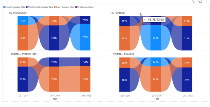
I am trying to make a Ribbon chart . I have 4 categories, but I dont see my category with purple color in any of my graphs.
In addition, Why in the first graphic the 74.4% is so big in size related to the 74.5% in blue. They are almost the same number.
Same case in my second graph, 71.5 double the size of 71.7 even if is a smaller number.
thank you for helping to understand.
Tatiana
- Mark as New
- Bookmark
- Subscribe
- Mute
- Subscribe to RSS Feed
- Permalink
- Report Inappropriate Content
Hi @Tatibella
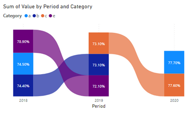
This looks weird. Can you please convert this ribbon chart to a table visual to show the data used to populate this chart? Is the purple category getting all blank values so it is missing in the chart?
And is the field on the Y-axis a measure or a column? What's the formula for it? If possible, can you please create a simple demo pbix that can reproduce this problem and share it with us? Or provide some sample data and steps that I can follow to reproduce this problem? How to provide sample data in the Power BI Forum - Microsoft Power BI Community
At present I'm not able to reproduce this problem.
Best Regards,
Community Support Team _ Jing
Helpful resources

Microsoft Fabric Learn Together
Covering the world! 9:00-10:30 AM Sydney, 4:00-5:30 PM CET (Paris/Berlin), 7:00-8:30 PM Mexico City

Power BI Monthly Update - April 2024
Check out the April 2024 Power BI update to learn about new features.

| User | Count |
|---|---|
| 105 | |
| 97 | |
| 80 | |
| 67 | |
| 63 |
| User | Count |
|---|---|
| 147 | |
| 110 | |
| 108 | |
| 85 | |
| 64 |


