New Offer! Become a Certified Fabric Data Engineer
Check your eligibility for this 50% exam voucher offer and join us for free live learning sessions to get prepared for Exam DP-700.
Get Started- Power BI forums
- Get Help with Power BI
- Desktop
- Service
- Report Server
- Power Query
- Mobile Apps
- Developer
- DAX Commands and Tips
- Custom Visuals Development Discussion
- Health and Life Sciences
- Power BI Spanish forums
- Translated Spanish Desktop
- Training and Consulting
- Instructor Led Training
- Dashboard in a Day for Women, by Women
- Galleries
- Community Connections & How-To Videos
- COVID-19 Data Stories Gallery
- Themes Gallery
- Data Stories Gallery
- R Script Showcase
- Webinars and Video Gallery
- Quick Measures Gallery
- 2021 MSBizAppsSummit Gallery
- 2020 MSBizAppsSummit Gallery
- 2019 MSBizAppsSummit Gallery
- Events
- Ideas
- Custom Visuals Ideas
- Issues
- Issues
- Events
- Upcoming Events
Don't miss out! 2025 Microsoft Fabric Community Conference, March 31 - April 2, Las Vegas, Nevada. Use code MSCUST for a $150 discount. Prices go up February 11th. Register now.
- Power BI forums
- Forums
- Get Help with Power BI
- Desktop
- Re: Reset aggregation measure at the start of each...
- Subscribe to RSS Feed
- Mark Topic as New
- Mark Topic as Read
- Float this Topic for Current User
- Bookmark
- Subscribe
- Printer Friendly Page
- Mark as New
- Bookmark
- Subscribe
- Mute
- Subscribe to RSS Feed
- Permalink
- Report Inappropriate Content
Reset aggregation measure at the start of each year
Hi all
I hope you can help
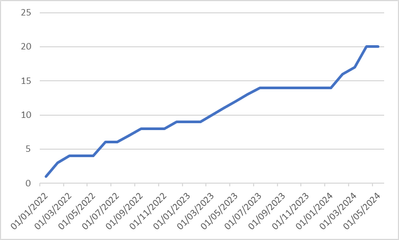
I have a measure to generate a "running total" line chart to show spend over time i.e. when a new spend is made the line chart adds that spend to the previous one so the line goes up.
This works great when looking at my data as a whole as I get a full trend of my spend
example picture:
However, I would like to advance this further by having the measure reset the aggregation start point at the start of each year to £0 spend. This will give me a line chart which trends spend over multiple years which I can plot against a yearly fluctuating budget
So something like this:
How can I adapt my measure to achieve this?
Thanks for your help
Matt
Solved! Go to Solution.
- Mark as New
- Bookmark
- Subscribe
- Mute
- Subscribe to RSS Feed
- Permalink
- Report Inappropriate Content
Try
Running Total Actual =
VAR MaxDate =
    MAX ( TimeSet[TimeByDay] )
VAR StartOfCurrentYear =
    DATE ( YEAR ( MaxDate ), 1, 1 )
RETURN
    CALCULATE (
        SUM ( 'Tasks & Baselines'[TaskFixedCost] ),
        USERELATIONSHIP ( TimeSet[TimeByDay], 'Tasks & Baselines'[TaskFinishDate] ),
        DATESBETWEEN ( 'TimeSet'[TimeByDay], StartOfCurrentYear, MaxDate )
    )
- Mark as New
- Bookmark
- Subscribe
- Mute
- Subscribe to RSS Feed
- Permalink
- Report Inappropriate Content
Perfect, thank you very much!!!!
Matt
- Mark as New
- Bookmark
- Subscribe
- Mute
- Subscribe to RSS Feed
- Permalink
- Report Inappropriate Content
Try
Running Total Actual =
VAR MaxDate =
    MAX ( TimeSet[TimeByDay] )
VAR StartOfCurrentYear =
    DATE ( YEAR ( MaxDate ), 1, 1 )
RETURN
    CALCULATE (
        SUM ( 'Tasks & Baselines'[TaskFixedCost] ),
        USERELATIONSHIP ( TimeSet[TimeByDay], 'Tasks & Baselines'[TaskFinishDate] ),
        DATESBETWEEN ( 'TimeSet'[TimeByDay], StartOfCurrentYear, MaxDate )
    )
Helpful resources

Join us at the Microsoft Fabric Community Conference
March 31 - April 2, 2025, in Las Vegas, Nevada. Use code MSCUST for a $150 discount!

Power BI Monthly Update - January 2025
Check out the January 2025 Power BI update to learn about new features in Reporting, Modeling, and Data Connectivity.

| User | Count |
|---|---|
| 124 | |
| 79 | |
| 50 | |
| 38 | |
| 38 |
| User | Count |
|---|---|
| 196 | |
| 80 | |
| 70 | |
| 51 | |
| 42 |


