Fabric Data Days starts November 4th!
Advance your Data & AI career with 50 days of live learning, dataviz contests, hands-on challenges, study groups & certifications and more!
Get registered- Power BI forums
- Get Help with Power BI
- Desktop
- Service
- Report Server
- Power Query
- Mobile Apps
- Developer
- DAX Commands and Tips
- Custom Visuals Development Discussion
- Health and Life Sciences
- Power BI Spanish forums
- Translated Spanish Desktop
- Training and Consulting
- Instructor Led Training
- Dashboard in a Day for Women, by Women
- Galleries
- Data Stories Gallery
- Themes Gallery
- Contests Gallery
- QuickViz Gallery
- Quick Measures Gallery
- Visual Calculations Gallery
- Notebook Gallery
- Translytical Task Flow Gallery
- TMDL Gallery
- R Script Showcase
- Webinars and Video Gallery
- Ideas
- Custom Visuals Ideas (read-only)
- Issues
- Issues
- Events
- Upcoming Events
Get Fabric Certified for FREE during Fabric Data Days. Don't miss your chance! Request now
- Power BI forums
- Forums
- Get Help with Power BI
- Desktop
- Requesting Help to Calculate Multi-Level Fail Rate...
- Subscribe to RSS Feed
- Mark Topic as New
- Mark Topic as Read
- Float this Topic for Current User
- Bookmark
- Subscribe
- Printer Friendly Page
- Mark as New
- Bookmark
- Subscribe
- Mute
- Subscribe to RSS Feed
- Permalink
- Report Inappropriate Content
Requesting Help to Calculate Multi-Level Fail Rate on a Line Chart+Slicer Combination
Hello,
I have a set of data that looks like the one I have pasted below.
Data -
There are two regions - R1 and R2. And each region has three groups - R1 has G1, G2, G3 and R2 has G4, G5, G6.
Then, there are Volumes and Fails for each date-region-group combination, from which the Fail Rate is calculated (Fail/Volume).
My requirement -
I need to show the Fail Rate on a Line Chart.
It should only show the Fail rate for each date. Then, there would be two slicers for region and group.
So,when I select R1 in the region slicer, then the chart should show the Fail Rate for R1. If I select G5 in the Group filter, then the chart should show the Fail Rate for G5.
Challenge -
The challenge that I am facing with the below data is that, when I represent this on a Line Chart, and then put in a slicer and select R1, then it sums up the Fail Rate, which is incorrect.
How can resolve this?
As explained, I need the original view as only date-wise Fail Rate and as and when slicers are selected, then those rates should pop-up.
I know, I can calculate three separate fail rates, one for Date-wise, one for region-wise and one for group-wise, but then I will have to put that into three charts and not one.
I hope my explaination makes sense.
Any support will be much appreciated.
Thank You so much.
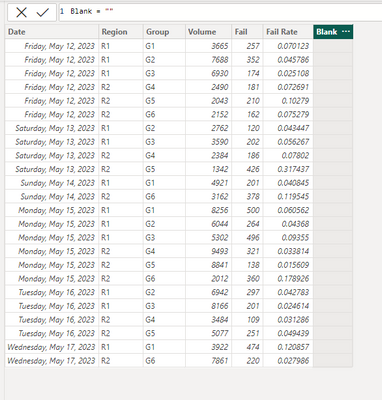
| Date | Region | Group | Volume | Fail | Fail Rate |
| 5/12/2023 | R1 | G1 | 3665 | 257 | 0.070123 |
| 5/12/2023 | R1 | G2 | 7688 | 352 | 0.045786 |
| 5/12/2023 | R1 | G3 | 6930 | 174 | 0.025108 |
| 5/12/2023 | R2 | G4 | 2490 | 181 | 0.072691 |
| 5/12/2023 | R2 | G5 | 2043 | 210 | 0.10279 |
| 5/12/2023 | R2 | G6 | 2152 | 162 | 0.075279 |
| 5/13/2023 | R1 | G2 | 2762 | 120 | 0.043447 |
| 5/13/2023 | R1 | G3 | 3590 | 202 | 0.056267 |
| 5/13/2023 | R2 | G4 | 2384 | 186 | 0.07802 |
| 5/13/2023 | R2 | G5 | 1342 | 426 | 0.317437 |
| 5/14/2023 | R1 | G1 | 4921 | 201 | 0.040845 |
| 5/14/2023 | R2 | G6 | 3162 | 378 | 0.119545 |
| 5/15/2023 | R1 | G1 | 8256 | 500 | 0.060562 |
| 5/15/2023 | R1 | G2 | 6044 | 264 | 0.04368 |
| 5/15/2023 | R1 | G3 | 5302 | 496 | 0.09355 |
| 5/15/2023 | R2 | G4 | 9493 | 321 | 0.033814 |
| 5/15/2023 | R2 | G5 | 8841 | 138 | 0.015609 |
| 5/15/2023 | R2 | G6 | 2012 | 360 | 0.178926 |
| 5/16/2023 | R1 | G2 | 6942 | 297 | 0.042783 |
| 5/16/2023 | R1 | G3 | 8166 | 201 | 0.024614 |
| 5/16/2023 | R2 | G4 | 3484 | 109 | 0.031286 |
| 5/16/2023 | R2 | G5 | 5077 | 251 | 0.049439 |
| 5/17/2023 | R1 | G1 | 3922 | 474 | 0.120857 |
| 5/17/2023 | R2 | G6 | 7861 | 220 | 0.027986 |
Thank You
Solved! Go to Solution.
- Mark as New
- Bookmark
- Subscribe
- Mute
- Subscribe to RSS Feed
- Permalink
- Report Inappropriate Content
Hi @It_Is_Me ,
Please try:
First add a new column:
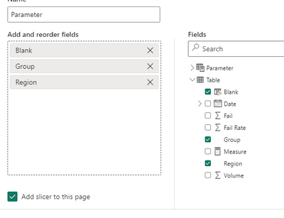
Then create a field parameter:
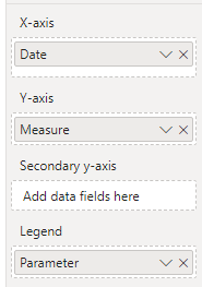
Then add the parameter to the legend of the line chart:
When you want to change the slicer, choose the parameter first:
Best Regards,
Jianbo Li
If this post helps, then please consider Accept it as the solution to help the other members find it more quickly.
Helpful resources

Fabric Data Days
Advance your Data & AI career with 50 days of live learning, contests, hands-on challenges, study groups & certifications and more!

Power BI Monthly Update - October 2025
Check out the October 2025 Power BI update to learn about new features.


