New Offer! Become a Certified Fabric Data Engineer
Check your eligibility for this 50% exam voucher offer and join us for free live learning sessions to get prepared for Exam DP-700.
Get Started- Power BI forums
- Get Help with Power BI
- Desktop
- Service
- Report Server
- Power Query
- Mobile Apps
- Developer
- DAX Commands and Tips
- Custom Visuals Development Discussion
- Health and Life Sciences
- Power BI Spanish forums
- Translated Spanish Desktop
- Training and Consulting
- Instructor Led Training
- Dashboard in a Day for Women, by Women
- Galleries
- Community Connections & How-To Videos
- COVID-19 Data Stories Gallery
- Themes Gallery
- Data Stories Gallery
- R Script Showcase
- Webinars and Video Gallery
- Quick Measures Gallery
- 2021 MSBizAppsSummit Gallery
- 2020 MSBizAppsSummit Gallery
- 2019 MSBizAppsSummit Gallery
- Events
- Ideas
- Custom Visuals Ideas
- Issues
- Issues
- Events
- Upcoming Events
Don't miss out! 2025 Microsoft Fabric Community Conference, March 31 - April 2, Las Vegas, Nevada. Use code MSCUST for a $150 discount. Prices go up February 11th. Register now.
- Power BI forums
- Forums
- Get Help with Power BI
- Desktop
- Re: Reporting on delimiter on single chart
- Subscribe to RSS Feed
- Mark Topic as New
- Mark Topic as Read
- Float this Topic for Current User
- Bookmark
- Subscribe
- Printer Friendly Page
- Mark as New
- Bookmark
- Subscribe
- Mute
- Subscribe to RSS Feed
- Permalink
- Report Inappropriate Content
Reporting on delimiter on single chart
Hi everyone,
I am working on a project in Power BI where I am taking an excel document where people picked their favorite applications in office but it could have been multiple choice. An example would be
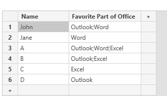
| Name | Favorite Part of Office |
| John | Outlook;Word |
| Jane | Word |
What is the best way to report on their favorite part of Office under one graph? Currently in PowerBI it will make "Outlook;Word" one selection so depending on the order they checked the answers it gets really messy really fast.
Solved! Go to Solution.
- Mark as New
- Bookmark
- Subscribe
- Mute
- Subscribe to RSS Feed
- Permalink
- Report Inappropriate Content
Hi @TRISTANCARY
I created a sample ,maybe you can refer to it .
Original Date:
(1)Use Split Column in Query Editor , to divide a column of values into multiple columns of single values according to the separator, like this
(2)Return to desktop view ,and create measures to count the rows for each part .
Word = COUNTROWS(FILTER('Table','Table'[Favorite Part of Office.1]="Word" || 'Table'[Favorite Part of Office.2]="Word" || 'Table'[Favorite Part of Office.3]="Word"))Outlook = COUNTROWS(FILTER('Table','Table'[Favorite Part of Office.1]="Outlook" || 'Table'[Favorite Part of Office.2]="Outlook" || 'Table'[Favorite Part of Office.3]="Outlook"))Excel = COUNTROWS(FILTER('Table','Table'[Favorite Part of Office.1]="Excel" || 'Table'[Favorite Part of Office.2]="Excel" || 'Table'[Favorite Part of Office.3]="Excel"))The results are as shown:
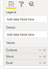
(3)Add a pie chart ,in the visual ,put the measures in Values .
I have attached my pbix file ,you can have a look .
Best Regards
Community Support Team _ Ailsa Tao
If this post helps, then please consider Accept it as the solution to help the other members find it more quickly.
- Mark as New
- Bookmark
- Subscribe
- Mute
- Subscribe to RSS Feed
- Permalink
- Report Inappropriate Content
yes, you can.
Subscribe to the @PowerBIHowTo YT channel for an upcoming video on List and Record functions in Power Query!!
Learn Power BI and Fabric - subscribe to our YT channel - Click here: @PowerBIHowTo
If my solution proved useful, I'd be delighted to receive Kudos. When you put effort into asking a question, it's equally thoughtful to acknowledge and give Kudos to the individual who helped you solve the problem. It's a small gesture that shows appreciation and encouragement! ❤
Did I answer your question? Mark my post as a solution. Proud to be a Super User! Appreciate your Kudos 🙂
Feel free to email me with any of your BI needs.
- Mark as New
- Bookmark
- Subscribe
- Mute
- Subscribe to RSS Feed
- Permalink
- Report Inappropriate Content
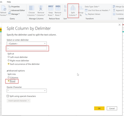
@TRISTANCARY it will make sense to split the data into rows in PQ and then everything will be easy to visualize
Check my latest blog post Comparing Selected Client With Other Top N Clients | PeryTUS I would ❤ Kudos if my solution helped. 👉 If you can spend time posting the question, you can also make efforts to give Kudos to whoever helped to solve your problem. It is a token of appreciation!
⚡Visit us at https://perytus.com, your one-stop-shop for Power BI-related projects/training/consultancy.⚡
Subscribe to the @PowerBIHowTo YT channel for an upcoming video on List and Record functions in Power Query!!
Learn Power BI and Fabric - subscribe to our YT channel - Click here: @PowerBIHowTo
If my solution proved useful, I'd be delighted to receive Kudos. When you put effort into asking a question, it's equally thoughtful to acknowledge and give Kudos to the individual who helped you solve the problem. It's a small gesture that shows appreciation and encouragement! ❤
Did I answer your question? Mark my post as a solution. Proud to be a Super User! Appreciate your Kudos 🙂
Feel free to email me with any of your BI needs.
- Mark as New
- Bookmark
- Subscribe
- Mute
- Subscribe to RSS Feed
- Permalink
- Report Inappropriate Content
When combining values into a single graph like below:
It seems to take the values and even with the same information it keeps it as seperate precentages from their different columns. Is there a way to unify them?
- Mark as New
- Bookmark
- Subscribe
- Mute
- Subscribe to RSS Feed
- Permalink
- Report Inappropriate Content
If you split it into rows can you add all split rows into the same graph? I don't believe power bi let's you combine multiple rows into one graph
Helpful resources

Join us at the Microsoft Fabric Community Conference
March 31 - April 2, 2025, in Las Vegas, Nevada. Use code MSCUST for a $150 discount!

Power BI Monthly Update - January 2025
Check out the January 2025 Power BI update to learn about new features in Reporting, Modeling, and Data Connectivity.

| User | Count |
|---|---|
| 97 | |
| 65 | |
| 45 | |
| 39 | |
| 31 |
| User | Count |
|---|---|
| 164 | |
| 111 | |
| 61 | |
| 53 | |
| 38 |


