Fabric Data Days starts November 4th!
Advance your Data & AI career with 50 days of live learning, dataviz contests, hands-on challenges, study groups & certifications and more!
Get registered- Power BI forums
- Get Help with Power BI
- Desktop
- Service
- Report Server
- Power Query
- Mobile Apps
- Developer
- DAX Commands and Tips
- Custom Visuals Development Discussion
- Health and Life Sciences
- Power BI Spanish forums
- Translated Spanish Desktop
- Training and Consulting
- Instructor Led Training
- Dashboard in a Day for Women, by Women
- Galleries
- Data Stories Gallery
- Themes Gallery
- Contests Gallery
- QuickViz Gallery
- Quick Measures Gallery
- Visual Calculations Gallery
- Notebook Gallery
- Translytical Task Flow Gallery
- TMDL Gallery
- R Script Showcase
- Webinars and Video Gallery
- Ideas
- Custom Visuals Ideas (read-only)
- Issues
- Issues
- Events
- Upcoming Events
Get Fabric Certified for FREE during Fabric Data Days. Don't miss your chance! Request now
- Power BI forums
- Forums
- Get Help with Power BI
- Desktop
- Relationship between KPIs and Targets on multiple ...
- Subscribe to RSS Feed
- Mark Topic as New
- Mark Topic as Read
- Float this Topic for Current User
- Bookmark
- Subscribe
- Printer Friendly Page
- Mark as New
- Bookmark
- Subscribe
- Mute
- Subscribe to RSS Feed
- Permalink
- Report Inappropriate Content
Relationship between KPIs and Targets on multiple datasets
I have target data for the KPIs in the different sheet as shown below. I don't know how to build relations between the both in PowerBI data model. I am trying to use the targets as dots on the Bar charts.
| Sheet 1 | Actual Data | ||||
| Plants | Freq | KPI 1 | KPI2 | KPI3 | |
| ABC | Week1 | 83% | 83% | 88% | |
| XYZ | Week1 | 75% | 85% | 84% | |
| TEST | Week1 | 76% | 90% | 98% | |
| ABC | Week2 | 71% | 93% | 100% | |
| XYZ | Week2 | 68% | 97% | 98% | |
| TEST | Week2 | 64% | 100% | 100% | |
| Sheet 2 | Target | ||||
| Plants | KPI 1 | KPI2 | KPI3 | ||
| ABC | 83% | 85% | 90% | ||
| XYZ | 75% | 86% | 95% | ||
| TEST | 76% | 88% | 92% |
- Mark as New
- Bookmark
- Subscribe
- Mute
- Subscribe to RSS Feed
- Permalink
- Report Inappropriate Content
Hi @lotus22 ,
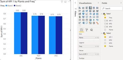
1. You can set the relationship between the two tables in the relationship view, Manage relationships-New
2. Place in the Bar chart
Is this the result you expect, if not, can you share sample data and sample output in table format? Or a sample pbix after removing sensitive data
You can downloaded PBIX file from here.
Best Regards,
Liu Yang
If this post helps, then please consider Accept it as the solution to help the other members find it more quickly.
Helpful resources

Power BI Monthly Update - November 2025
Check out the November 2025 Power BI update to learn about new features.

Fabric Data Days
Advance your Data & AI career with 50 days of live learning, contests, hands-on challenges, study groups & certifications and more!

| User | Count |
|---|---|
| 97 | |
| 71 | |
| 50 | |
| 47 | |
| 44 |


