New Offer! Become a Certified Fabric Data Engineer
Check your eligibility for this 50% exam voucher offer and join us for free live learning sessions to get prepared for Exam DP-700.
Get Started- Power BI forums
- Get Help with Power BI
- Desktop
- Service
- Report Server
- Power Query
- Mobile Apps
- Developer
- DAX Commands and Tips
- Custom Visuals Development Discussion
- Health and Life Sciences
- Power BI Spanish forums
- Translated Spanish Desktop
- Training and Consulting
- Instructor Led Training
- Dashboard in a Day for Women, by Women
- Galleries
- Community Connections & How-To Videos
- COVID-19 Data Stories Gallery
- Themes Gallery
- Data Stories Gallery
- R Script Showcase
- Webinars and Video Gallery
- Quick Measures Gallery
- 2021 MSBizAppsSummit Gallery
- 2020 MSBizAppsSummit Gallery
- 2019 MSBizAppsSummit Gallery
- Events
- Ideas
- Custom Visuals Ideas
- Issues
- Issues
- Events
- Upcoming Events
Don't miss out! 2025 Microsoft Fabric Community Conference, March 31 - April 2, Las Vegas, Nevada. Use code MSCUST for a $150 discount. Prices go up February 11th. Register now.
- Power BI forums
- Forums
- Get Help with Power BI
- Desktop
- Re: Reforming table and averaging multiple values ...
- Subscribe to RSS Feed
- Mark Topic as New
- Mark Topic as Read
- Float this Topic for Current User
- Bookmark
- Subscribe
- Printer Friendly Page
- Mark as New
- Bookmark
- Subscribe
- Mute
- Subscribe to RSS Feed
- Permalink
- Report Inappropriate Content
Reforming table and averaging multiple values for plotting
I'm a bit new to DAX but I'm quickly learning. However, I'm sort of stuck here. I've attached my pbix file with the raw data in case you guys are able to help me.
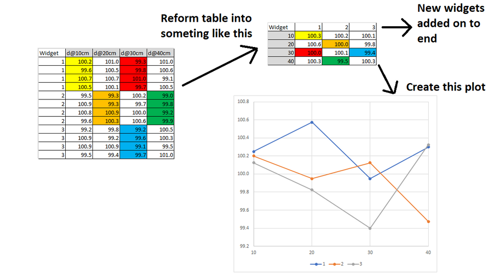
I've simplified the problem down into "widgets." There are multiple measurements for each "widget" taken along the length of the widget and I want to average the multiple measurements then plot the average value. The picture below shows what I'm trying to form the table into and then how I'd plot it.
So I basically need a table where the widgets run along one axis and the measurement points run along the other axis. Inside each cell is the average of all measurements for that widget at that location. New widgets should be added to the end of the able. New measurement locations will have to be hard-coded since the column names are strings.
.pbix file with data loaded here: https://www.dropbox.com/s/qi7ajoh7hif5wrd/Widget%20Test.pbix?dl=0
- Mark as New
- Bookmark
- Subscribe
- Mute
- Subscribe to RSS Feed
- Permalink
- Report Inappropriate Content
Hi @hamwagon11 ,
You could use the following formula to create a calculated table:
Table =
VAR _t =
    UNION (
        SELECTCOLUMNS (
            'Widgets',
            "Widgets", 'Widgets'[Widget],
            "d@At", "10",
            "Values", 'Widgets'[d@10cm]
        ),
        SELECTCOLUMNS (
            'Widgets',
            "Widgets", 'Widgets'[Widget],
            "d@At", "20",
            "Values", 'Widgets'[d@20cm]
        ),
        SELECTCOLUMNS (
            'Widgets',
            "Widgets", 'Widgets'[Widget],
            "d@At", "30",
            "Values", 'Widgets'[d@30cm]
        ),
        SELECTCOLUMNS (
            'Widgets',
            "Widgets", 'Widgets'[Widget],
            "d@At", "40",
            "Values", 'Widgets'[d@40cm]
        )
    )
RETURN
    GROUPBY ( _t, [d@At], [Widgets], "V", AVERAGEX ( CURRENTGROUP (), [Values] ) )
Or in Power Query, duplicate the Widgets table and do some transform ,but it will lead to an increase in memory/cpu to a certain extent.And normally memory consumption will reduce the performance and brings heavier load to the model.
So it is recommended to use DAX.
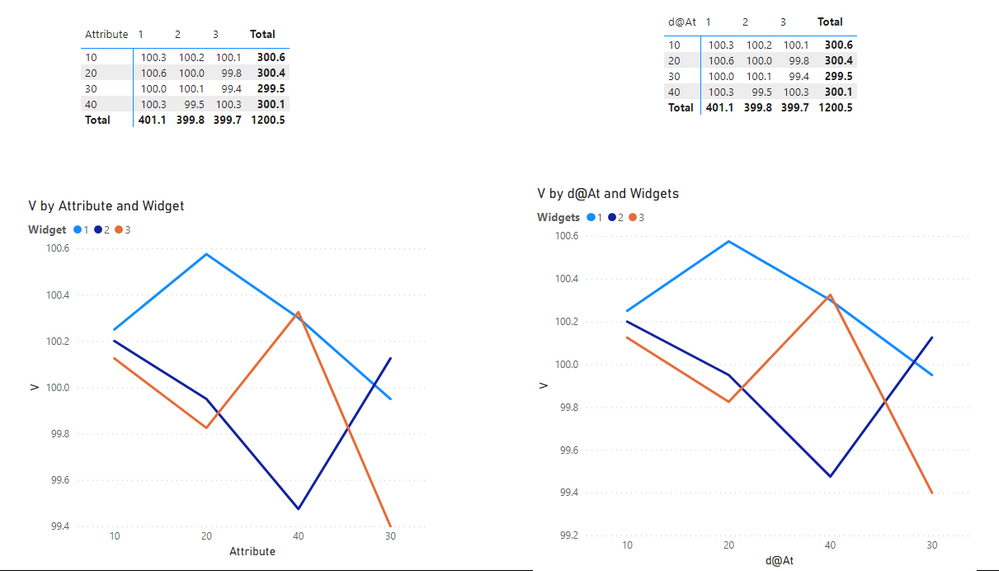
The final output is shown below:
Please take a look at the pbix file here .
Best Regards,
Eyelyn Qin
If this post helps, then please consider Accept it as the solution to help the other members find it more quickly.
- Mark as New
- Bookmark
- Subscribe
- Mute
- Subscribe to RSS Feed
- Permalink
- Report Inappropriate Content
Don't do this. Keep your data model as tight as possible with as few "off on the side" tables as possible.
- Mark as New
- Bookmark
- Subscribe
- Mute
- Subscribe to RSS Feed
- Permalink
- Report Inappropriate Content
Hi @littlemojopuppy ,
Thanks for your suggestion.😀 And I have already stated the drawbacks of the second method before: it will lead to an increase in memory/cpu to a certain extent.And normally memory consumption will reduce the performance and brings heavier load to the model. It is recommended to use DAX.
So for @hamwagon11 ,If the original table could be trandformed directly and will not affect other visualizations, unpivot is the best way. Otherwise, you could create a calculated table.I just propose more solutions for you to choose and sorry for the misunderstanding...
Best Regards,
Eyelyn Qin
- Mark as New
- Bookmark
- Subscribe
- Mute
- Subscribe to RSS Feed
- Permalink
- Report Inappropriate Content
Hi @v-eqin-msft
No worries! I mentioned in a previous response to this that "I've developed a theory which is impossible to test that the simplicity of a data model is inversely proportional to the lines of code to deal with a bad model." When I was in grad school the second time around, I came across a series of articles by an author (I believe his last name was Sessions but that was seven years ago) that had to do with simplicity in IT and rang true to me. His premise had to do with the number of integrations among systems. I apply that to part of my work, but it's also applicable within a given project, in this case a tabular data model.
I've seen lots of people that either worked for me or in this or other forums try to write really convoluted code in several languages to compensate for bad design. @hamwagon11 could write all kinds of code to accommodate his bad data model. Or create a better design and make it much easier. I don't see anything in any of those visualizations that couldn't be accomplished with a good data model plus the right measures.
- Mark as New
- Bookmark
- Subscribe
- Mute
- Subscribe to RSS Feed
- Permalink
- Report Inappropriate Content
This would be very easy to accomplish if you were to unpivot your columns of "d@10cm", "d@20cm", etc. into a single field with those column headings as values.
- Mark as New
- Bookmark
- Subscribe
- Mute
- Subscribe to RSS Feed
- Permalink
- Report Inappropriate Content
So I played around with this a bit more and here's what I did...
1. Unpivoted the d(at)... . columns which gave me an Attribute column.
2. Created a column that converts the d(at)10cm, etc. to 10, 20, 30, 40 for plotting.
3. Used Group By in the Power Query Editor to group by Attribute and Widget number and return the average.
This got me what I wanted with one minor issue which is that hte original table is gone. So I guess my last question would be: what's the easiest way to preserve the original table and to have this new table?
Thank you so much for the help.
- Mark as New
- Bookmark
- Subscribe
- Mute
- Subscribe to RSS Feed
- Permalink
- Report Inappropriate Content
Hi @hamwagon11. Apologies for the delayed response...I had the pleasure of showcasing a new suite of reports to C-suite execs today.
You should have stopped at unpivoting the columns that gave you an attribute column. Everything from that point forward should have been a measure. I've developed a theory which is impossible to test that the simplicity of a data model is inversely proportional to the lines of code to deal with a bad model.
I would not suggest creating a separate table just for one visualization...you'll create problems with syncing slicers and that kind of noise you don't want.
Can you provide a modified PBIX file that stops at unpivoting the column?
Helpful resources

Join us at the Microsoft Fabric Community Conference
March 31 - April 2, 2025, in Las Vegas, Nevada. Use code MSCUST for a $150 discount!

Power BI Monthly Update - January 2025
Check out the January 2025 Power BI update to learn about new features in Reporting, Modeling, and Data Connectivity.

| User | Count |
|---|---|
| 96 | |
| 69 | |
| 43 | |
| 38 | |
| 29 |
| User | Count |
|---|---|
| 154 | |
| 93 | |
| 63 | |
| 42 | |
| 41 |


