FabCon is coming to Atlanta
Join us at FabCon Atlanta from March 16 - 20, 2026, for the ultimate Fabric, Power BI, AI and SQL community-led event. Save $200 with code FABCOMM.
Register now!- Power BI forums
- Get Help with Power BI
- Desktop
- Service
- Report Server
- Power Query
- Mobile Apps
- Developer
- DAX Commands and Tips
- Custom Visuals Development Discussion
- Health and Life Sciences
- Power BI Spanish forums
- Translated Spanish Desktop
- Training and Consulting
- Instructor Led Training
- Dashboard in a Day for Women, by Women
- Galleries
- Data Stories Gallery
- Themes Gallery
- Contests Gallery
- Quick Measures Gallery
- Notebook Gallery
- Translytical Task Flow Gallery
- TMDL Gallery
- R Script Showcase
- Webinars and Video Gallery
- Ideas
- Custom Visuals Ideas (read-only)
- Issues
- Issues
- Events
- Upcoming Events
Join the Fabric FabCon Global Hackathon—running virtually through Nov 3. Open to all skill levels. $10,000 in prizes! Register now.
- Power BI forums
- Forums
- Get Help with Power BI
- Desktop
- Re: group models <10%
- Subscribe to RSS Feed
- Mark Topic as New
- Mark Topic as Read
- Float this Topic for Current User
- Bookmark
- Subscribe
- Printer Friendly Page
- Mark as New
- Bookmark
- Subscribe
- Mute
- Subscribe to RSS Feed
- Permalink
- Report Inappropriate Content
Re: group models <10%
Good morning!
I have an issue that you may know how to help me.
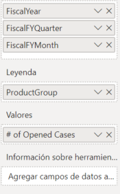
Ive been working with a line chart. So I have:
AXE / EJE : Leyend: Values:
- fiscalyear - ProductGroup # of opened Cases
- fiscal quarter
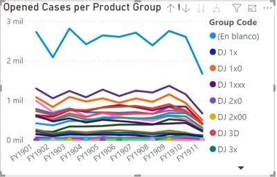
I would like to group the product group that are <10% and to show or name them as others. For the groups that are >10% I want the normal names. This is with the objective i can see a cleaner graphic and not see a lot of lines in the chart.
**Remember that im working through live connection and I can not create colums or tables inside power BI. All the metrics come from SSAS. I put an image so you can see better the issue I have:
Thank YOu!
Best Regards,
- Mark as New
- Bookmark
- Subscribe
- Mute
- Subscribe to RSS Feed
- Permalink
- Report Inappropriate Content
Hi,
After my test, i can easily change your original group by adding calculated columns.
However, Live Connection has limited this function but only can creating measure.
So for your requirement, there is no direct way to solve it.
There is a workaround that you can try to shrink Y-axis or change all lines' colors to one color at the bottom of visual.
Best Regards,
Giotto Zhi
- Mark as New
- Bookmark
- Subscribe
- Mute
- Subscribe to RSS Feed
- Permalink
- Report Inappropriate Content
Hi @Anonymous
Not sure how you would achieve the result you seek, without the ability to create calculated columns. Aren't you able to download the pbix from the Power BI Service and edit that in Desktop?
Failing that, a workaround might be if you changed the Y-axis lower limit to begin above the 10% threshold, so all categories that fall below it would appear as a single line at the bottom.
Hope that helps,
Best,
Tom


