Get Fabric certified for FREE!
Don't miss your chance to take exam DP-600 or DP-700 on us!
Request now- Power BI forums
- Get Help with Power BI
- Desktop
- Service
- Report Server
- Power Query
- Mobile Apps
- Developer
- DAX Commands and Tips
- Custom Visuals Development Discussion
- Health and Life Sciences
- Power BI Spanish forums
- Translated Spanish Desktop
- Training and Consulting
- Instructor Led Training
- Dashboard in a Day for Women, by Women
- Galleries
- Data Stories Gallery
- Themes Gallery
- Contests Gallery
- QuickViz Gallery
- Quick Measures Gallery
- Visual Calculations Gallery
- Notebook Gallery
- Translytical Task Flow Gallery
- TMDL Gallery
- R Script Showcase
- Webinars and Video Gallery
- Ideas
- Custom Visuals Ideas (read-only)
- Issues
- Issues
- Events
- Upcoming Events
Learn from the best! Meet the four finalists headed to the FINALS of the Power BI Dataviz World Championships! Register now
- Power BI forums
- Forums
- Get Help with Power BI
- Desktop
- Rank Visualization and rounddown
- Subscribe to RSS Feed
- Mark Topic as New
- Mark Topic as Read
- Float this Topic for Current User
- Bookmark
- Subscribe
- Printer Friendly Page
- Mark as New
- Bookmark
- Subscribe
- Mute
- Subscribe to RSS Feed
- Permalink
- Report Inappropriate Content
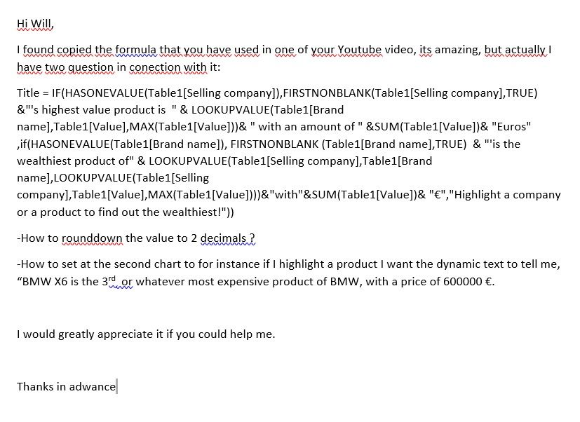
Rank Visualization and rounddown

as you see this is What I'd like to solve, today.
I'greatly appreciate your help.
Thanks
Solved! Go to Solution.
- Mark as New
- Bookmark
- Subscribe
- Mute
- Subscribe to RSS Feed
- Permalink
- Report Inappropriate Content
You can use ROUNDDOWN() Function to round down the value to 2 decimals.
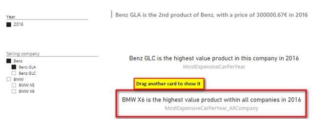
In my chart, when a company is selected, the highest value product in this company will be displayed in Card. Rank value of each product in this company will be displayed in Multi-row card.
When a product is selected, the highest value product in this company will be displayed in Card. Rank value and value of this product in this company will be displayed in Multi-row card.
Please refer to following detailed steps:
- Create a calculated column which stores the value rank of each product in the company.
RankInCompany1 = RANKX ( FILTER ( Table1, EARLIER ( Table1[Selling company] ) = Table1[Selling company] ), Table1[Value] ) - Create a calculated column which stores the information displayed in Multi-row card.
Title2 = VAR RankString = SWITCH ( Table1[RankInCompany1], 1, "most expensive", 2, "2nd", 3, "3rd", Table1[RankInCompany1] & "th" ) RETURN ( Table1[Brand name] & " is the " & RankString & " product of " & Table1[Selling company] & ", with a price of " & ROUNDDOWN(Table1[Value],2) & "€" ) - Create a measure which will show the most expensive product of selected company.
MostExpensiveCar = IF ( HASONEVALUE ( Table1[Selling company] ), LOOKUPVALUE ( Table1[Brand name], Table1[Value], CALCULATE ( MAX ( Table1[Value] ), ALLEXCEPT ( Table1, Table1[Selling company] ) ) ) & " is the highest value product in this company", "Please highlight a company or a product." ) - Drag one custom visual Hierarchy Slicer, one Multi-row card and one Card into the canvas.
- Mark as New
- Bookmark
- Subscribe
- Mute
- Subscribe to RSS Feed
- Permalink
- Report Inappropriate Content
One more thing sir, If I'd like to see the rankings per year, all I gotta do is to filter it per year no ?
You are a genius, thanks
- Mark as New
- Bookmark
- Subscribe
- Mute
- Subscribe to RSS Feed
- Permalink
- Report Inappropriate Content
If you’d like to see the rankings per year, you need to create some other columns with following steps. I assume you have a Date column with format m/d/yyyy.
- Create a Year column as below.
Year =
YEAR ( Table1[Date] )
- Create a calculated column which stores the value rank of each product in the company per year.
RankInCompanyPerYear = RANKX ( FILTER ( Table1, EARLIER ( Table1[Selling company] ) = Table1[Selling company] && EARLIER ( Table1[Year] ) = Table1[Year] ), Table1[Value] ) - Create a calculated column which stores the information displayed in Multi-row card.
TitlePerYear = VAR RankString = SWITCH ( Table1[RankInCompanyPerYear], 1, "most expensive", 2, "2nd", 3, "3rd", Table1[RankInCompanyPerYear] & "th" ) RETURN ( Table1[Brand name] & " is the " & RankString & " product of " & Table1[Selling company] & ", with a price of " & ROUNDDOWN(Table1[Value],2) & "€" & " in " & Table1[Year]) - Create a measure which will show the most expensive product of selected company per year.
MostExpensiveCarPerYear = IF ( HASONEVALUE ( Table1[Selling company] ), LOOKUPVALUE ( Table1[Brand name], Table1[Value], CALCULATE ( MAX ( Table1[Value] ), ALLEXCEPT ( Table1, Table1[Selling company], Table1[Year] ) ) ) & " is the highest value product in this company in " & VALUES(Table1[Year]), "Please highlight a company or a product." ) - Drag one custom visual Hierarchy Slicer (Selling company and Brand name in Fields), one slicer (Year in Filed), one Multi-row card (TitlePerYear in Fields) and one Card (MostExpensiveCarPerYear in Fields) into the canvas.
- Mark as New
- Bookmark
- Subscribe
- Mute
- Subscribe to RSS Feed
- Permalink
- Report Inappropriate Content
@Simon_Hou, If I would like the dynamic text to tell me for instence, BMW X6 is the highest value product besides [product type], in this [segment] in the year of 2015 This two additional thing.
How could I do this ?
Thanks a lot your support
- Mark as New
- Bookmark
- Subscribe
- Mute
- Subscribe to RSS Feed
- Permalink
- Report Inappropriate Content
If you’d like to show the highest value product in all companies in a specified year. You can create a new measure which is only a bit different from the measure of “MostExpensiveCarPerYear” as below.
MostExpensiveCarPerYear_AllCompany =
IF (
HASONEVALUE ( Table1[Selling company] ),
LOOKUPVALUE (
Table1[Brand name],
Table1[Value], CALCULATE (
MAX ( Table1[Value] ),
ALLEXCEPT ( Table1, Table1[Year] )
)
)
& " is the highest value product within all companies in " & VALUES(Table1[Year]),
"Please highlight a company or a product."
)
Regards,
Helpful resources

Join our Fabric User Panel
Share feedback directly with Fabric product managers, participate in targeted research studies and influence the Fabric roadmap.

Power BI Monthly Update - February 2026
Check out the February 2026 Power BI update to learn about new features.

| User | Count |
|---|---|
| 51 | |
| 40 | |
| 37 | |
| 14 | |
| 14 |
| User | Count |
|---|---|
| 84 | |
| 69 | |
| 38 | |
| 29 | |
| 27 |


