Get Fabric certified for FREE!
Don't miss your chance to take the Fabric Data Engineer (DP-700) exam on us!
Learn more- Power BI forums
- Get Help with Power BI
- Desktop
- Service
- Report Server
- Power Query
- Mobile Apps
- Developer
- DAX Commands and Tips
- Custom Visuals Development Discussion
- Health and Life Sciences
- Power BI Spanish forums
- Translated Spanish Desktop
- Training and Consulting
- Instructor Led Training
- Dashboard in a Day for Women, by Women
- Galleries
- Data Stories Gallery
- Themes Gallery
- Contests Gallery
- QuickViz Gallery
- Quick Measures Gallery
- Visual Calculations Gallery
- Notebook Gallery
- Translytical Task Flow Gallery
- TMDL Gallery
- R Script Showcase
- Webinars and Video Gallery
- Ideas
- Custom Visuals Ideas (read-only)
- Issues
- Issues
- Events
- Upcoming Events
The FabCon + SQLCon recap series starts April 14th at 8am Pacific. If you’re tracking where AI is going inside Fabric, this first session is a can't miss. Register now
- Power BI forums
- Forums
- Get Help with Power BI
- Desktop
- Random Brackets on Positive Numbers
- Subscribe to RSS Feed
- Mark Topic as New
- Mark Topic as Read
- Float this Topic for Current User
- Bookmark
- Subscribe
- Printer Friendly Page
- Mark as New
- Bookmark
- Subscribe
- Mute
- Subscribe to RSS Feed
- Permalink
- Report Inappropriate Content
Random Brackets on Positive Numbers
Hello,
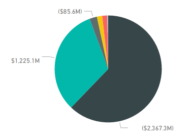
Some of my visuals are wrapping numbers in brackets and I don't know why. None of these numbers are negative.
Does anyone have any ideas? See image below,
thanks!
Solved! Go to Solution.
- Mark as New
- Bookmark
- Subscribe
- Mute
- Subscribe to RSS Feed
- Permalink
- Report Inappropriate Content
Hi, you have done nothing wrong. Its a presentational failsafe so that if you had a label which was for example '5' and the result was 5% then if it were on one line with no parentheses it would look like 5 5%. Not a great result. You can see that if the label is on a second line its not in the brackets.
To work around it if you need to try putting the value in as a tooltip. You might need a FIRSTNONBLANK(Value , 1) to make the tool tip work sucessfully. You might also need to turn off the value on the piechart values label.
// if this is a solution please mark as such
- Mark as New
- Bookmark
- Subscribe
- Mute
- Subscribe to RSS Feed
- Permalink
- Report Inappropriate Content
My experience has been that this happens when you have the Detail Labels for a pie chart display BOTH Category and Data Value!
Then depending on whether the Category (Data Value) fit on the same line => the Date Value is in parentheses ( )
If the Data Value does not fit on the same line it is placed below the Category and it is not in parentheses ( )
In some cases adjusting the dimensions of the visual can take care of this but as soon as you use a slicer or filter the data by another visual you will get the same behavior!
Helpful resources

New to Fabric Survey
If you have recently started exploring Fabric, we'd love to hear how it's going. Your feedback can help with product improvements.

Power BI DataViz World Championships - June 2026
A new Power BI DataViz World Championship is coming this June! Don't miss out on submitting your entry.

Join our Fabric User Panel
Share feedback directly with Fabric product managers, participate in targeted research studies and influence the Fabric roadmap.

| User | Count |
|---|---|
| 50 | |
| 44 | |
| 44 | |
| 19 | |
| 19 |
| User | Count |
|---|---|
| 71 | |
| 70 | |
| 34 | |
| 33 | |
| 31 |


