Join us at FabCon Vienna from September 15-18, 2025
The ultimate Fabric, Power BI, SQL, and AI community-led learning event. Save €200 with code FABCOMM.
Get registered- Power BI forums
- Get Help with Power BI
- Desktop
- Service
- Report Server
- Power Query
- Mobile Apps
- Developer
- DAX Commands and Tips
- Custom Visuals Development Discussion
- Health and Life Sciences
- Power BI Spanish forums
- Translated Spanish Desktop
- Training and Consulting
- Instructor Led Training
- Dashboard in a Day for Women, by Women
- Galleries
- Data Stories Gallery
- Themes Gallery
- Contests Gallery
- Quick Measures Gallery
- Notebook Gallery
- Translytical Task Flow Gallery
- TMDL Gallery
- R Script Showcase
- Webinars and Video Gallery
- Ideas
- Custom Visuals Ideas (read-only)
- Issues
- Issues
- Events
- Upcoming Events
Enhance your career with this limited time 50% discount on Fabric and Power BI exams. Ends August 31st. Request your voucher.
- Power BI forums
- Forums
- Get Help with Power BI
- Desktop
- Radar chart for soccer player individual report
- Subscribe to RSS Feed
- Mark Topic as New
- Mark Topic as Read
- Float this Topic for Current User
- Bookmark
- Subscribe
- Printer Friendly Page
- Mark as New
- Bookmark
- Subscribe
- Mute
- Subscribe to RSS Feed
- Permalink
- Report Inappropriate Content
Radar chart for soccer player individual report
Hi guys!
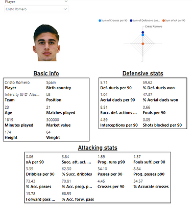
I need a bit of help creating a radar chart similar to this one:
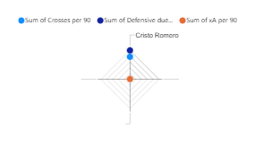
The main issue is that when adding the stats the graph only uses the "category" (in this case Player) as the only axys, instead of using the rest of the data provided, I end up with something like this:
I've been checking through other post regarding radar charts on the forum, but I have not find anything similar to my issue, so I have to be doing something wrong, could you lend me a hand?
Thank you in advance!
Regards,
Eduardo.
- Mark as New
- Bookmark
- Subscribe
- Mute
- Subscribe to RSS Feed
- Permalink
- Report Inappropriate Content
Hi again!
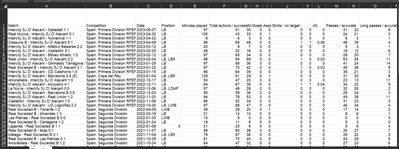
Just to give further context the data files are .xlsx files imported from wyscout, I have both a file with all the player data for a season and one individual file per player, with the data from each match of the season.
I hope this can help.
Thank you again!
Helpful resources
| User | Count |
|---|---|
| 77 | |
| 77 | |
| 36 | |
| 30 | |
| 28 |
| User | Count |
|---|---|
| 106 | |
| 97 | |
| 55 | |
| 49 | |
| 46 |


