FabCon is coming to Atlanta
Join us at FabCon Atlanta from March 16 - 20, 2026, for the ultimate Fabric, Power BI, AI and SQL community-led event. Save $200 with code FABCOMM.
Register now!- Power BI forums
- Get Help with Power BI
- Desktop
- Service
- Report Server
- Power Query
- Mobile Apps
- Developer
- DAX Commands and Tips
- Custom Visuals Development Discussion
- Health and Life Sciences
- Power BI Spanish forums
- Translated Spanish Desktop
- Training and Consulting
- Instructor Led Training
- Dashboard in a Day for Women, by Women
- Galleries
- Data Stories Gallery
- Themes Gallery
- Contests Gallery
- QuickViz Gallery
- Quick Measures Gallery
- Visual Calculations Gallery
- Notebook Gallery
- Translytical Task Flow Gallery
- TMDL Gallery
- R Script Showcase
- Webinars and Video Gallery
- Ideas
- Custom Visuals Ideas (read-only)
- Issues
- Issues
- Events
- Upcoming Events
The Power BI Data Visualization World Championships is back! Get ahead of the game and start preparing now! Learn more
- Power BI forums
- Forums
- Get Help with Power BI
- Desktop
- Radar Chart
- Subscribe to RSS Feed
- Mark Topic as New
- Mark Topic as Read
- Float this Topic for Current User
- Bookmark
- Subscribe
- Printer Friendly Page
- Mark as New
- Bookmark
- Subscribe
- Mute
- Subscribe to RSS Feed
- Permalink
- Report Inappropriate Content
Radar Chart
Hello!
I am trying to get started using POWER BI in my company and I would like to apply this program is the creation of a report on the performance of different structures.
Among the different tools, I would like to use the Radar Chart.
My data is structured as follows:
| STRUCTURE | Item 1 | Item 2 | Item 3 |
| Structure A | 70% | 90% | 80% |
| Structure B | 80% | 90% | 70% |
| Structure C | 90% | 80% | 90% |
| Structure B | 40% | 80% | 90% |
| Structure B | 80% | 70% | 40% |
| Structure C | 100% | 40% | 90% |
| Structure A | 70% | 80% | 90% |
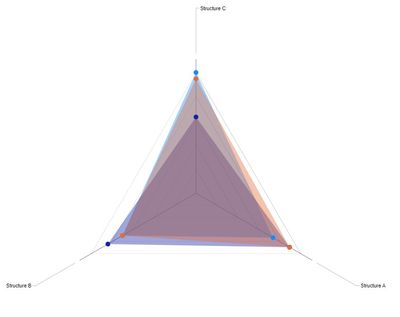
I would like to have the average percentage of an item on each axis of the Radar Chart. I am only managing to create Radar Charts that have the different structures on their axes (see picture):
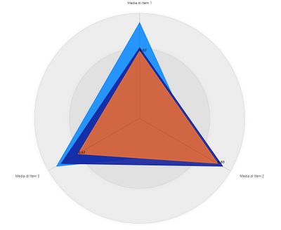
The only one that allows me to create them how i would like of MAQ software (see another picture):
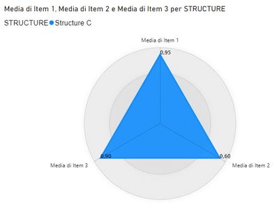
The problem is that, when I aggregate the data of the structures or try to display the data of a single structure, it uses a different scale for each axis, effectively making the graph useless (see the last picture):
Is there a solution that does not involve transposing the data? The database is quite large and I have already set up several sections of the report.
Thanks in advance.
- Mark as New
- Bookmark
- Subscribe
- Mute
- Subscribe to RSS Feed
- Permalink
- Report Inappropriate Content
Hi @babajat ,
Here are the steps you can follow:
1. Create measure.
Measure 3 =
(
AVERAGEX(FILTER(ALL('Table'),'Table'[STRUCTURE]=MAX('Table'[STRUCTURE])),[Item 1])
+
AVERAGEX(FILTER(ALL('Table'),'Table'[STRUCTURE]=MAX('Table'[STRUCTURE])),[Item 2])
+
AVERAGEX(FILTER(ALL('Table'),'Table'[STRUCTURE]=MAX('Table'[STRUCTURE])),[Item 3]))/3
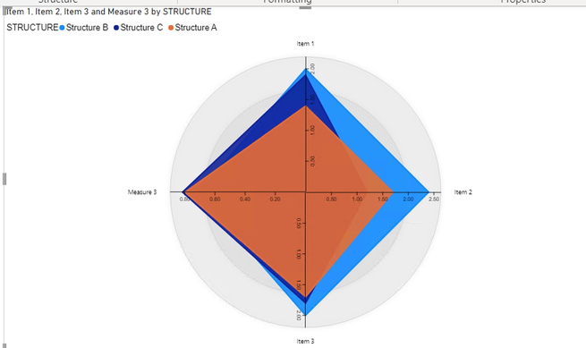
2. Result:
If you need pbix, please click here.
Best Regards,
Liu Yang
If this post helps, then please consider Accept it as the solution to help the other members find it more quickly
- Mark as New
- Bookmark
- Subscribe
- Mute
- Subscribe to RSS Feed
- Permalink
- Report Inappropriate Content
Hi! Sorry for the late response and thanks for the answer.
I'm afraid i have explained myself badly.
The problem is that, when i try to do the radar chart only with one structure (figure 3), the scale for each one of the axis is different rendering the graph useless. Thus i was trying to find a way to change the min-max value of the axis,
I know that other types of charts could be used, but i would be a pity not to use reporting forms that we are already using on excel.
- Mark as New
- Bookmark
- Subscribe
- Mute
- Subscribe to RSS Feed
- Permalink
- Report Inappropriate Content
Don't use a Radar Chart. Use a chart type that allows you to freeze the scale on the Y axis.
Helpful resources

Power BI Dataviz World Championships
The Power BI Data Visualization World Championships is back! Get ahead of the game and start preparing now!

| User | Count |
|---|---|
| 38 | |
| 36 | |
| 33 | |
| 31 | |
| 28 |
| User | Count |
|---|---|
| 129 | |
| 88 | |
| 79 | |
| 68 | |
| 63 |


