New Offer! Become a Certified Fabric Data Engineer
Check your eligibility for this 50% exam voucher offer and join us for free live learning sessions to get prepared for Exam DP-700.
Get Started- Power BI forums
- Get Help with Power BI
- Desktop
- Service
- Report Server
- Power Query
- Mobile Apps
- Developer
- DAX Commands and Tips
- Custom Visuals Development Discussion
- Health and Life Sciences
- Power BI Spanish forums
- Translated Spanish Desktop
- Training and Consulting
- Instructor Led Training
- Dashboard in a Day for Women, by Women
- Galleries
- Community Connections & How-To Videos
- COVID-19 Data Stories Gallery
- Themes Gallery
- Data Stories Gallery
- R Script Showcase
- Webinars and Video Gallery
- Quick Measures Gallery
- 2021 MSBizAppsSummit Gallery
- 2020 MSBizAppsSummit Gallery
- 2019 MSBizAppsSummit Gallery
- Events
- Ideas
- Custom Visuals Ideas
- Issues
- Issues
- Events
- Upcoming Events
Don't miss out! 2025 Microsoft Fabric Community Conference, March 31 - April 2, Las Vegas, Nevada. Use code MSCUST for a $150 discount. Prices go up February 11th. Register now.
- Power BI forums
- Forums
- Get Help with Power BI
- Desktop
- Re: Radar Chart 2.0.2 - Athlete Profile
- Subscribe to RSS Feed
- Mark Topic as New
- Mark Topic as Read
- Float this Topic for Current User
- Bookmark
- Subscribe
- Printer Friendly Page
- Mark as New
- Bookmark
- Subscribe
- Mute
- Subscribe to RSS Feed
- Permalink
- Report Inappropriate Content
Radar Chart 2.0.2 - Athlete Profile
Hi everybody,
I have a problem with the radar chart 2.0.2..
I have a data base looking like this:
| Name | Jump | Sprint | Leg Strength | Upper Body Strength |
| Athlete 1 | 40 | 5 | 3050 | 800 |
| Athlete 2 | 35 | 6 | 2700 | 600 |
| Athlete 3 | 37 | 7 | 2300 | 560 |
Now I want to display a single Athlete in the Radar chart. And then a second athlete to compare both.
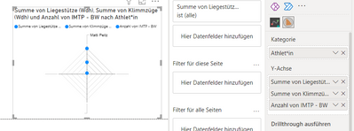
However I can only achieve a radar chart where the different results are getting stacked under the same slot:
What do I need to do?
Thanks in advance!
Matti
- Mark as New
- Bookmark
- Subscribe
- Mute
- Subscribe to RSS Feed
- Permalink
- Report Inappropriate Content
Hi @Anonymous ,
Do you mean you want to display different names on one axis comparing information in different items.
Here are the steps you can follow:
1. Select [Jump], [Sprint], [Leg Strength], [Upper Body Strength].
Result:
2. Get more viusal – select Radar chart – xViz.
3. Result:
Best Regards,
Liu Yang
If this post helps, then please consider Accept it as the solution to help the other members find it more quickly
- Mark as New
- Bookmark
- Subscribe
- Mute
- Subscribe to RSS Feed
- Permalink
- Report Inappropriate Content
thank you, i think it is what i am looking for.
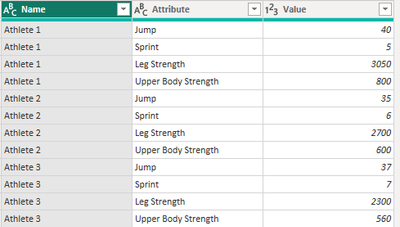
I was able to change my table accordingly.
However now all my tests will always be in the visual. If i would like to select wich test to display, would I need an extra table for each? Or is there any possibility to select which "attribute" will be displayed?
Will this table also be update accordingly when my data base is getting more data?
What happens with calculated columns?
Thank you
Helpful resources

Join us at the Microsoft Fabric Community Conference
March 31 - April 2, 2025, in Las Vegas, Nevada. Use code MSCUST for a $150 discount! Prices go up Feb. 11th.

Power BI Monthly Update - January 2025
Check out the January 2025 Power BI update to learn about new features in Reporting, Modeling, and Data Connectivity.

| User | Count |
|---|---|
| 143 | |
| 85 | |
| 66 | |
| 51 | |
| 45 |
| User | Count |
|---|---|
| 217 | |
| 89 | |
| 82 | |
| 66 | |
| 57 |


