- Subscribe to RSS Feed
- Mark Topic as New
- Mark Topic as Read
- Float this Topic for Current User
- Bookmark
- Subscribe
- Printer Friendly Page
- Mark as New
- Bookmark
- Subscribe
- Mute
- Subscribe to RSS Feed
- Permalink
- Report Inappropriate Content

REMOVEFILTERS, ALLEXCEPT, ALL etc not working as expected
Hello,
I'm trying to do something that should be so simple... I want to get the table below. For my measures, I have the following:
measure1 = DISTINCTCOUNT(contacts[individualid])
measure2 = CALCULATE([measure1],ALLSELECTED(AgeBands[Age Band]))
measure3 = [measure1]/[measure2]
I'm happy that measure1 and measure3 are doing what they should, but measure2 is just giving me the same numbers as measure1, instead of giving me the total number of contacts in that region. Annoyingly, I can easily get measure3 by using "% of column total" in a matrix visual, but I can't do that in a line chart, which is what I ultimately want to have. My measure3 is currently just giving me 100% as measure1 and measure2 are identical.
My table visual is filtered on Region (there are other regions that I don't want to show in this analysis), and also one other field (let's call it Customer Type). I've tried what feels like every permutation of ALL, ALLEXCEPT, ALLSELECTED, KEEPFILTERS, REMOVEFILTERS... I keep getting the same results. Help!
| Age Band | Region | (measure1) - total contacts | (measure2) - total contacts disregarding age band | (measure3) - % of contacts in this region who fall into this age band |
| Under 20 | South | 20 | 100 | 20% |
| Under 20 | North | 40 | 50 | 90% |
| Under 20 | West | 6 | 20 | 30%
|
- Mark as New
- Bookmark
- Subscribe
- Mute
- Subscribe to RSS Feed
- Permalink
- Report Inappropriate Content

Any ideas, anyone? I still don't understand why this isn't working as expected.
- Mark as New
- Bookmark
- Subscribe
- Mute
- Subscribe to RSS Feed
- Permalink
- Report Inappropriate Content

Oh, and the age bands table is related to the contacts table - but I've also tried having a field for age bands on the contacts table itself (adding it in Power Query) and had the same problems.
- Mark as New
- Bookmark
- Subscribe
- Mute
- Subscribe to RSS Feed
- Permalink
- Report Inappropriate Content

Hi @s--turn ,
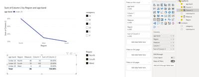
Another way to be independent of slicers is to create a calculated column. Here are the steps.
Create a measure.
Measure =
DISTINCTCOUNT ( AgeBands[individual id] )
Create two columns.
Column 1 =
CALCULATE (
    DISTINCTCOUNT ( AgeBands[individual id] ),
    FILTER ( 'AgeBands', 'AgeBands'[Region] = EARLIER ( AgeBands[Region] ) )
)
Column 2 =
DIVIDE ( [Measure], 'AgeBands'[Column 1] )And you can also put them in a line chart.
Final output:
I attach my sample below for your reference.
Best Regards,
Community Support Team _ xiaosun
If this post helps, then please consider Accept it as the solution to help the other members find it more quickly.
- Mark as New
- Bookmark
- Subscribe
- Mute
- Subscribe to RSS Feed
- Permalink
- Report Inappropriate Content

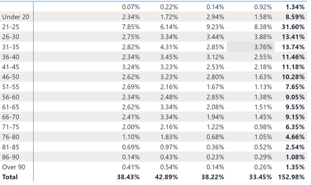
Hi @v-xiaosun-msft , thank you for replying. I@ve tried that technique but unfortunately it still doesn't quite do what I need. Please see images below. The line chart, at first glance, looks better (Region is on the Legend), but when I convert it into a matrix, I can see that the figures for each Region do not add up to 100%. What I'm trying to show is the relative distribution of ages in each region, so that we can say (for example) that Region X has a younger profile than Region Y.
Helpful resources
| Subject | Author | Posted | |
|---|---|---|---|
| 05-13-2024 08:54 AM | |||
| 10-18-2023 07:58 PM | |||
| 12-18-2024 10:43 PM | |||
| 10-17-2024 03:33 AM | |||
| 10-20-2024 11:58 PM |
| User | Count |
|---|---|
| 127 | |
| 99 | |
| 82 | |
| 51 | |
| 46 |


