New Offer! Become a Certified Fabric Data Engineer
Check your eligibility for this 50% exam voucher offer and join us for free live learning sessions to get prepared for Exam DP-700.
Get Started- Power BI forums
- Get Help with Power BI
- Desktop
- Service
- Report Server
- Power Query
- Mobile Apps
- Developer
- DAX Commands and Tips
- Custom Visuals Development Discussion
- Health and Life Sciences
- Power BI Spanish forums
- Translated Spanish Desktop
- Training and Consulting
- Instructor Led Training
- Dashboard in a Day for Women, by Women
- Galleries
- Community Connections & How-To Videos
- COVID-19 Data Stories Gallery
- Themes Gallery
- Data Stories Gallery
- R Script Showcase
- Webinars and Video Gallery
- Quick Measures Gallery
- 2021 MSBizAppsSummit Gallery
- 2020 MSBizAppsSummit Gallery
- 2019 MSBizAppsSummit Gallery
- Events
- Ideas
- Custom Visuals Ideas
- Issues
- Issues
- Events
- Upcoming Events
Don't miss out! 2025 Microsoft Fabric Community Conference, March 31 - April 2, Las Vegas, Nevada. Use code MSCUST for a $150 discount. Prices go up February 11th. Register now.
- Power BI forums
- Forums
- Get Help with Power BI
- Desktop
- QoQ comparison of last two years
- Subscribe to RSS Feed
- Mark Topic as New
- Mark Topic as Read
- Float this Topic for Current User
- Bookmark
- Subscribe
- Printer Friendly Page
- Mark as New
- Bookmark
- Subscribe
- Mute
- Subscribe to RSS Feed
- Permalink
- Report Inappropriate Content
QoQ comparison of last two years
Hi Everyone,
Need your help as i am new to Power Bi. I need to compare the QoQ for two years, lets say Q1 2017 Vs Q1 2018. so when i drill down this comparision, it should be Month 2017 Vs Month 2018 and further week 2017 Vs week 2018. Pls let me know how to do this. Appreciate an early reply, since its very urgent for me.
Thank you.
Solved! Go to Solution.
- Mark as New
- Bookmark
- Subscribe
- Mute
- Subscribe to RSS Feed
- Permalink
- Report Inappropriate Content
Hi @sanghamitra123,
It seems that you want to compare the QoQ for two years.
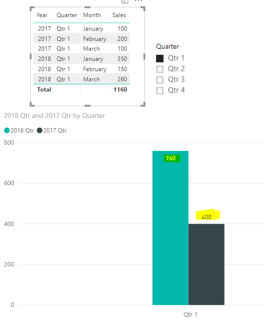
Here is my sample. If you create two measures like below, then you could get the compare chart for QoQ for two years.
2017 Qtr = CALCULATE(SUM(Table1[Sales]),FILTER('Table1',YEAR('Table1'[Date])=YEAR(MIN('Table1'[Date]))))

2018 Qtr = CALCULATE(SUM(Table1[Sales]),FILTER('Table1',YEAR('Table1'[Date])=YEAR(MIN('Table1'[Date]))+1))
In addition, you could have a reference of this video for Quarter On Quarter Sales Trends In Power BI - DAX Formula.
If you still need help, please share some data sample and your desired output so that we could help further on it.
Best Regards,
Cherry
If this post helps, then please consider Accept it as the solution to help the other members find it more quickly.
- Mark as New
- Bookmark
- Subscribe
- Mute
- Subscribe to RSS Feed
- Permalink
- Report Inappropriate Content
Hi Cherry,
I managed to get the chart as below, thanks a lot. Pls let me know if there is a way to drill down further into months and weeks in the same chart, comparing two years (Same as we did for quarter)
Regards
Sanghamitra
- Mark as New
- Bookmark
- Subscribe
- Mute
- Subscribe to RSS Feed
- Permalink
- Report Inappropriate Content
Hi Cherry,
The below graphs looks absolutely fine for me.
I tried this way, the problem here is i am n ot using any DB, i am using Excel. Is there a way we can write measures for excel too.
Helpful resources

Join us at the Microsoft Fabric Community Conference
March 31 - April 2, 2025, in Las Vegas, Nevada. Use code MSCUST for a $150 discount! Prices go up Feb. 11th.

Power BI Monthly Update - January 2025
Check out the January 2025 Power BI update to learn about new features in Reporting, Modeling, and Data Connectivity.

| User | Count |
|---|---|
| 143 | |
| 79 | |
| 63 | |
| 52 | |
| 47 |
| User | Count |
|---|---|
| 212 | |
| 89 | |
| 76 | |
| 66 | |
| 60 |

