FabCon is coming to Atlanta
Join us at FabCon Atlanta from March 16 - 20, 2026, for the ultimate Fabric, Power BI, AI and SQL community-led event. Save $200 with code FABCOMM.
Register now!- Power BI forums
- Get Help with Power BI
- Desktop
- Service
- Report Server
- Power Query
- Mobile Apps
- Developer
- DAX Commands and Tips
- Custom Visuals Development Discussion
- Health and Life Sciences
- Power BI Spanish forums
- Translated Spanish Desktop
- Training and Consulting
- Instructor Led Training
- Dashboard in a Day for Women, by Women
- Galleries
- Data Stories Gallery
- Themes Gallery
- Contests Gallery
- QuickViz Gallery
- Quick Measures Gallery
- Visual Calculations Gallery
- Notebook Gallery
- Translytical Task Flow Gallery
- TMDL Gallery
- R Script Showcase
- Webinars and Video Gallery
- Ideas
- Custom Visuals Ideas (read-only)
- Issues
- Issues
- Events
- Upcoming Events
The Power BI Data Visualization World Championships is back! Get ahead of the game and start preparing now! Learn more
- Power BI forums
- Forums
- Get Help with Power BI
- Desktop
- Pulse chart aggregates data between two events
- Subscribe to RSS Feed
- Mark Topic as New
- Mark Topic as Read
- Float this Topic for Current User
- Bookmark
- Subscribe
- Printer Friendly Page
- Mark as New
- Bookmark
- Subscribe
- Mute
- Subscribe to RSS Feed
- Permalink
- Report Inappropriate Content
Pulse chart aggregates data between two events
Hello!
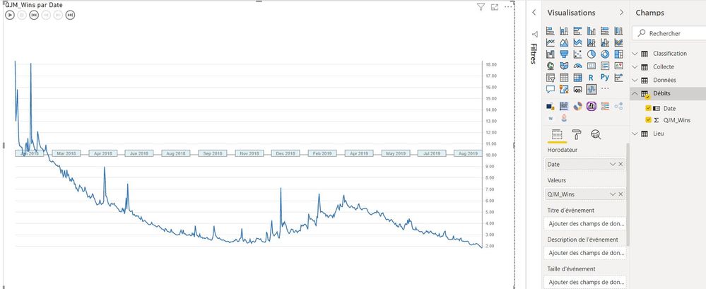
I am using pulse chart to plot river flow against time and feature the number of litter observed for each clean up. It was perfectly working two weeks ago but it is not anymore.
Here are some info about my data and what I think might be wrong:

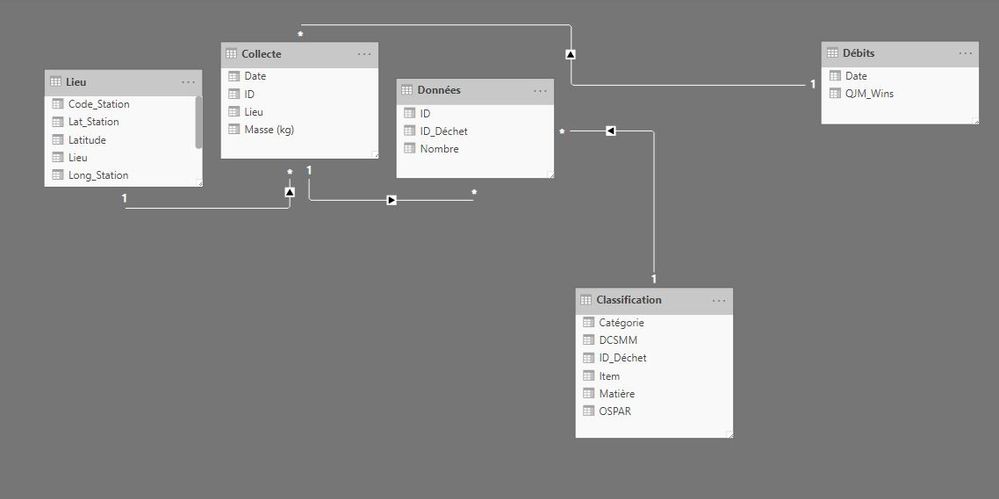
River flow is plotted using columns "QJM_Wins" and "Date" in table "Débits".
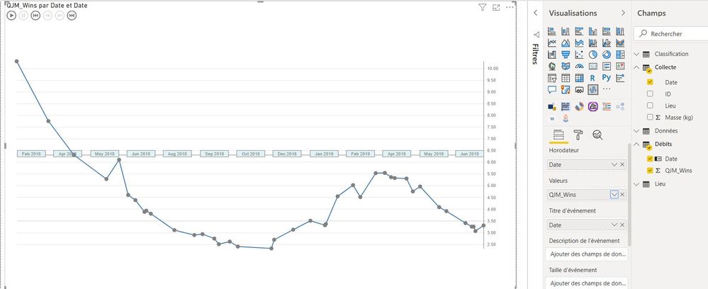
Now, when I add events from table "Collecte", the river flow gets aggregated between two events.
I don't want this agregation but I didn't find a way to avoid it even when choosing the "don't sum up" option.
What's weird is that it was working this way 2 weeks ago.
I also found a difference compared with when it was working. My column "date" in table "Collecte" has no little icon confirming that it's a date in the right panel (as shown below over the red marks). However, in the top panel, I can read that this column is under a date format.
Thanks for all the help you could provide!
Antoine
Solved! Go to Solution.
- Mark as New
- Bookmark
- Subscribe
- Mute
- Subscribe to RSS Feed
- Permalink
- Report Inappropriate Content
Hi @abruge ,
To what I can test out I always loose the the details because of the fact that the relationships are forcing the grouping of the information so only returning the values where the date is equal.
You want to have a chart that looks like your first image but with the highlights in the second image correct?
What I did was to had a measure as my events:
Events =
Events = COUNT(Collecte[ID])

or

Events = CONCATENATEX(Collecte;Collecte[ID])
First one just give a simple count second gives the concatenation of the ID for each date result is below and in PBIX attach.
Regards
Miguel Félix
Did I answer your question? Mark my post as a solution!
Proud to be a Super User!
Check out my blog: Power BI em Português- Mark as New
- Bookmark
- Subscribe
- Mute
- Subscribe to RSS Feed
- Permalink
- Report Inappropriate Content
Hi @abruge ,
If you look at the images you are giving you have the field Date in two values on the second image HoroDateur and Titre d'événement on the first image the date is only on HoroDateur. Can you check if removing from the second field your chart work as expected.
Regarding the second part the icon means that the specific column was setup as a date column, right click the table and choose mark table as Date Table and select the date column should take back the icon.
Regards
Miguel Félix
Did I answer your question? Mark my post as a solution!
Proud to be a Super User!
Check out my blog: Power BI em Português- Mark as New
- Bookmark
- Subscribe
- Mute
- Subscribe to RSS Feed
- Permalink
- Report Inappropriate Content
Hello @MFelix ,
Thank you for your quick answer.
Following your advice, I removed the field "Date" in the event section. The plot is as I want it (as in screenshot 2 I shared in my initial message) but the events (clean ups) are missing.
In fact, I have two columns named "Date". One is in table "Débits" and correspond to days from 01/01/2018 to now, day by day. I added this one in the horodator section. The second is in table "Collecte" and relates to the dates of clean ups. I put this one in the event section. I tried to replace it by clean up IDs but the problem is the same. Values of river flow between events still aggregate and I cannot select "don't sum up" when I clic right on "QJM" in the section "Values".
Regarding the date format, I cannot mark table "Collecte" as table date because the field date is not continious and some dates are present several times.
One solution to my problem would be to format my data differently as adviced when using Pulse chart, as below, but I will have to change completly the way I organise my data and I still don't understand why it was working this way two weeks ago.
Date | River Flow | Events | Event Size |
|
|
|
|
What do you think @MFelix or others? 🙂
Best,
Antoine
- Mark as New
- Bookmark
- Subscribe
- Mute
- Subscribe to RSS Feed
- Permalink
- Report Inappropriate Content
Hi @abruge ,
Did you make the update for the new version of PBI? The changes can be from the updated version.
Is it possible to share a sample file? So I can make some tests?
Regards
Miguel Félix
Did I answer your question? Mark my post as a solution!
Proud to be a Super User!
Check out my blog: Power BI em Português- Mark as New
- Bookmark
- Subscribe
- Mute
- Subscribe to RSS Feed
- Permalink
- Report Inappropriate Content
Hello @MFelix ,
Here is a sample of my dataset. Please, let me know what you think!
I didn't manually update PowerBI but perhaps it did it on its own.
Best,
Antoine
- Mark as New
- Bookmark
- Subscribe
- Mute
- Subscribe to RSS Feed
- Permalink
- Report Inappropriate Content
Hi @abruge ,
To what I can test out I always loose the the details because of the fact that the relationships are forcing the grouping of the information so only returning the values where the date is equal.
You want to have a chart that looks like your first image but with the highlights in the second image correct?
What I did was to had a measure as my events:
Events =
Events = COUNT(Collecte[ID])

or

Events = CONCATENATEX(Collecte;Collecte[ID])
First one just give a simple count second gives the concatenation of the ID for each date result is below and in PBIX attach.
Regards
Miguel Félix
Did I answer your question? Mark my post as a solution!
Proud to be a Super User!
Check out my blog: Power BI em Português- Mark as New
- Bookmark
- Subscribe
- Mute
- Subscribe to RSS Feed
- Permalink
- Report Inappropriate Content
Hello @MFelix ,
Thank you for your help and sorry for my slow reply.
It's exactly what I was looking for. Your solution works.
Thanks a lot for that!!!
All the best,
Antoine
Helpful resources

Power BI Dataviz World Championships
The Power BI Data Visualization World Championships is back! Get ahead of the game and start preparing now!

| User | Count |
|---|---|
| 41 | |
| 39 | |
| 37 | |
| 29 | |
| 24 |
| User | Count |
|---|---|
| 122 | |
| 110 | |
| 83 | |
| 69 | |
| 68 |


