Fabric Data Days starts November 4th!
Advance your Data & AI career with 50 days of live learning, dataviz contests, hands-on challenges, study groups & certifications and more!
Get registered- Power BI forums
- Get Help with Power BI
- Desktop
- Service
- Report Server
- Power Query
- Mobile Apps
- Developer
- DAX Commands and Tips
- Custom Visuals Development Discussion
- Health and Life Sciences
- Power BI Spanish forums
- Translated Spanish Desktop
- Training and Consulting
- Instructor Led Training
- Dashboard in a Day for Women, by Women
- Galleries
- Data Stories Gallery
- Themes Gallery
- Contests Gallery
- QuickViz Gallery
- Quick Measures Gallery
- Visual Calculations Gallery
- Notebook Gallery
- Translytical Task Flow Gallery
- TMDL Gallery
- R Script Showcase
- Webinars and Video Gallery
- Ideas
- Custom Visuals Ideas (read-only)
- Issues
- Issues
- Events
- Upcoming Events
Get Fabric Certified for FREE during Fabric Data Days. Don't miss your chance! Request now
- Power BI forums
- Forums
- Get Help with Power BI
- Desktop
- Project RAG Status overtime
- Subscribe to RSS Feed
- Mark Topic as New
- Mark Topic as Read
- Float this Topic for Current User
- Bookmark
- Subscribe
- Printer Friendly Page
- Mark as New
- Bookmark
- Subscribe
- Mute
- Subscribe to RSS Feed
- Permalink
- Report Inappropriate Content
Project RAG Status overtime
Hi - I would like to show the projects which have moved from Green to Amber, Green to Red, Amber to Red, Amber to Green, Red to Amber and Red to Green over a month on month comparison...
Example data -
| Month | Project Code | Project Status |
| Jan-21 | 1234 | Green |
| Jan-21 | 1212 | Green |
| Jan-21 | 3333 | Green |
| Jan-21 | 4444 | Green |
| Feb-21 | 1234 | Green |
| Feb-21 | 1212 | Green |
| Feb-21 | 3333 | Amber |
| Feb-21 | 4444 | Red |
| Mar-21 | 1234 | Amber |
| Mar-21 | 1212 | Green |
| Mar-21 | 3333 | Amber |
| Mar-21 | 4444 | Green |
If i view the report as of Feb-21 -then i should see a visual with this information:
| Feb-21 | |
| Green to Amber | 3333 |
| Green to Red | 1212, 4444 |
| Amber to Red | |
| Amber to Green | |
| Red to Amber | |
| Red to Green |
This how it would look like when run as of March.
| Mar-21 | |
| Green to Amber | 1234 |
| Green to Red | |
| Amber to Red | |
| Amber to Green | 3333 |
| Red to Amber | |
| Red to Green | 4444 |
Whats the best visual for this and best way to model the data to get a good visual for this?
Solved! Go to Solution.
- Mark as New
- Bookmark
- Subscribe
- Mute
- Subscribe to RSS Feed
- Permalink
- Report Inappropriate Content
Hi @Mal_Sondh
There are several problems in your description .
(1)When you view the report as of Feb-21 ,the status for 1212 is still green ,so why put it in “Green to Red” ?
(2)When you view the report as of Mar-21 ,the status for 3333 is still Amber ,so why put it in “Amber to Green” ?
According to the data you provided, I created a sample .
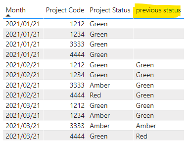
(1)Create a column to return the previous status for the code
previous status = CALCULATE(SELECTEDVALUE('Table'[Project Status]),FILTER(ALLEXCEPT('Table','Table'[Project Code]),EOMONTH('Table'[Month],0)=EOMONTH(EARLIER('Table'[Month]),-1)))
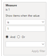
(2)Create a measure to judge whether the 'Table'[Project Status] and 'Table'[previous status] is changed .
Measure = IF(SELECTEDVALUE('Table'[Project Status])<>SELECTEDVALUE('Table'[previous status]) && SELECTEDVALUE('Table'[previous status])<>BLANK(),1,0)
And then put the measure in Filter Pane to return the changed 'Table'[Project Code] .
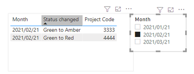
(3)Create a measure to combine the two status
Status changed = COMBINEVALUES(" to ",SELECTEDVALUE('Table'[previous status]),SELECTEDVALUE('Table'[Project Status]))
And add it in the visual of the second step .You can also add a slicer with 'Table'[Month] to filter the data you want .
I have attached my pbix file, you can refer to it .
Best Regards
Community Support Team _ Ailsa Tao
If this post helps, then please consider Accept it as the solution to help the other members find it more quickly.
- Mark as New
- Bookmark
- Subscribe
- Mute
- Subscribe to RSS Feed
- Permalink
- Report Inappropriate Content
@Anonymous brillaint - thank you so much - this worked as expected!!
- Mark as New
- Bookmark
- Subscribe
- Mute
- Subscribe to RSS Feed
- Permalink
- Report Inappropriate Content
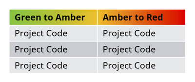
maybe a visual like this:
Note i have not catered for all combination on this example visual.
- Mark as New
- Bookmark
- Subscribe
- Mute
- Subscribe to RSS Feed
- Permalink
- Report Inappropriate Content
also is there a way of putting the previous months status in another column on the same table.. i.e. something like lookupvalue?
Helpful resources

Power BI Monthly Update - November 2025
Check out the November 2025 Power BI update to learn about new features.

Fabric Data Days
Advance your Data & AI career with 50 days of live learning, contests, hands-on challenges, study groups & certifications and more!

| User | Count |
|---|---|
| 97 | |
| 76 | |
| 52 | |
| 51 | |
| 46 |


