FabCon is coming to Atlanta
Join us at FabCon Atlanta from March 16 - 20, 2026, for the ultimate Fabric, Power BI, AI and SQL community-led event. Save $200 with code FABCOMM.
Register now!- Power BI forums
- Get Help with Power BI
- Desktop
- Service
- Report Server
- Power Query
- Mobile Apps
- Developer
- DAX Commands and Tips
- Custom Visuals Development Discussion
- Health and Life Sciences
- Power BI Spanish forums
- Translated Spanish Desktop
- Training and Consulting
- Instructor Led Training
- Dashboard in a Day for Women, by Women
- Galleries
- Data Stories Gallery
- Themes Gallery
- Contests Gallery
- Quick Measures Gallery
- Notebook Gallery
- Translytical Task Flow Gallery
- TMDL Gallery
- R Script Showcase
- Webinars and Video Gallery
- Ideas
- Custom Visuals Ideas (read-only)
- Issues
- Issues
- Events
- Upcoming Events
To celebrate FabCon Vienna, we are offering 50% off select exams. Ends October 3rd. Request your discount now.
- Power BI forums
- Forums
- Get Help with Power BI
- Desktop
- Problems with grouped column and row graph
- Subscribe to RSS Feed
- Mark Topic as New
- Mark Topic as Read
- Float this Topic for Current User
- Bookmark
- Subscribe
- Printer Friendly Page
- Mark as New
- Bookmark
- Subscribe
- Mute
- Subscribe to RSS Feed
- Permalink
- Report Inappropriate Content
Problems with grouped column and row graph
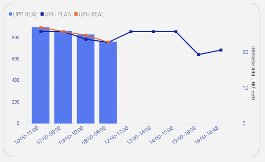
I'm building a graph of grouped columns and lines and I noticed a small bug, on the x axis I have the schedules and on the y I have a metric called UPP REAL, this graph refers to the lines of work, currently I'm trying to apply the play axis to this report, however when placing the parameter "line" in the field, it returns the result below:
It is as if he were taking all the lines, adding the "UPP REAL" for each time and determining how the maximum value is, for example:
7h ~ line 01: 20
7h ~ line 02: 30
7h ~ line 03: 10
It puts in general the sum of all the lines and the hourly value of 7 am would be 60, I would like it to show individually, for each line it shows the REAL UPP of that line, and not the sum. This darker blue on the graph is the value it should show as the total value of the column, and this lighter blue is the sum (which I would not like to be displayed). In summary I would like the graph to look like this.
It does not show the option "Do not summarize", only "sum, maximum, minimum, count, etc."
Attached is my pbix (testChart.pbix )
Solved! Go to Solution.
- Mark as New
- Bookmark
- Subscribe
- Mute
- Subscribe to RSS Feed
- Permalink
- Report Inappropriate Content
Hi @Anonymous
Sorry we can't fix the issue coz it's from custom visual, you might turn to the author for more help.
If this post helps, then please consider Accept it as the solution to help the other members find it more
quickly.


