Join us at FabCon Vienna from September 15-18, 2025
The ultimate Fabric, Power BI, SQL, and AI community-led learning event. Save €200 with code FABCOMM.
Get registered- Power BI forums
- Get Help with Power BI
- Desktop
- Service
- Report Server
- Power Query
- Mobile Apps
- Developer
- DAX Commands and Tips
- Custom Visuals Development Discussion
- Health and Life Sciences
- Power BI Spanish forums
- Translated Spanish Desktop
- Training and Consulting
- Instructor Led Training
- Dashboard in a Day for Women, by Women
- Galleries
- Data Stories Gallery
- Themes Gallery
- Contests Gallery
- Quick Measures Gallery
- Notebook Gallery
- Translytical Task Flow Gallery
- TMDL Gallery
- R Script Showcase
- Webinars and Video Gallery
- Ideas
- Custom Visuals Ideas (read-only)
- Issues
- Issues
- Events
- Upcoming Events
Enhance your career with this limited time 50% discount on Fabric and Power BI exams. Ends September 15. Request your voucher.
- Power BI forums
- Forums
- Get Help with Power BI
- Desktop
- Problems displaying a normal time series
- Subscribe to RSS Feed
- Mark Topic as New
- Mark Topic as Read
- Float this Topic for Current User
- Bookmark
- Subscribe
- Printer Friendly Page
- Mark as New
- Bookmark
- Subscribe
- Mute
- Subscribe to RSS Feed
- Permalink
- Report Inappropriate Content
Problems displaying a normal time series
Hi,
I have the following information and just want to get it displayed as a normal time series. With the date on the X axis and the value on the Y, but I am getting a really random line graph out of it.
| Date | Costs |
| 01.01.2023 | 31,50 |
| 01.02.2023 | 63,00 |
| 03.03.2023 | 63,65 |
| 21.02.2023 | 65,25 |
| 13.03.2023 | 66,35 |
| 13.03.2023 | 67,25 |
| 09.03.2023 | 68,65 |
| 09.03.2023 | 70,05 |
| 09.03.2023 | 71,45 |
| 09.03.2023 | 72,85 |
| 09.03.2023 | 74,25 |
| 21.03.2023 | 75,25 |
| 21.03.2023 | 76,25 |
| 28.03.2023 | 77,25 |
| 28.03.2023 | 78,25 |
| 21.04.2023 | 78,90 |
| 21.04.2023 | 79,44 |
| 21.04.2023 | 79,47 |
| 21.04.2023 | 79,55 |
| 21.04.2023 | 79,55 |
| 28.04.2023 | 80,55 |
| 28.04.2023 | 81,55 |
| 28.04.2023 | 82,55 |
| 28.04.2023 | 83,55 |
| 28.04.2023 | 84,55 |
| 28.04.2023 | 85,55 |
| 28.04.2023 | 86,55 |
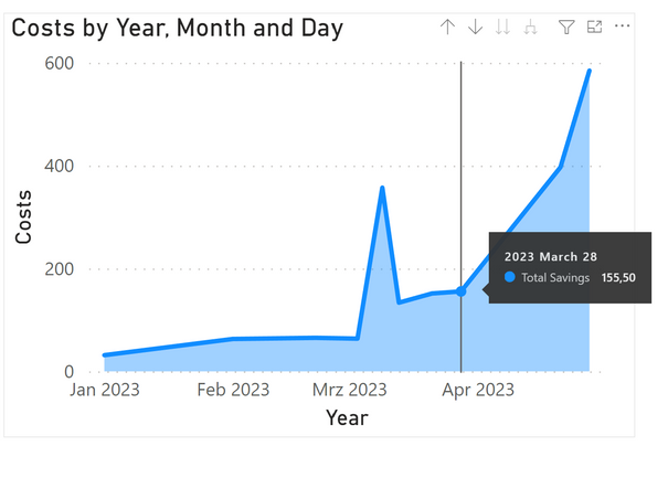
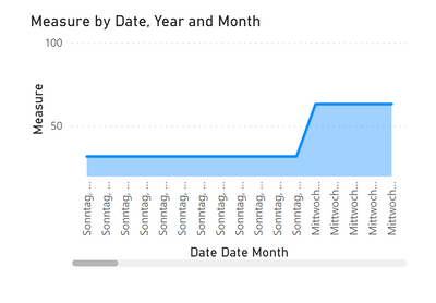
And the graph which I get from this is shown like this :
I have no idea where it's getting these numbers from, I have turned off the summarization to "don't summarize" but yet it seems to keep on giving me a running total, but with a blip in the middle (probably because there are many entries for that specific date, but then how can I get it that it just takes the maximum and ignores the others ?) I would expect it to be a straight upwards trend with no random up and down in the middle. Any help with this would really be appreciated ! 😊
Solved! Go to Solution.
- Mark as New
- Bookmark
- Subscribe
- Mute
- Subscribe to RSS Feed
- Permalink
- Report Inappropriate Content
Hi,
try using a measure for the costs column:
- Mark as New
- Bookmark
- Subscribe
- Mute
- Subscribe to RSS Feed
- Permalink
- Report Inappropriate Content
Hi @Adam_089,
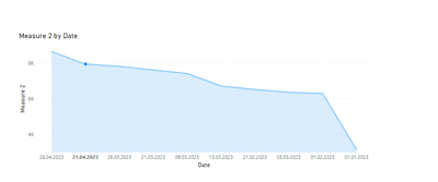
It is best to create a measure, that will calculate your cost. I imagine you have a Date Table (where you are taking you're months from also).
Simple measure like this should work:

- Mark as New
- Bookmark
- Subscribe
- Mute
- Subscribe to RSS Feed
- Permalink
- Report Inappropriate Content
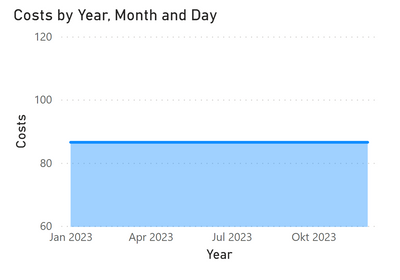
Thanks, it's changed it, but now it's just basically a flat line over the time period only showing the maximum value and for dates in the future, which I shouldn't really show
- Mark as New
- Bookmark
- Subscribe
- Mute
- Subscribe to RSS Feed
- Permalink
- Report Inappropriate Content
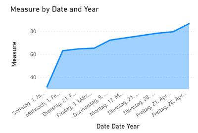
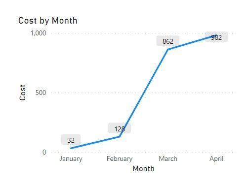
That's strange, this is what i got with the same measure:
If I answered your question, please mark my post as solution, Appreciate your Kudos 👍
- Mark as New
- Bookmark
- Subscribe
- Mute
- Subscribe to RSS Feed
- Permalink
- Report Inappropriate Content
I've uploaded the file here:
https://drive.google.com/file/d/1cTlCF5kTFCG8FJ_e6hPOANzXC0UtMX5D/view?usp=sharing
If I answered your question, please mark my post as solution, Appreciate your Kudos 👍
- Mark as New
- Bookmark
- Subscribe
- Mute
- Subscribe to RSS Feed
- Permalink
- Report Inappropriate Content
Ok, thanks, I don't quite know why, but when I deleted the graph and then reinserted it with exactly the same figures, it seems to have done more or less what I wanted to.
The only challenge now is to make the X Axis display properly. If I put it on anything less than a year in the date hierarchy it shows me a daily breakdown (that's on the monthly option on the hierarchy) any idea on how to change this to be just back to the months ? I can't see an option in the formatting
- Mark as New
- Bookmark
- Subscribe
- Mute
- Subscribe to RSS Feed
- Permalink
- Report Inappropriate Content
I've noticed that sometimes the chart automatically drills down to the lowest level when deleting part of the hierachy. see if there's a drill up option on the chart.
If not delete the day level and only leave month that should work
If I answered your question, please mark my post as solution, Appreciate your Kudos 👍
- Mark as New
- Bookmark
- Subscribe
- Mute
- Subscribe to RSS Feed
- Permalink
- Report Inappropriate Content
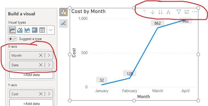
You can use arrows up and down as highlighted to toggle between daily view and monthly view, depending on what you put on your X-Axis. Hope this helps.
- Mark as New
- Bookmark
- Subscribe
- Mute
- Subscribe to RSS Feed
- Permalink
- Report Inappropriate Content
Ah, doh ! Thanks, I totally forgot about that ! 😁
- Mark as New
- Bookmark
- Subscribe
- Mute
- Subscribe to RSS Feed
- Permalink
- Report Inappropriate Content
No worries! Glad it helped! 😀
- Mark as New
- Bookmark
- Subscribe
- Mute
- Subscribe to RSS Feed
- Permalink
- Report Inappropriate Content
Hi,
try using a measure for the costs column:
