Join us at the 2025 Microsoft Fabric Community Conference
Microsoft Fabric Community Conference 2025, March 31 - April 2, Las Vegas, Nevada. Use code MSCUST for a $150 discount.
Register now- Power BI forums
- Get Help with Power BI
- Desktop
- Service
- Report Server
- Power Query
- Mobile Apps
- Developer
- DAX Commands and Tips
- Custom Visuals Development Discussion
- Health and Life Sciences
- Power BI Spanish forums
- Translated Spanish Desktop
- Training and Consulting
- Instructor Led Training
- Dashboard in a Day for Women, by Women
- Galleries
- Webinars and Video Gallery
- Data Stories Gallery
- Themes Gallery
- Contests Gallery
- Quick Measures Gallery
- R Script Showcase
- COVID-19 Data Stories Gallery
- Community Connections & How-To Videos
- 2021 MSBizAppsSummit Gallery
- 2020 MSBizAppsSummit Gallery
- 2019 MSBizAppsSummit Gallery
- Events
- Ideas
- Custom Visuals Ideas
- Issues
- Issues
- Events
- Upcoming Events
The Power BI DataViz World Championships are on! With four chances to enter, you could win a spot in the LIVE Grand Finale in Las Vegas. Show off your skills.
- Power BI forums
- Forums
- Get Help with Power BI
- Desktop
- Problem calculating percentage total - bar chart
- Subscribe to RSS Feed
- Mark Topic as New
- Mark Topic as Read
- Float this Topic for Current User
- Bookmark
- Subscribe
- Printer Friendly Page
- Mark as New
- Bookmark
- Subscribe
- Mute
- Subscribe to RSS Feed
- Permalink
- Report Inappropriate Content
Problem calculating percentage total - bar chart
Hello guys!
I'm new in Power BI 🙂 I'm trying to create a bar chart to display my data but it's working partially.
I create a new measure to calculate the percentage of total. Follow my formula:


Solved! Go to Solution.
- Mark as New
- Bookmark
- Subscribe
- Mute
- Subscribe to RSS Feed
- Permalink
- Report Inappropriate Content
Hi, try with this:
Medida = DIVIDE(SUM(Table1[Valor]),CALCULATE(SUM(Table1[Valor]),ALLSELECTED(Table1[Faixa])))
Regards
Victor
Lima - Peru
- Mark as New
- Bookmark
- Subscribe
- Mute
- Subscribe to RSS Feed
- Permalink
- Report Inappropriate Content
Seems like the slicers are both multi-selection slicers in your two screenshots, to be general, you may modify your measure like pattern below and try again:
Medida =
DIVIDE (
    COUNT ( Consulta1[Intervalo] );
    CALCULATE ( COUNT ( Consulta1[Intervalo] ); ALLSELECTED ( Consulta1 ) )
)
Community Support Team _ Jimmy Tao
If this post helps, then please consider Accept it as the solution to help the other members find it more quickly.
- Mark as New
- Bookmark
- Subscribe
- Mute
- Subscribe to RSS Feed
- Permalink
- Report Inappropriate Content
@v-yuta-msft,
Thank you for feedback 🙂
I tried the pattern that you suggested. It works but not like I expected.
I got the total percentage, if I sum all values referent A and B I have 99,99% and it's right. But I need that the sum of all B columns displays 100%(or almost it) and all A columns displays 100%(or almost it).
How could I do that? Is it possible? I tried the last pattern with ALLEXCEPT but using some filters the value displayed is incorrect.
Best regards,
Roger.
- Mark as New
- Bookmark
- Subscribe
- Mute
- Subscribe to RSS Feed
- Permalink
- Report Inappropriate Content
I got the total percentage, if I sum all values referent A and B I have 99,99% and it's right. But I need that the sum of all B columns displays 100%(or almost it) and all A columns displays 100%(or almost it).
How could I do that? Is it possible? I tried the last pattern with ALLEXCEPT but using some filters the value displayed is incorrect.
I tried the pattern that you suggested. It works but not like I expected.
Could you clarify more about "display 100%"? If possible, could you please share some sample data?
Community Support Team _ Jimmy Tao
If this post helps, then please consider Accept it as the solution to help the other members find it more quickly.
- Mark as New
- Bookmark
- Subscribe
- Mute
- Subscribe to RSS Feed
- Permalink
- Report Inappropriate Content
Hello @v-yuta-msft,
The 100% represents the sum of all columns related to a Product (Produto).
I created a new scenario to simulate the problem. I reduce the number of fields to make it easy.

The dataset that I used is:
| Familia | Produto | BR | Regional | Faixa | Valor |
| Home | Blue-Ray | BR1 | SP | A | 1 |
| Home | TV | BR2 | MT | B | 1 |
| Home | Blue-Ray | BR3 | AL | C | 1 |
| Home | TV | BR1 | SP | D | 1 |
| Home | Blue-Ray | BR2 | MT | E | 1 |
| Home | TV | BR3 | AL | A | 1 |
| Home | Blue-Ray | BR1 | SP | B | 1 |
| Home | TV | BR2 | MT | C | 1 |
| Home | Blue-Ray | BR3 | AL | D | 1 |
| Home | TV | BR1 | SP | E | 1 |
| Home | Blue-Ray | BR2 | MT | A | 1 |
| Home | TV | BR3 | AL | B | 1 |
| Home | Blue-Ray | BR1 | SP | C | 1 |
| Home | TV | BR2 | MT | D | 1 |
| Home | Blue-Ray | BR3 | AL | E | 1 |
| Home | TV | BR1 | SP | A | 1 |
| Home | Blue-Ray | BR2 | MT | B | 1 |
| Home | TV | BR3 | AL | C | 1 |
| Home | Blue-Ray | BR1 | SP | D | 1 |
| Home | TV | BR2 | MT | E | 1 |
| Home | Blue-Ray | BR3 | AL | A | 1 |
| Home | TV | BR1 | SP | B | 1 |
| Home | Blue-Ray | BR2 | MT | C | 1 |
| Home | TV | BR3 | AL | D | 1 |
| Home | Blue-Ray | BR1 | SP | E | 1 |
| Home | X-Box | BR1 | SP | A | 1 |
| Home | X-Box | BR2 | MT | B | 1 |
| Home | X-Box | BR3 | AL | C | 1 |
| Home | X-Box | BR1 | SP | D | 1 |
| Home | X-Box | BR2 | MT | E | 1 |
| Home | X-Box | BR3 | AL | A | 1 |
| Home | X-Box | BR1 | SP | B | 1 |
| Home | X-Box | BR2 | MT | C | 1 |
| Home | X-Box | BR3 | AL | D | 1 |
| Home | X-Box | BR1 | SP | E | 1 |
I’m using two bar charts to check and to explain the scenario.
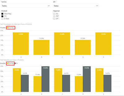
The barchart below I use just to check the values, notice that if you sum de percentage the value is 100% (23,08% + 15,38% + 23,08% + 15,38% + 23,08%). I also filter this chart by the “Produto” that I need to check.

Here is how I configured it.

This second barchart represents the comparison between my “Produtos”, I use a measure to calculate the value.
The measure (“medida”) formula is: Medida = DIVIDE(COUNT('chamado-ms'[Faixa]);CALCULATE(COUNT('chamado-ms'[Faixa]);ALLEXCEPT('chamado-ms';'chamado-ms'[Familia];'chamado-ms'[Produto];'chamado-ms'[BR];'chamado-ms'[Regional])))

Here is how I configured chart 2.

Now I will show two scenarios, the first one is when it works properly and the second one is when I get the unexpected behavior.
Scenario 1: Filtering only by “Produto”.

The values related to “Produto” Blue-Ray are equal in both charts, if we sum the values we get the value 100% (23,08% + 15,38% + 23,08% + 15,38% + 23,08%).
The value when we sum the second product “TV” is also correct (100,01%).
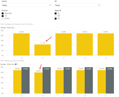
Scenario 2: Filtering by “Produto” and “Regional”.

When I add this filter, my measure “medida” calculates the value incorretly.
How could I fix it? I have no idea about the reason of this behavior 😞
Best regards
Roger
- Mark as New
- Bookmark
- Subscribe
- Mute
- Subscribe to RSS Feed
- Permalink
- Report Inappropriate Content
Hi, try with this:
Medida = DIVIDE(SUM(Table1[Valor]),CALCULATE(SUM(Table1[Valor]),ALLSELECTED(Table1[Faixa])))
Regards
Victor
Lima - Peru
- Mark as New
- Bookmark
- Subscribe
- Mute
- Subscribe to RSS Feed
- Permalink
- Report Inappropriate Content
Hi @Vvelarde,
It works!!! Thank you!
Just a point that I want to share. When I try to "Sort by column" using a different column I have the following behavior.

All columns displays 100%, it's crazy, isn't it? kkk
Well, it's working as I need now (I will use the default "sort").
Thank you @v-yuta-msft and @Vvelarde for help!
Best regards,
Roger
Helpful resources

Join us at the Microsoft Fabric Community Conference
March 31 - April 2, 2025, in Las Vegas, Nevada. Use code MSCUST for a $150 discount!

Join our Community Sticker Challenge 2025
If you love stickers, then you will definitely want to check out our Community Sticker Challenge!

| User | Count |
|---|---|
| 126 | |
| 78 | |
| 78 | |
| 59 | |
| 51 |
| User | Count |
|---|---|
| 165 | |
| 83 | |
| 68 | |
| 68 | |
| 59 |
