- Power BI forums
- Updates
- News & Announcements
- Get Help with Power BI
- Desktop
- Service
- Report Server
- Power Query
- Mobile Apps
- Developer
- DAX Commands and Tips
- Custom Visuals Development Discussion
- Health and Life Sciences
- Power BI Spanish forums
- Translated Spanish Desktop
- Power Platform Integration - Better Together!
- Power Platform Integrations (Read-only)
- Power Platform and Dynamics 365 Integrations (Read-only)
- Training and Consulting
- Instructor Led Training
- Dashboard in a Day for Women, by Women
- Galleries
- Community Connections & How-To Videos
- COVID-19 Data Stories Gallery
- Themes Gallery
- Data Stories Gallery
- R Script Showcase
- Webinars and Video Gallery
- Quick Measures Gallery
- 2021 MSBizAppsSummit Gallery
- 2020 MSBizAppsSummit Gallery
- 2019 MSBizAppsSummit Gallery
- Events
- Ideas
- Custom Visuals Ideas
- Issues
- Issues
- Events
- Upcoming Events
- Community Blog
- Power BI Community Blog
- Custom Visuals Community Blog
- Community Support
- Community Accounts & Registration
- Using the Community
- Community Feedback
Register now to learn Fabric in free live sessions led by the best Microsoft experts. From Apr 16 to May 9, in English and Spanish.
- Power BI forums
- Forums
- Get Help with Power BI
- Desktop
- Re: PowerBI Stacked Chart | Show % value as label ...
- Subscribe to RSS Feed
- Mark Topic as New
- Mark Topic as Read
- Float this Topic for Current User
- Bookmark
- Subscribe
- Printer Friendly Page
- Mark as New
- Bookmark
- Subscribe
- Mute
- Subscribe to RSS Feed
- Permalink
- Report Inappropriate Content
PowerBI Stacked Chart | Show % value as label in the legends | Display labels as % of row total
I am looking to Display measures as percentages in Power BI charts - Stacked bar chart.
x-axis: Month year column
y-axis: Absolute Value
Legend: category
Display labels as percentage of row total.
sample data
| Month | London | Paris | Tokyo | Total |
| Jan-23 | 5 | 5 | 15 | 25 |
| Feb-23 | 20 | 25 | 30 | 75 |
| Mar-23 | 35 | 30 | 5 | 70 |
| Apr-23 | 10 | 20 | 30 | 60 |
Same data in percentage
| London | Paris | Tokyo | |
| Jan-23 | 20% | 20% | 60% |
| Feb-23 | 27% | 33% | 40% |
| Mar-23 | 50% | 43% | 7% |
| Apr-23 | 17% | 33% | 50% |
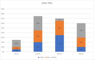
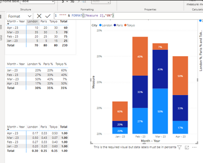
Desired output
Solved! Go to Solution.
- Mark as New
- Bookmark
- Subscribe
- Mute
- Subscribe to RSS Feed
- Permalink
- Report Inappropriate Content
Hi , @pranjaljain
Thanks for your response!
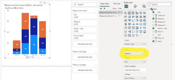
According to your description, you put Measure2. If you want to draw a bar chart of different data according to your Value, then you cannot place Measure2 but Measure.
We just configured the display format of Measure on the basis of Measure:
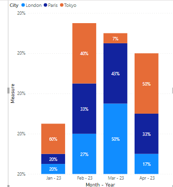
If configured purely like this, the Y axis will indeed display the full 20%, like this:
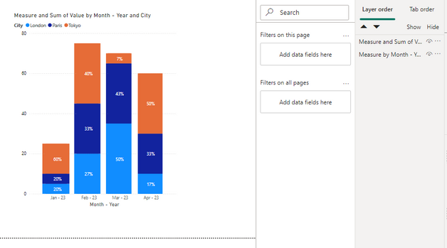
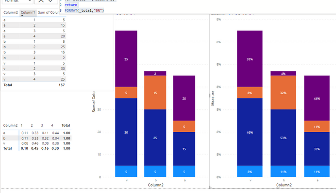
If you want the Y axis to display the Y axis of your previous value, the only way is to create an identical visual, then configure the corresponding color, and hide the fields that do not need to be displayed; then finally we can achieve such a visual:
The size of the bar chart will only be different according to the size of the value, we can only change the output format of the value, we cannot make a value have two different values.
Thank you for your time and sharing, and thank you for your support and understanding of PowerBI!
Best Regards,
Aniya Zhang
If this post helps, then please consider Accept it as the solution to help the other members find it more quickly
- Mark as New
- Bookmark
- Subscribe
- Mute
- Subscribe to RSS Feed
- Permalink
- Report Inappropriate Content
This was really awesome.
FYI - I just went one step ahead here by replacing the stacked column chart with a line and a stacked column chart.
Now I reduced line stroke width to 0px(to make it invisible)
Then I enabled secondary y axis with 'sum of values' - Switched y axis positions, and made the y axis values colour as white.
This allowed me to use only a single visual(rather than overlaping one on top of other)
This was really a major learning point and I really enjoyed it. Thanks for you support.
- Mark as New
- Bookmark
- Subscribe
- Mute
- Subscribe to RSS Feed
- Permalink
- Report Inappropriate Content
Hi , @pranjaljain
According to your description, you want to custom the measure format in your visual.
You can try to use the measure - dynamic feature.
First , we can create a measure like this:
Measure 2 = var _total =  CALCULATE( SUM('Table'[Value]) , ALL('Table'[City]))
return
SUM('Table'[Value])/_total
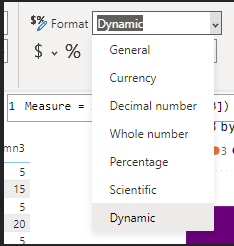
Then we can configure it in the measure format:
And then we can put this dax in it like this:
var _total = [Measure 2]
return
FORMAT(_total,"0%")
Then we can get the result like this:
For more information, you can refer to :
Create dynamic format strings for measures in Power BI Desktop - Power BI | Microsoft Learn
Thank you for your time and sharing, and thank you for your support and understanding of PowerBI!
Best Regards,
Aniya Zhang
If this post helps, then please consider Accept it as the solution to help the other members find it more quickly
- Mark as New
- Bookmark
- Subscribe
- Mute
- Subscribe to RSS Feed
- Permalink
- Report Inappropriate Content
- Mark as New
- Bookmark
- Subscribe
- Mute
- Subscribe to RSS Feed
- Permalink
- Report Inappropriate Content
Can you please check this pbix file for what I've done exactly.
I did follow your method as well, But percentages are giving incorrect values
- Mark as New
- Bookmark
- Subscribe
- Mute
- Subscribe to RSS Feed
- Permalink
- Report Inappropriate Content
Hi , @pranjaljain
Thanks for your quick response !
I tested it in your pbix file, you can try to convert the dax code of the format:
"""" & FORMAT([Measure 2],"0%")
Then we can get this:
Thank you for your time and sharing, and thank you for your support and understanding of PowerBI!
Best Regards,
Aniya Zhang
If this post helps, then please consider Accept it as the solution to help the other members find it more quickly
- Mark as New
- Bookmark
- Subscribe
- Mute
- Subscribe to RSS Feed
- Permalink
- Report Inappropriate Content
@v-yueyunzh-msft I did try the new workaround as well. Didn't work as expected
Visual: Stacked Column Chart
X-axis: Month-Year
Y-Axis: Measure 2
Legend: City
Output: 100% Stacked column chart
Am I missing anything?
Also I want Values column on y-axis
- Mark as New
- Bookmark
- Subscribe
- Mute
- Subscribe to RSS Feed
- Permalink
- Report Inappropriate Content
Hi , @pranjaljain
Thanks for your response!
According to your description, you put Measure2. If you want to draw a bar chart of different data according to your Value, then you cannot place Measure2 but Measure.
We just configured the display format of Measure on the basis of Measure:
If configured purely like this, the Y axis will indeed display the full 20%, like this:
If you want the Y axis to display the Y axis of your previous value, the only way is to create an identical visual, then configure the corresponding color, and hide the fields that do not need to be displayed; then finally we can achieve such a visual:
The size of the bar chart will only be different according to the size of the value, we can only change the output format of the value, we cannot make a value have two different values.
Thank you for your time and sharing, and thank you for your support and understanding of PowerBI!
Best Regards,
Aniya Zhang
If this post helps, then please consider Accept it as the solution to help the other members find it more quickly
Helpful resources

Microsoft Fabric Learn Together
Covering the world! 9:00-10:30 AM Sydney, 4:00-5:30 PM CET (Paris/Berlin), 7:00-8:30 PM Mexico City

Power BI Monthly Update - April 2024
Check out the April 2024 Power BI update to learn about new features.

| User | Count |
|---|---|
| 105 | |
| 96 | |
| 79 | |
| 67 | |
| 62 |
| User | Count |
|---|---|
| 137 | |
| 105 | |
| 104 | |
| 80 | |
| 63 |
