Fabric Data Days starts November 4th!
Advance your Data & AI career with 50 days of live learning, dataviz contests, hands-on challenges, study groups & certifications and more!
Get registered- Power BI forums
- Get Help with Power BI
- Desktop
- Service
- Report Server
- Power Query
- Mobile Apps
- Developer
- DAX Commands and Tips
- Custom Visuals Development Discussion
- Health and Life Sciences
- Power BI Spanish forums
- Translated Spanish Desktop
- Training and Consulting
- Instructor Led Training
- Dashboard in a Day for Women, by Women
- Galleries
- Data Stories Gallery
- Themes Gallery
- Contests Gallery
- QuickViz Gallery
- Quick Measures Gallery
- Visual Calculations Gallery
- Notebook Gallery
- Translytical Task Flow Gallery
- TMDL Gallery
- R Script Showcase
- Webinars and Video Gallery
- Ideas
- Custom Visuals Ideas (read-only)
- Issues
- Issues
- Events
- Upcoming Events
Get Fabric Certified for FREE during Fabric Data Days. Don't miss your chance! Request now
- Power BI forums
- Forums
- Get Help with Power BI
- Desktop
- Power BI scatter chart - tooltip showing incorrect...
- Subscribe to RSS Feed
- Mark Topic as New
- Mark Topic as Read
- Float this Topic for Current User
- Bookmark
- Subscribe
- Printer Friendly Page
- Mark as New
- Bookmark
- Subscribe
- Mute
- Subscribe to RSS Feed
- Permalink
- Report Inappropriate Content
Power BI scatter chart - tooltip showing incorrect values...
Hi Team,
I am seeing some really odd behaviour in Power BI whereby a tooltip within a scatter chart is showing incorrect data for certain data points compare with the same data displayed via a matrix.
Is there a known issue with this visual? Or does Power BI interpret data differently depending on the visual used?
Thanks,
Matty
- Mark as New
- Bookmark
- Subscribe
- Mute
- Subscribe to RSS Feed
- Permalink
- Report Inappropriate Content
Hi @Matty,
You need to understand how the scatter chart and Matrix display the date. Please check the calculation in different visuals.
For my sample table below, create measure Count = COUNTA(Table1[physicians]). Then I create two visuals deperately.
In martix, the rows and column level shows the row and column context in resource table, and the value shows what your expected number value categoried by rows level and column level. For example, 2 means there are 2 physicians(who statue is in) in category DRA.
In scatter chart visual, the X-axis and Y-axis show the number value(count of different categories), if the field is string type, it shows count of them automatically. Then legend shows the category. Please hover over the point, you will see the details, please check your date and visual carefully.
Best Regards,
Angelia
- Mark as New
- Bookmark
- Subscribe
- Mute
- Subscribe to RSS Feed
- Permalink
- Report Inappropriate Content
Hi Angelia,
Thanks for taking the time to respond, but I don't think that's it.
Oddly enough, if I choose to exclude a single data point (any data point) from the chart, the chart recalculates and displays correctly. But as soon as I choose to put the data I've removed back in (meaning all filtered data points are shown), it displays incorrectly again.
Give that the same data in an adjacent matrix remains correct throughout, it looks to me like a bug in the scatter chart visual.
Cheers,
Matty
- Mark as New
- Bookmark
- Subscribe
- Mute
- Subscribe to RSS Feed
- Permalink
- Report Inappropriate Content
Hi @Matty,
I am unable to reproduce your scenario, could you please share a screenshot for further analysis?
Best Regards,
Angelia
- Mark as New
- Bookmark
- Subscribe
- Mute
- Subscribe to RSS Feed
- Permalink
- Report Inappropriate Content
I have this issue, too. When adding tooltips to a scatter chart, some filtering doesn't seem to work correctly when data is not being summarized and both the X Axis and Y Axis buckets are populated with numeric values.
Unfortunately, this is difficult to describe, so I'll use a series of pictures of a simplified case. Here's the table relationships:
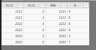
t1 c1, t1 c2, t2 c1, and t2 c2 all contain numerical data. Here's table1:
and table2:
Here's the visualization setup (emphasis on the scatter chart):
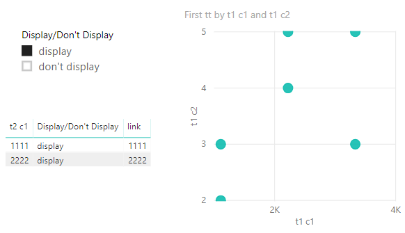
Note the "tt" field from table1 being used as the tooltip. All fields in this scatter chart come from table1. Here's what happens when I use the "Display/Don't Display" filter:
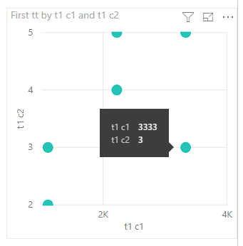
The scatter chart did not change, with the exception of the tooltip field not being displayed in the tooltip window for data points that should not be displayed (note the "tt" field missing in the popup below):
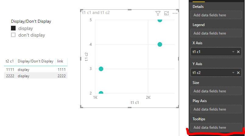
When the "tt" field is removed from the tooltip bucket of the scatter chart visualization, the following happens:
Now, only the properly-filtered values are shown in the scatter chart.
I've only been able to reproduce this when using unsummarized numeric values in both the X Axis and Y Axis buckets. I also can't reproduce this behavior with other visual types.
It's possible I'm either not understanding some complexity in even this simplified model, or I'm getting this behavior because it's what the scatter chart is supposed to do. However...
...if I change the Y Axis bucket to some sort of summarization, the issue disappears: the "Display/Don't Display" filter produces expected results. It's only when both axes are not summarized that I see the buggy behavior.
- Mark as New
- Bookmark
- Subscribe
- Mute
- Subscribe to RSS Feed
- Permalink
- Report Inappropriate Content
Hi,
I have the excact same problem. Did you solve this one or have a workaround?
Thanks,
Femke
Helpful resources

Fabric Data Days
Advance your Data & AI career with 50 days of live learning, contests, hands-on challenges, study groups & certifications and more!

Power BI Monthly Update - October 2025
Check out the October 2025 Power BI update to learn about new features.


