Fabric Data Days starts November 4th!
Advance your Data & AI career with 50 days of live learning, dataviz contests, hands-on challenges, study groups & certifications and more!
Get registered- Power BI forums
- Get Help with Power BI
- Desktop
- Service
- Report Server
- Power Query
- Mobile Apps
- Developer
- DAX Commands and Tips
- Custom Visuals Development Discussion
- Health and Life Sciences
- Power BI Spanish forums
- Translated Spanish Desktop
- Training and Consulting
- Instructor Led Training
- Dashboard in a Day for Women, by Women
- Galleries
- Data Stories Gallery
- Themes Gallery
- Contests Gallery
- QuickViz Gallery
- Quick Measures Gallery
- Visual Calculations Gallery
- Notebook Gallery
- Translytical Task Flow Gallery
- TMDL Gallery
- R Script Showcase
- Webinars and Video Gallery
- Ideas
- Custom Visuals Ideas (read-only)
- Issues
- Issues
- Events
- Upcoming Events
Get Fabric Certified for FREE during Fabric Data Days. Don't miss your chance! Request now
- Power BI forums
- Forums
- Get Help with Power BI
- Desktop
- Power BI Line Chart visualisation with two columns...
- Subscribe to RSS Feed
- Mark Topic as New
- Mark Topic as Read
- Float this Topic for Current User
- Bookmark
- Subscribe
- Printer Friendly Page
- Mark as New
- Bookmark
- Subscribe
- Mute
- Subscribe to RSS Feed
- Permalink
- Report Inappropriate Content
Power BI Line Chart visualisation with two columns in the X axis
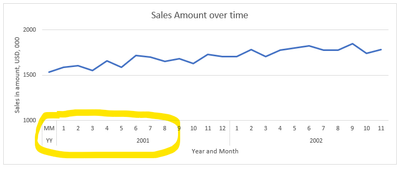
Is it possible to display two columns in a Line Chart visulaisation?
To implement this in Excel is pretty straight forward (as shown below) so seems like it should be available in Power BI.
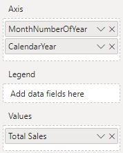
The following configuration only shows the month number and not the year in the output. I have substituted this for the Year and Month in the date hierarchy and it is the same result. I can use a YYYYMM column but this is ugly.
It seems implausable to me that a long time Excel feature is not available in Power BI, am I missing something or would a different visualisation be better?
Solved! Go to Solution.
- Mark as New
- Bookmark
- Subscribe
- Mute
- Subscribe to RSS Feed
- Permalink
- Report Inappropriate Content
@RossRobinson , Make sure both Year and Month number. I was able to get similar stuff with this setting. But month was text and sorted on month no
- Mark as New
- Bookmark
- Subscribe
- Mute
- Subscribe to RSS Feed
- Permalink
- Report Inappropriate Content
Hey @RossRobinson ,
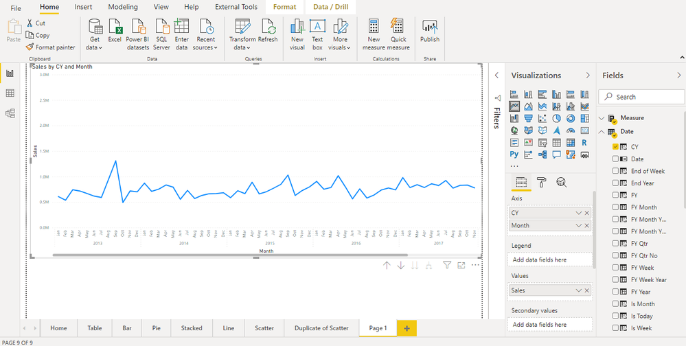
it's recommended not to say mandatory to use a dedicated date or calendar table inside your data model. This table then is related to the corresponding columns of the fact tables. Then the "month number" column can be used to create a chart like this:
This article covers almost everything about date related calculations in Power BI: https://www.daxpatterns.com/time-patterns/
This site provides a great introduction into the world of data modeling in Power BI: https://docs.microsoft.com/en-us/learn/modules/design-model-power-bi/
Hopefully, this provides what you are looking for, at least some ideas on how to tackle your challenge.
Regards,
Tom
Did I answer your question? Mark my post as a solution, this will help others!
Proud to be a Super User!
I accept Kudos 😉
Hamburg, Germany
- Mark as New
- Bookmark
- Subscribe
- Mute
- Subscribe to RSS Feed
- Permalink
- Report Inappropriate Content
Hi Tom, thank you, I will look into that. At the moment I am just experimenting so it will be ideal to compare how things worked before and after I get to the maturity level whereby I create the dedicated date table.
- Mark as New
- Bookmark
- Subscribe
- Mute
- Subscribe to RSS Feed
- Permalink
- Report Inappropriate Content
@RossRobinson , Make sure both Year and Month number. I was able to get similar stuff with this setting. But month was text and sorted on month no
- Mark as New
- Bookmark
- Subscribe
- Mute
- Subscribe to RSS Feed
- Permalink
- Report Inappropriate Content
Thank you Amit.
I got it to work based on your feedback and following this guys link (https://www.youtube.com/watch?v=MAdAa1t9FSY).
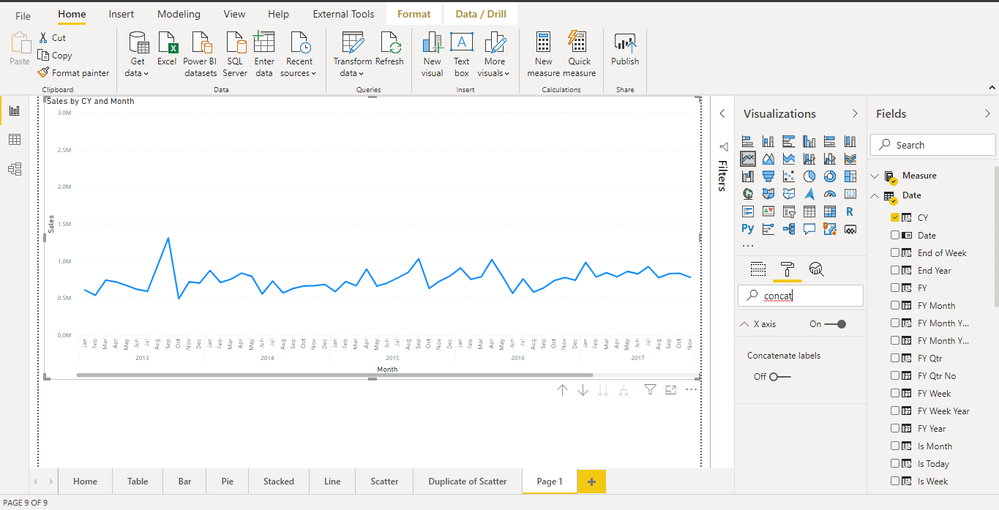
It took quite a bit of fiddling but it appears the following are key. Use the drill-down and turn the 'Concatenate labels' to 'Off' and dont use the 'Month number', this didnt work for me but when I replaced it with the 'Month name' (which was sorted by Month number) it did work out. I was so reluctant to experiment with using the 'Month name' instead of the 'Month number' because I couldnt see why this would make a difference!
One interesting observation, is if someone follows the URL above it uses a 'Stacked column chart' and the year and month from the date hierrachy. This worked for me in but when switching to the 'Line' chart the appealing X axis layout was replaced. This could be resolved by changing the X axis type from 'Continuos' to 'Categorical'. However after making the change there was no dialogue available to change it back!
I cant say it is the most intuative way of working but I suppose you only need to learn those steps once.
I wont post a screenshot of the resuly because it doesnt really differ from yours below.
Once again thank you for your assistance.
Helpful resources

Fabric Data Days
Advance your Data & AI career with 50 days of live learning, contests, hands-on challenges, study groups & certifications and more!

Power BI Monthly Update - October 2025
Check out the October 2025 Power BI update to learn about new features.


